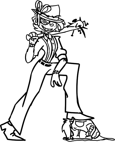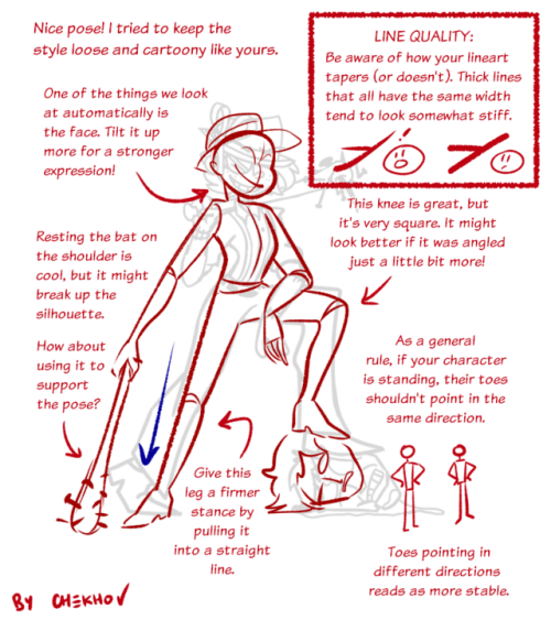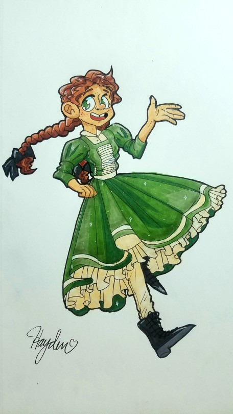


eyyy so i know the lineart is super unbalanced but?? that’s not the point. i spent an hour and a half on this pose but i can’t seem to get it to look right ! you think i could get some help getting this pose to be a little more dynamic and readable? :0 thanks!
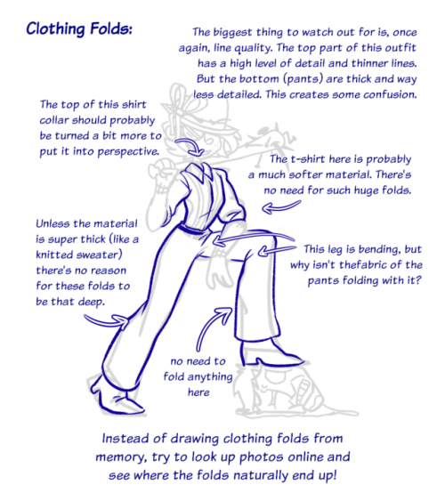
also i need help with clothes folds shhhhhh-(submitted by @arsenicdream)
Thanks for the submission! I actually don’t think the pose is too unbalanced at all. I do recommend, however, trying to be a little bit more consistent with your lineart. It’ll make your drawing look even cooler and cleaner! :)
- Mod Chekhov
from The Redline Station http://bit.ly/2SWvPNy
via IFTTT

No comments:
Post a Comment