Lips are enigmatic things. Mostly because in most popular media such as cartoons or comics, they’re mostly kept subtle as to not detract from the attention of the viewer/reader.
The trick is to make sure that your detail level fits with the rest of your art style. Something that’s defenitely easier said than done.
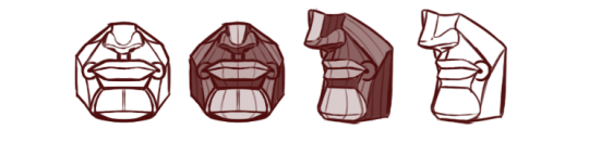
Since I don’t know what your style looks like exactly, and since we can learn a great deal from simply looking at how other artists chose to depict them, ( given noses are not only popular but NECESSARY to stylize for almost every non-realistic artist ) let’s take a look at some tips in entertainment.
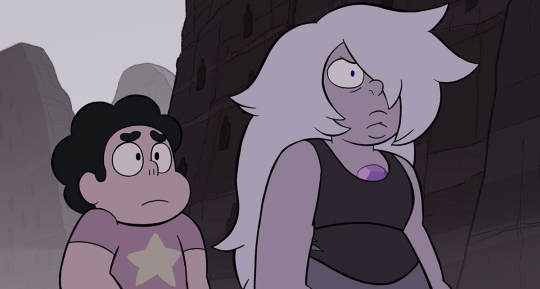
Steven Universe
A show you’re probably familiar with has a very simple way of depicting lips on some of its characters. Although, the universe dictates that lips that don’t contribute directly to the character design, are not drawn at all ( see Steven, Pearl, Peridot + ). Meanwhile, characters, where the lips are a prominent part of their design, such as Amethyst ( as well as Rose Quartz and Garnet ), are depicted with somewhat bold curves facing upward for the upper lip, and downward for the bottom lip.
This plays well into the universe itself, where the focus is more on form and colour, and the intricacies of anatomy are mostly ignored in favour of a much simpler design.
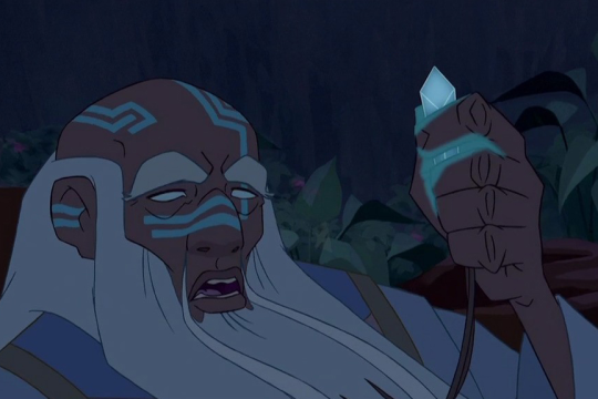
Media that rely heavier on a more semi-realistic style, tend to mark the lips in less brazen ways, but they’re nonetheless still visible. A popular method is to mark up the upper lip and colour it in a slightly darker tone than the rest of the skin. Often, this is accompanied by a curve indicating the bottom lip’s volume. you’ll see a lot of these stylizations in some of Disney’s films aimed at a somewhat grown-child demographic such as “Hercules.
This is personally one of my prefered methods for my current semi-realistic style. It has some sort of stylized maturity to it that you don’t quite see anywhere else.
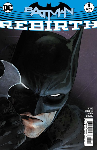
On this very realistically rendered cover, we see that the artist put time and effort into contouring some of the tiny wrinkles in the upper lip, as well as texture the bottom lip with shadows. This works well because the rest of the image’s detail level can keep up with the lips, disallowing them from becoming the focal point, and thusly avoiding making the character appear “ uncanny”.
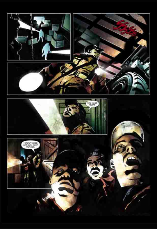
Alternatively, the artists of Top Cow’s “ impaler” comic, didn’t do much to stylize the lips in any sense of lineart or colour. But instead used the other surrounding volumes to define the mass and shape of the lips. ( the shadows, the moustache on the guy in the bottom right ). This is a clever way to prevent having to draw lips while still having them very much present in the art. But may require a good bit of anatomical know-how and a wealth of construction skills.
You can certainly look for more ways people have drawn lips in your favourite shows, comics or by your favourite internet artists. There’s a whole slew of ways I haven’t covered yet, and for you to pick and choose between these and make them work with your style should be a simple task in theory. Although it might take some tries before you find the method that suits your style better.
- mod wackart ( ko-fi )
from The Redline Station https://ift.tt/2PPy1X4
via IFTTT


No comments:
Post a Comment