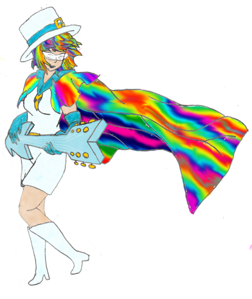
So i drew this for my ask blog while back, and i’m super proud of it! however, the guitar feels rather blocky, and the cape… the stripes don’t feel as if they’re actually stripes along the curvature of the fabric. the hand along the base of the guitar, strumming the strings feels limp, but other than that, i feel my perspective is good and the pose generic popstar enough.
So in Summary: how can i make the cape seem like it’s more solid stripes, THe hand strumming seems limp, and the guitar feels basic, and i’d love any suggestions you have for me.
the hair looks like it does as a stylistic choice, although i know it’s a bit “blocky” that was intentional to differentiate her from some other bobcut characters i draw.
__________________________________
Hey there!! Thanks for the submission!! You’ve got a really dynamic, interesting pose with a lot of movement. That’s hard to do, and you did a great job!
As far as the guitar goes:
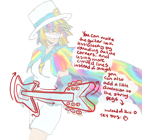
Bringing the points of a guitar to a more rounded tip, rather than a pointed one, can help it feel a little smoother and more realistic. Most guitars have beveled, rounded edges, even some of the more angular ones. Like this:
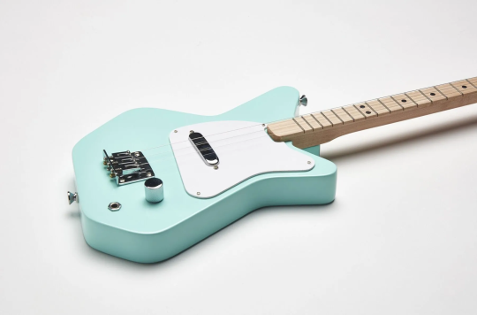
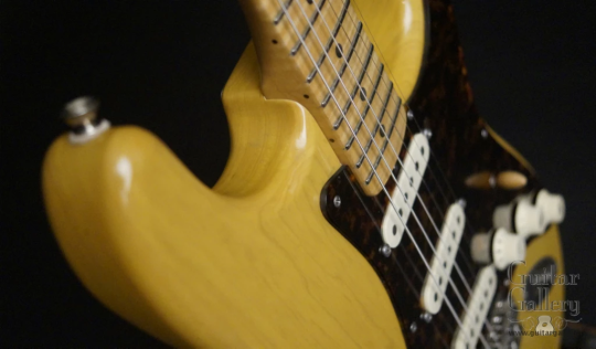
And posing the strumming hand:
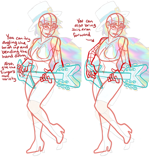
Putting her wrist at a slightly different angle can give the hand a little more life; the way it’s rounded and sort of laying on the guitar makes it look a little limp. Lifting the wrist up off the guitar makes it look more like she’s mid-strum. Also, splaying the fingers at different angles can give the hand a little more visual interest.
And the cape:
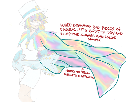
You’ve got a lot of folds going on for such a big piece of fabric moving in a relatively simple direction, plus a very busy pattern. Trying to match the pattern up to all the folds and angles you’ve got going on can make it visually confusing. Try simplifying the shapes, like this:
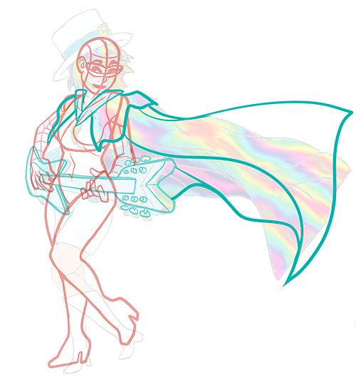
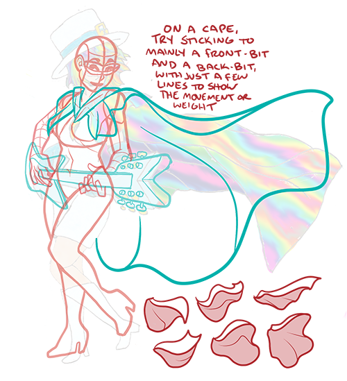
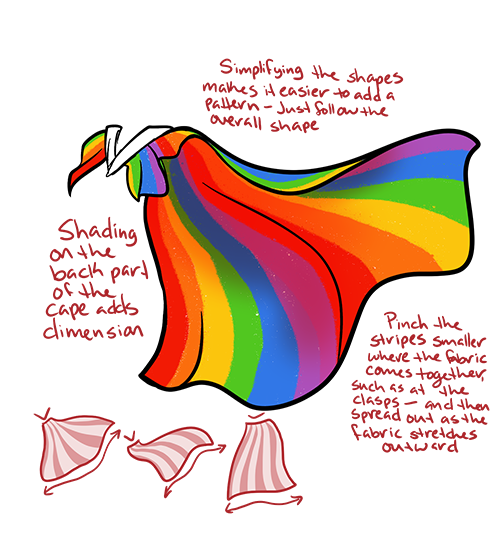
I hope that helps!! Thank you for your submission, and happy drawing!!
-Mod Kat <3
from The Redline Station https://ift.tt/2m34Guc
via IFTTT
No comments:
Post a Comment