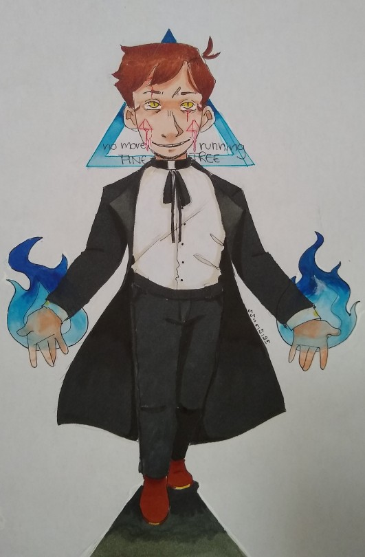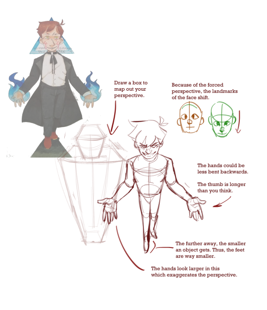
Hello there! This is some fan art that I did a while ago. 1)What I really wanted to do with this was make it look like you are viewing him slightly from above. I didn’t really manage to capture that, so I’d like that to be a focus in the redline. 2)The pose itself also feels a bit awkward, he’s supposed to be holding his hands out and slightly forward and be taking a step towards the viewer. Thanks for your help in advance :)
Submitted by meower808
I may have overshot the perspective in this one, but the logic is the same. I think overall your proportions are good, they just need to be pushed farther.
You may also think about the coil method for perspective. Here’s another post that covers that: https://theredlinestation.tumblr.com/post/178611837324/i-dont-know-if-you-can-work-with-this-doodle-but

Basically the idea is you treat the body like anything else. When you look up at a building, the top is smaller than the bottom (farther v. closer). When you look down at a person, the head is larger than the feet (closer/farther).
-Mod Future (ko-fi)
from The Redline Station https://ift.tt/350oeQw
via IFTTT

No comments:
Post a Comment