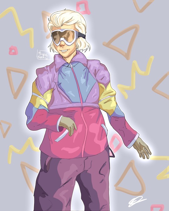
With this piece I was focusing on the lining which I think went pretty well and I do like the over all piece, but if possible it’d be cool if I could get some help with the jacket? Something looks quite off about it, maybe the sleeve? (it’s supposed to be a windbreaker) the highlights also don’t really look as good as I’d hoped, if you could give me some tips on making them look more seemless or less out of place maybe? Thank you!
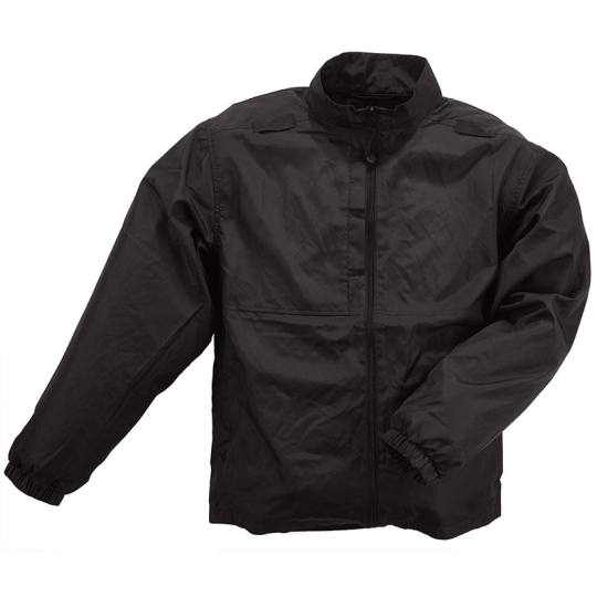
https://www.grejfreak.dk/shop/57-overtoej-til-maend/958-5-11-packable-jacket-windbreaker/
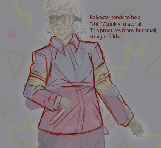
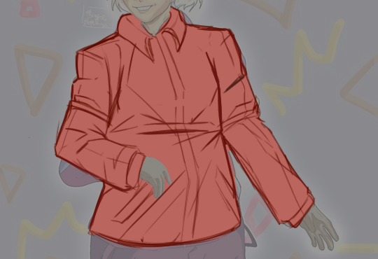
Windbreakers are rather crinkly material. Not very flexible, so the lines forming over a coat like this are usually pretty geometrical. ( See the triangular folds on the reference above). You’ve already made note of that around the shoulders and sleeves. However, with the material being as thin and “crisp” as it is, I would make the edge of the outline of the coat look a little bit sharper/pointier.
Personally, I think less is more in terms of textile folds in the drawing. That’s why I’d probably focus my folds and wrinkles around points of compression, as it gives a clear image of where the fabric is being tugged in or twisted. Thusly, I haven’t drawn in that many lines on the coat where there is little to no tension ( chest, left side of the lower quadrant of the torso. arms minus the crease of the elbows ). This vetting also makes sense with the detail level in the rest of your drawing.
My main points of interests being the nook of the elbows, the armpits and the slight stretch that is going on in the dent between the character’s left side and arm, as he is turning ever so slightly in the image.
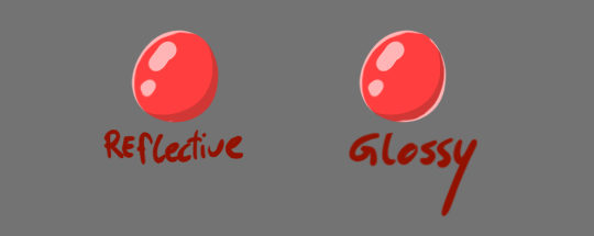
In terms of light. Polyester ( which is typically part of the blend of a windbreaker, along with nylon ) is relatively reflective. Meaning that it’ll receive light and spread it through what we in more digital terms call ambient occlusion ( the spread of light on an object from an ambient light ).
This fabric blend doesn’t typically boast highlights unless the textile is coated with some type of glossy overlay ( like some raincoats are )
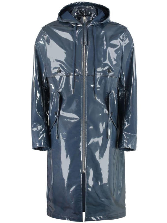
However, if you want to add highlights for the aesthetic, then I recommend you first laying out the ambient light across the figure. In your original drawing, the source of light was included as a mid-tone. The direction the light came from was not abundantly clear to me, so I followed the shadow from the coat’s midsection and build my way from there ( somewhere slightly off-centre of the character).
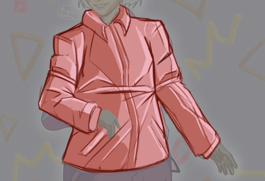
Adding highlights after localizing the ambient light a bit more made me able to dot in some highlights. Now, highlights just like ambient light, all follow the same direction. In case of the example above- they would all be situated facing towards the light ( every highlight sits towards the right, but can stretch to the left depending on how they’re orientated towards the light).
If you want your material to look really glossy - you can add rim light to your drawing. The rim light is a small local light that doesn’t necessarily face the light-source itself but outlines the character or object on the darker portions.
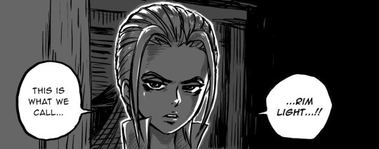
https://www.pinterest.es/pin/301952350012266432/?lp=true
Rim light is often used as a stylistic means rather than a genuine lighting-technique. Often as a means to superimpose characters on top of a background for clarity, or to invoke some feeling of aura. It gives the character in question a slightly graphic look.
- mod wackart ( ko-fi )
from The Redline Station https://ift.tt/2COnW3n
via IFTTT
No comments:
Post a Comment