As it is with watermarks, signatures and other protective measures you can schlap on your art, it always comes at the cost of the clarity, and maybe even quality of your original piece. One has to make up their mind about how much they are willing to compromise their work in order to protect it. Me, someone who hasn’t had many problems with my stuff ending up places - other than your typical bots snatching your stuff for generated storefronts, i try to maintain the clarity of my pieces over enforcing the more extensive measures to make sure my art isn’t distributed without my consent. This might change in the future. As we grow as artists we need to take different measures to keep our property safe and moderated as we meet with new audiences.
Designing a logo, signature
- I recommend you make your signature or logo Monochrome, At most dual-chrome. Too many colours don’t make for a very versatile logo. These many colours can clash with the pallette of the individual piece.
- Simple, clear and easy to read.
- No complex patterns or shapes, think of your signature as an icon or a logo for a company or a brand.
- Should be in lieu stylistically with the typical aesthetic you dabble in.
Basic placement of the watermark/signature
Smack-dab centre of everything
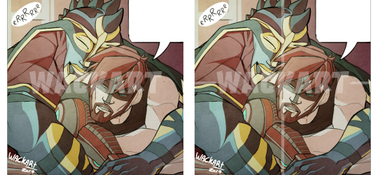
What I normally see, in regards to watermarks, is a very central placement on the given piece. This gives anyone wanting to crop the image a very hard time sectioning off pieces of the art to use without cutting into the watermark. It’s pretty effective for sure. The downside is that a large watermark like that typically compromises the readability and composition of an image.
I could recommend it as teaser-thumbnails for potential patreon-rewards, or as previews of commissions ( or process images for your client of a commission yet to be paid ).
The tagline
More elegantly, you can put your signature somewhere near the focal point. This only works if your signature is versatile enough to blend with the composition somehow. Text or very small, simple logos should do the trick.
By placing your signature or watermark near the focal point of your piece, you’re able to ensure that anyone trying to crop the image will have to make a pretty aesthetically unappealing cut to crop out your signature or risk losing the important parts of your illustration. The downside to this one is that a watermark or signature in itself isn’t diegetic ( part of the narrative in a given scene, in this case, your illustration ) - unless your illustration is of a more graphic nature ( magazine-cover. Text-art. Etc ). Meaning that if you are drawing a story-heavy scene or an atmospheric piece of abstract art, a signature like this can break with the immersion.
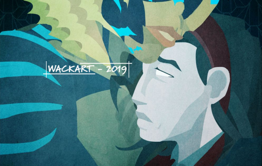
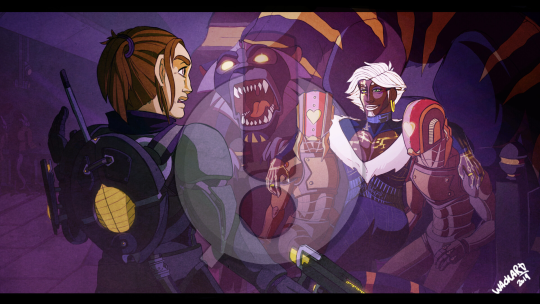
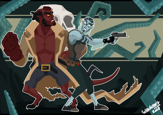
Classic simple signature
If you’re more inclined to simply having your signature there for the sake of ..well. having it there, assuming or not worrying about someone cropping the image and redistributing it without your tag on it, you can stick the signature in the corner of the piece. I tend to do this on a lot of my smaller pieces cause I’m a lazy bum who can’t always be arsed.
The Motif of a watermark
Working off of the placements I just presented, here are a few more ways to incorporate a watermark or signature into your work. some more or less brazen. Valuing either protection or clarity.
Shutterstock’s text
I saw this on a Shutterstock image somewhere, and i kinda liked it as a watermark. It’s either just basic text with the name of the owner of the image, sometimes accompanied by little lines running alone the image either vertically + horizontally or diagonally. Supposedly to prevent someone from cropping a significant bit of the image without getting a bit of the watermark too.
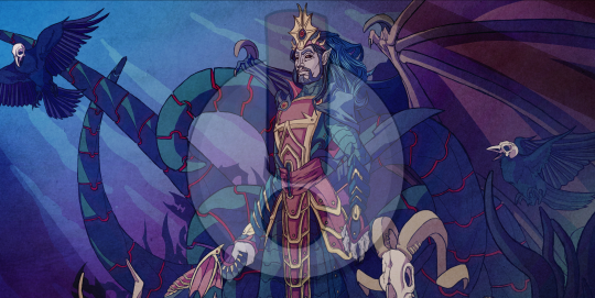
Full logo
Just like with the preview with the logo at the very centre of the composition, this kind of watermark is very effective at keeping croppings from leaving out your signature. But it obscures the rest of the image pretty badly. As previously mentioned, I’d only keep this for art that is supposed to “tease” its full resolution. Or protect unpublished material from the public.
The stamp
I’ve actually been considering switching to this particular kind of signature. It has a really neat compact look, is easy to read and fits with my style very well.
The strength of a stamp is that the logo frames itself in a rather basic shape. Which makes it pretty self-contained and is easy for the eye to read. It also fits pretty neatly into any corner or nook with a composition depending on what you need it for.
Including links
On principle, I think it’s worth injecting your presence into every piece you churn out. But ultimately, not all pieces are going to have the compositional weight to maintain a load of links on it. I think it should come down to whether or not you think it looks passable. For me, I would never cover a sketch in a ton of links unless I knew it was going to a demographic that could generate some sort of revenue or clout.
I think - keep your full set of links for your bigger pieces. Then use a simple, elegant and link in your less complex works ( a little tagline in a corner somewhere or something ). For me - I keep the full link-collection to my “big” official illustrations, those that go in my portfolio and those I push to the forefront of my platform to generate attention and interest. Or if I am foraging into a platform where credit can easily get lost ( Tumblr for an example ); ie. anywhere where I feel like it’s crucial for people to know exactly where to find me at all times.
I hope this was useful to an extent. So sorry for the premature upload, I’m old and don’t know how Tumblr works. God help me.
from The Redline Station https://ift.tt/2EA6RLt
via IFTTT


No comments:
Post a Comment