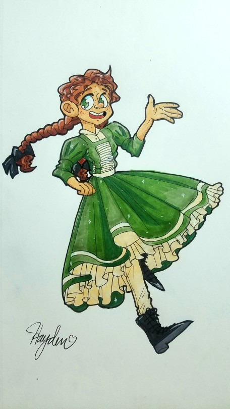
Submission by peachy-beeps
Hello Redline Crew! I just finished this piece and I’m having a bit of problem with the anatomy. The arm feels wrong but I can’t tell what needs to be fixed, and I think the perspective of the shoulder/collarbone needs some work, but again I don’t know what to do with it. Also I’m not positive if the hand I drew clutching the bottle is the best.
Of course, if you wanted to add any other criticisms you’re definitely free to, and I wanted to thank you guys for the amazing service that you give! ♡♡♡
Redlined By: Mod Todd (With commentary by Mod Future!)
This is a great piece! I love the Colours and use of foreground elements!
Mod Future chiming in here on Mod Todd’s great redlining: It looks like what Mod Todd is saying is that the use of a simple perspective tool like the horizon line and vanishing point can help you lay out your environment, such as the buildings in the background, to make a more believable 3D space. Perspective grids can also help you place a figure in the space they’re in, as well as set the guide for the perspective in the rest of the figure.

So, by first establishing the angle at which we’re looking at the character (from below, from above, at eye level) we can determine how the features will be placed. Take this page from “Successful Drawing” by Andrew Loomis (You can find all Loomis books for free at http://www.alexhays.com/loomis/ ):

You’ll see in Mod Todd’s redline that this is now a more straight-on ¾ view. The line of the collarbone is lifted. The arm has been shortened to be more proportional to the body. For the hand, she sought out reference, and also grouped the two middle fingers for a more appealing shape language. In your initial picture, the fingers were too short overall.

Mod Future: If this was more of a sliiiight top-down shot like in Mod Todd’s perspective drawing, the collarbone follows the line of the shoulders. This is why it’s important to know a few guidelines to be able to check your work. If the shoulders were more defined, this also reduces the chance of the arm looking too long. Notice in my redline and in your picture, the elbow is pretty much at the same point, but it’s the angle and position of the shoulder that makes the difference.

Hope this helps! Perspective is a doozy, so give that Loomis book a read if you can! Stuff like that can help build your knowledge exponentially, even if it’s just by reading it.
-Mod Future (ko-fi)
-Mod Todd (ko-fi)
from The Redline Station https://ift.tt/3hjhUdJ
via IFTTT

No comments:
Post a Comment