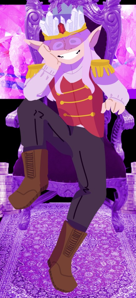
An older piece that I cropped since I want to focus more on the character in the drawing than any of the background elements.
i mainly want critique on the design of the character in specific, along with the posing of the character. Hes suppose to be sitting in a laxed, unprofessional way on the chair, but the pose seems stiff to me.
I also feel like the design of the character is too busy, but i don’t really know what to take away without him looking bland, so i wanted a second opinion to see if it really is too busy or if im just thinking too hard into it.
[Submitted by watermelon-dad]
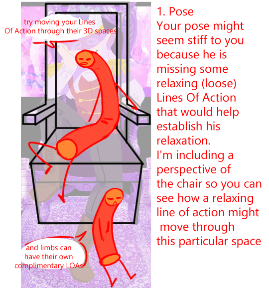
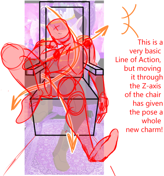
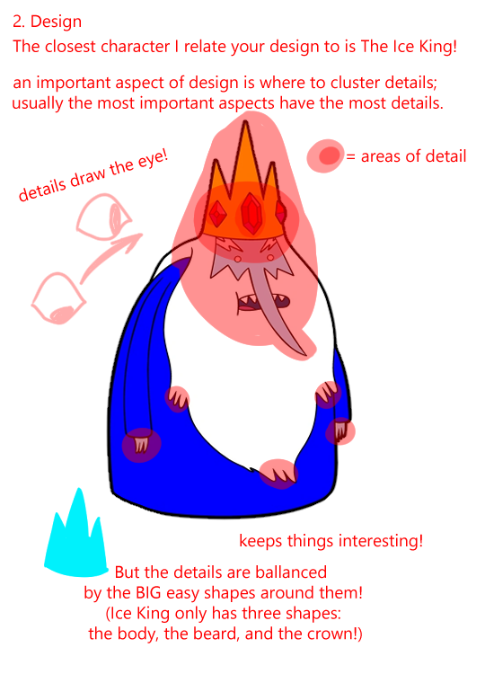
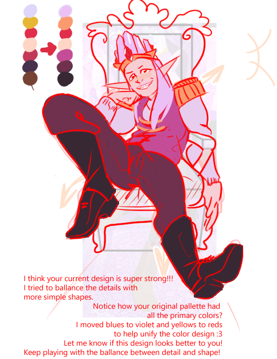
He looks comfortable doesn’t he? xD I hope this helped!
(With love from Mod Koikro55)
from The Redline Station https://ift.tt/31t91FJ
via IFTTT
No comments:
Post a Comment