The cool thing about line-art is that, if you know the tricks, you can make a black and white drawing look good without the need of colors!
The weight of a line can express different things, like lighting source, depth of field and the weight or material of a specific object.
(Since Tumblr is being a whiny little baby, if you click on the pictures and they don’t zoom in, then right click > open in a new tab that should work!)
So let’s check this first drawing I did with a rather flat line-art:
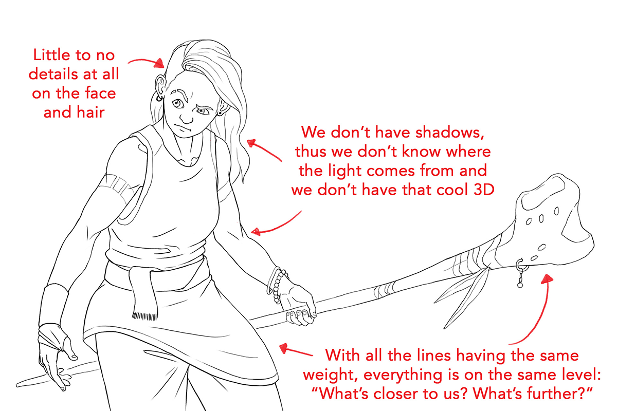
As you can see, all the lines her have somewhat the same weight. The drawing is nice and clean, yes, but there’s just no personality to it. Of course, it’s not forbidden to use this kind of line-art, but it’s more appropriate for things like animation (check out cartoons like Adventure Time, or almost any anime)because of the simple and clean lines.
Now, let’s check the same drawing, but giving those lines the thicc-ness they deserve!
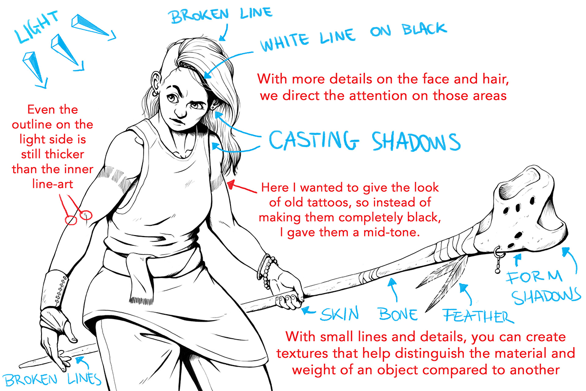
LIGHT/SHADOWS: When you’ve established a light source, the lines closer to the light source will be thinner (the part being “hit” with the light) and the lines on the side away from the light source will be thicker (the “shadow” side).
DEPTH OF FIELD / PERSPECTIVE: The object closer to us will have a thicker line-art than the ones behind it. This also helps to separate objects from one another.
OUTLINE/ DETAILS:Small details (like wrinkles on the face or scratches on the staff) will always be thinner than the outlines.The outlines being thicker help again with separating objects or characters from one another in the drawing.
MATERIAL: Depending on the material an object is made of, it can have thinner or thicker line-art than another, thus representing the strength, elasticity, softness or fragility or other characteristics of said object.
WEIGHT: The heavier the object, the thicker the lineart will be, and vice versa. Look at the feathers compared to the staff. The staff is made of bone, definitely heavier than a feather. You can see I even interrupt the line-art of the feathers in some parts, to give the feeling of “light” even more. Same as the hair: a lock of hair is heavier than one single hair. Also here for one single hair, the line-art is interrupted.The human brain is able to make out and finish the shape of something even if we don’t see the whole thing.
SEPARATING ONE OBJECT FROM ANOTHER:The main ways I use to give this effect are:- The object on front has thicket outline- The line of the background object doesn’t touch the line of the front object- Using white lines where there’s more black
Here I found other tutorials that show more examples!
http://rapidfireart.com/2017/08/15/lesson-7-introduction-to-line-quality/
https://www.tomrichmond.com/sunday-mailbag-179/20/12/2009/
https://www.deviantart.com/michaelmetcalf/art/Line-weight-Tutorial-384281679
- Mod Wilden
from The Redline Station https://ift.tt/2s9P0YI
via IFTTT


No comments:
Post a Comment