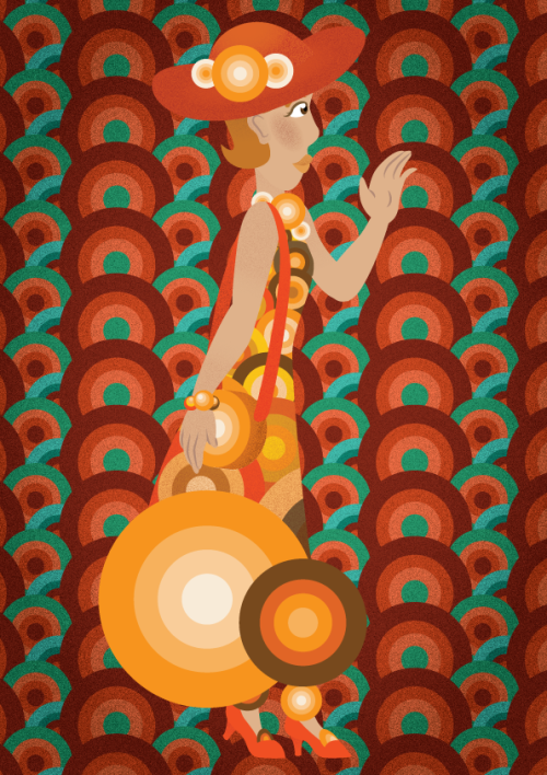
So this is part of a Fashion Illustration Series called “Flat Fashion” that I worked on a while ago. Although the concept is fine, I’m not sure it looks like a fashion illustration enough. Care to help?
P.S. The reason why this is called flat fashion is because they’re vector illustrations and I want to emulate a similarly flat illustration style.
What is Fashion Illustration
I’m pretty sure OP knows what FI is, but just to allow everyone else to catch up.
So I wasn’t actually sure what Fashion Illustration actually entailed, so I went across my campus to talk to some of our Fashion Designers and here’s the rundown I got.
Fashion design is one hell of an old method used to convey ideas through the visual medium of drawing/painting/sketching. They mentioned that there wasn’t really a formula or specific rules that you had to adhere to. Of course, there were norms, but it all came in the context of your project, and what would be required for the final product.
https://www.artsthread.com/portfolios/concept-journal/
In that regard, I guess I could compare it to general concept art, more specifically concept design. There is no one way to do concept art or design, it is considered successful whenever you deem you have the information you ( or your external partner ) need to fully understand our idea. This can mean various stages of polish.
HIGH POLISH / LOW POLISH
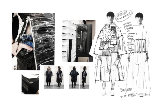
The image beneath is a collection of designs which i would consider “high-polish”
What we mean, at least in the concept art world- a visual project with “high-polish”, means that it leans heavier on the presentation being aesthetically pleasing and communicating clearly, rather than catching the more abstract idea that lies behind it.
https://www.artstation.com/artwork/A66Dq
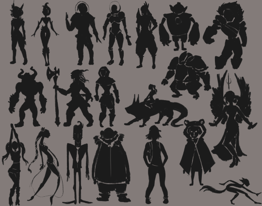
^Low polish
Low polish is often comprised of very rudimentary sketches, paintings or scribbles. In many cases of world-design or character design, you ‘ll see these silhouettes. The quick and often crude, and most of the time they don’t adhere all that much to proportions or anatomy. It’s merely there to flesh out the shapes and sizes that any project will boast. This is the startup-phase of any larger project, and it’s all about speed. You’ll see artists pull out all the stops to crank out as many ideas in as short time as possible.
http://howtonotsuckatgamedesign.com/2014/02/lets-get-real-concept-art/
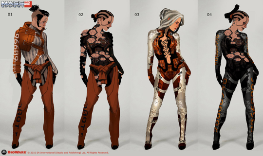
^High Polish
High Polish is the step beyond the initial concept phase. And incidentally, the stage where things become a lot more marketable as well. still, you can expect artists to try and cut corners anywhere they can in order to preserve speed.
High polish communicates the idea on a slightly more refined basis than the low polish depictions would. Why?
Because from here on out, it is possible that one of these designs will be greenlit and send along to a modeller ( in the fashion industry, this could be a seamstress or a factory ), that would use the image to produce the actual product off of. And depending on the complexity of your design, it is likely that your piece would need to be more or less High Polish in order for someone else to be able to read it properly.
Incidentally, a lot of the “leaked concept” art you see outside of a game’s artbible ( artbooks too, in some certain cases ) are not actually the ‘concept’ work, but promo-art. Which is concept art that has been reworked and touched up to appeal to the masses, and to generate hype.
( Just a fun fact for you guys who are looking into concept art as a career, whether in games, movies, fashion, whichever - the real, rudimentary concept art is rarely published outside the company )
I think your piece can be considered somewhat high polish. Or at least very close to that classification, as there is a lot of information about the pattern itself, along with the accessory and the overall colour choice. The only things missing would be the seams of the dress or the exact way by which the large circles at the bottom of the dress would attach to the fabric: Technical details so to speak.
HIGH CONCEPT / LOW CONCEPT
This is my favourite part about discussing Haute Couture with people cause they get so mad. ( And where you get to see some of the stuff the super-cool fashion design students do at my school )
If you’ve never been into fashion, and you happen to sit down and watch a show. You will notice that some outfits definitely seem more realistic to see on the street or in the shop window, than others.
If you’re the type, you might even get upset that someone would pour money, time and resources into making these wild and sometimes childish costumes that crop up as Haute Couture.
What a lot of people who get unreasonably mad fail to realize is- that Haute Couture is not meant to be taken to the streets. It is merely experimentation. It’s not meant to be mass-produced or celebrated as “pretty clothes”. It’s meant to showcase techniques, combinations or aesthetics that other designers can then get inspired by- and then possibly do a more moderated version of, that can -perhaps- be sold in shops.
In the design world ( including Haute Couture ) we primarily talk about two classifications when it comes to how abstract a product or idea is.
High Concept and Low Concept
Low concept is typically ideas that would sell well as a product in a store. They conform to the usual typical norms and garner general mass appeal. It’s not usually dotted with odds and ends since it typically comes down to the display of craftsmanship rather than expressing wild ideas.
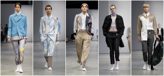
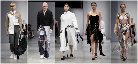
https://fablstyle.com/future-fashion-kadk-kolding-design-school/
High concept is where you typically see people gnashing their teeth in frustration over the assumed hubris from the artist/designer. It doesen’t neccessarily have to boast any complex and sublime craftsmanship methods or adhere to any sort of norm either. It’s there to display an idea or a rebellion with norms.
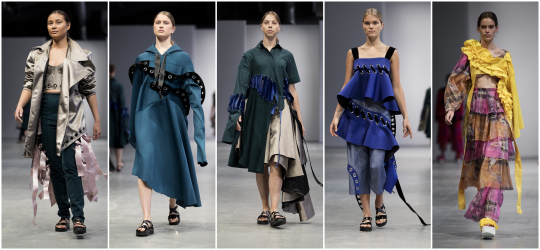
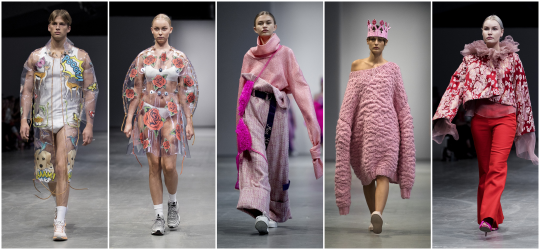
https://fablstyle.com/future-fashion-kadk-kolding-design-school/
I’d probably regard yours as more of a “high-concept” as of right now. Since the picture can be considered rather abstract, and closer to conveying the theme and idea of vector-like flat shapes as a whole, rather than how the garment would actually fit around the body, and how it’ supposed to be produced ( seamlines, textile types, etc ).
So, A “High-polish” somewhat “High-concept” is what I‘ll classify your drawing. This is perfectly fine if you want to keep your idea as more of an illustrative series that can possibly inspire someone else to bring the product along. But if you want it to be considered “viable” to outsource to a seamstress or factory - you’d want to include more technical information.
( as I mentioned before, the seams, the textile, attachment. etc). I would also be curious to see a frontal view of the dress in case I was to consider this as a template from which a seamstress would work off of. But the straight profile-aesthetic does contribute to a very stylistic feel.
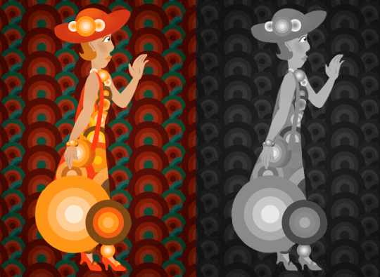
One thing I might point to in terms of the draftsmanship on the drawing itself is that the character blends a little bit with the background. I absolutely love the colours and the pattern in the back, but I would darken or lighten it a little bit to make sure that your character would stand out clearly on top of the background. This can be done by valuing your drawing ( bringing it into Greyscale, and then adjusting the dark/light on the composition until each element is clearly distinguished ). Then either reapply the colours or take use the grey-scale version as a reference to retouch the original.
from The Redline Station https://ift.tt/2ralRMt
via IFTTT
No comments:
Post a Comment