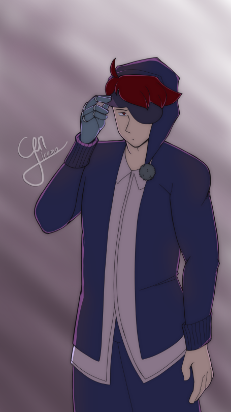
Hello fellow mods, I would like some help with the coloring and shading in this piece. This piece was my first time trying to focus on color theory and shading, and I really want to focus on improving those two things specifically.
I was trying to go for a cool analogous color scheme with blue, purple, and red. I know the background clashes with the shading, because I’ll be honest I got lazy after coloring and shading the whole darn thing. The light was supposed to be directly behind him, but I didn’t know how to convey that in the background and just did something random and diagonal to make it look somewhat nicer. I probably should’ve put the lighting diagonally instead to match the background…? I’m not sure. Overall, the mood of the piece was supposed to be lethargic and “sleepy”, like you just woke up from a long nap and you can’t tell if it’s midnight or dawn. I hope that helps with the redlining. Thanks for the work you do folks!
Thank you for contributing to our inbox, so that we may get to work on your wonderful stuff : )
Starting up with colour theory is always a little dense, but as you move into it more, i’m sure you’ll find that you’ll acquire some sort of natural feel for it.
Let’s take a look at what you got here.
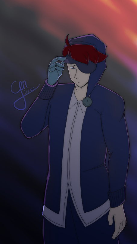
First of all, i would amp the colours of the background up, so that we can clearly distinguish them from one another. To stay in the vein of your setting ( groggy, midnight/early morning atmosphere) and your pallette (blues, purples and red ).
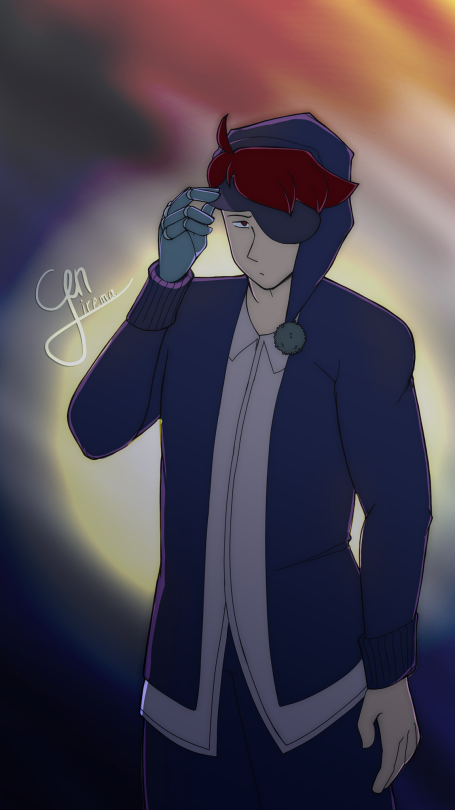
Adding a light source directly from the back can take a little bit of work. Especially if you don’t have the luxury of using the gradient tool for software or stylization reasons.
Either way, plopping a lightsource behind a character is a lot simpler ( if maybe time consuming ) than it can seem. Literally just put it in there on a layer underneath your character (Usually light seen directly from the front shapes up like an orb, sometimes with an added halo ). If you get your shading right, the viewer will be able to tell the direction of the light just fine without any additional pointers.
You had a bunch of good observations in the original image, i’ve mostly just build on top of them. I’ve allowed the light to creep in a little further onto the character in certain areas, such as the space between his left arm and his shirt, as well as his temple and eye.
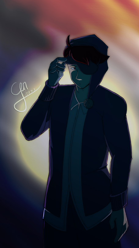
Since we’ve darkened the background a whole lot, i suggest we darken the shadows as well, and amp up the blue tone in it as well to make it integrate with the pieces overall pallette better.
- Mod Wackart ( Ko-fi )
from The Redline Station https://ift.tt/372qURQ
via IFTTT


No comments:
Post a Comment