
The scene here is two close characters going for a walk, and the human, Beryl, gets tired and takes a small powernap while Illanipi-the deer-provides a comfy back prop and lookout.
For this piece, I focused on the composition, coloring and background, so I would like to know if there is any way I can improve that, especially since this is the first nature background that I have put effort into. (I’m especially not sure how I did with the human’s posing and if I did the deer alright since I never drew one from the front before.)
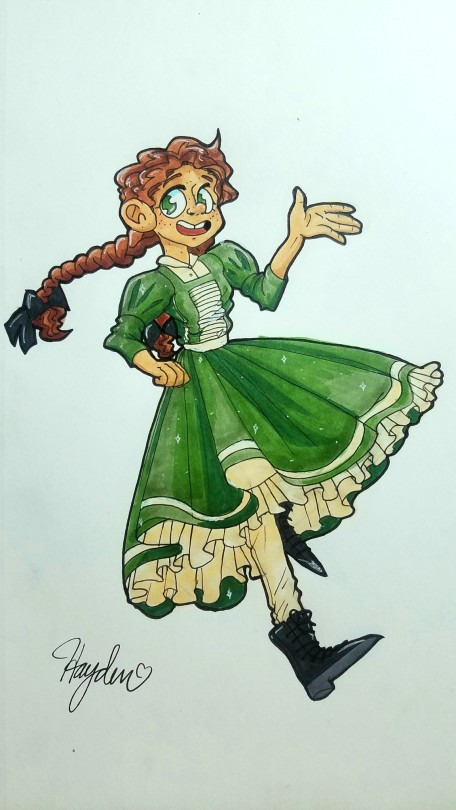
While its not something you have to do, could you also tell me how I did on the character design? The human is supposed to be a child of 12 and the deer-creature isn’t a full deer, it’s a deer-shifter which are pretty huge compared to average deer and have a wider range of color.
Thank you so much ^^
This is very charming! I’ll compliment you right away from having two characters interacting in a diegetic environment, it already reads like a scene which can be difficult to pierce together.

First things first, colour. Since you’re working on a pretty limited colour pallette ( what with the deer being close to exclusively white or tan colours, and the human’s pallette being a triadic pallette from what i can see, i’d like to take a moment to give the overal piece a tiny bit of love.
And that can be done pretty easily with an overlaying colour layer. Or by mastering your colours so that they all have undertones of one specific colour.
My only comment for the character designs is that perhaps the girl’s outfit could be simplified down even more to match the detail level of the deer. Though that is really nitpicky and speaks moreso into the overall visual language of the universe than the designs on their own. They’re just fine.
For this winter scene, i gave everything a blueish colour to let the temperature of the scene soak the atmosphere of the whole piece. Now this colour layer is a little rough and doesn’t look super integrated, but im sure you can apply it much better since you have the original file ( and know what kind of mood you want to push with the image ).

To look at some composition, i will be pulling out my trusty rule of thirds grid ( more about composition here:
https://theredlinestation.tumblr.com/post/623115556175888384/can-you-explain-the-rule-of-thirdsthe-golden#notes )
Perhaps you already considered the grid, since it seems the deer aligns somewhat perfectly with the two rows of focal points on the left. I’ll be keeping this disposition but turn the camera around just a bit to reveal a bit more of our characters.

Like this. This angle gives us more context as to how the girl is leaning against the deer. In overal, the angle also gives us a little more to look at, as the original angle of the deer gave us mostly the very front of it, which didn’t describe much about the creature as a whole.
I’ve also added a snippet of a tree in front, just to give us a little bit more sense of depth in the planes of the image ( background, midground and foreground ). You can also add more trees to the background to further enhance the feeling of depth, but that all depends on what kind of environment / forest composition you were looking to do, as the original image shows that there can be quite a bit of distance between the trees, which leads to a bunch of open spaces in their surroundings.

- Mod Wackart ( Ko-fi )
from The Redline Station https://ift.tt/2TrwsgV
via IFTTT


No comments:
Post a Comment