Monday, December 21, 2020

kalidraws:Today I gave my students a quick presentation on some...


kalidraws:

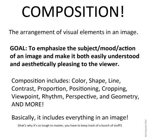
Today I gave my students a quick presentation on some of the basic considerations for composition, which I am now sharing with you! I’ve given them separate talks about color and tonal value/contrast, which are also super important compositional concerns. (I’ll be sharing those presentations too once I properly format them)

I personally love learning about different compositional techniques. It’s fun to think about the ways that the brain views & sorts images, and how we can trick it into feeling a certain way or looking at certain aspects of an image first! It’s easy to fall into compositional ruts (which I am also guilty of) because a lot of art gets by with mediocre, though serviceable, compositions. If you can generally understand what’s happening in an image then it’s generally fine. However, it’s the truly great compositions, where everything in the whole image has been considered and ‘clicks’ together, that bump up an illustration to a visual slam dunk. NC Wyeth is one of my favorite artists for this reason: his compositions are rock solid, varied based on the image’s intent, and always enhance the mood or action he is depicting.

For extra reading, some online compositional resources that I’ve found helpful or interesting include:
Creative Illustration by Andrew Loomis (download it for FREE. Such a great book all-around.)
Gurney Journey (check out the “Composition” tag, but really everything he posts is great)
The Schweitzer guide to spotting tangents
Cinemosaic (a blog by Lou Romano with some truly WONDERFUL compositions captured from various films)
Where to Put the Cow by Anita Griffin

Happy composition-ing!


from The Redline Station https://ift.tt/3h9Fz0O
via IFTTT

Sunday, December 20, 2020

Hello! This is a commission piece I did and there’s just some parts that I couldn’t get right. I was...

image

Hello! This is a commission piece I did and there’s just some parts that I couldn’t get right.

I was focused mainly on the anatomy and that’s what I would like corrected :) I feel like the hands and legs just don’t look right and the overall anatomy on the character in white just bugs me

If I could get tips on the anatomy and maybe even the perspective on the cake that would be great!! Thank you so much!!

Any mod is okay!

submitted by @professor-sneaky

Redlined by Mod Future

This looks like a real welcoming picture! In this redline I will be focusing on the anatomy and the perspective of the cake. 

First for a quick pose pass: I always search up reference pictures, or take some myself if I can’t find them. Google, Bing, and other search engines should be utilized. I just searched up “two people holding a cake”, and these are the closest ones I found. 

image

So for this redline, I referenced the middle picture the most, and the other two are just for variation in posing. The biggest change I made was moving the pelvis/hips much higher. Because the cake blocked the way, I assume it messed with you a little, resulting in elongated torsos. To combat this, draw through your bodies all the way if they’re blocked by any props. 

In the new pose, I made sure the thumbs are visible, just like in my reference picture. This really helps add the sense of weight from the cake plate(?) they are holding. 

For the cake itself, I also referenced the picture! The original perspective was much too intense. We usually only get super tapered perspective when looking at large buildings or using a super wide camera lens. Just the slightest bit of tapering is enough to give us a 3D look. 

Thank you for submitting your work! I hope this was helpful :D

-Mod Future (ko-fi)


from The Redline Station https://ift.tt/3pcd3ys
via IFTTT

Saturday, December 19, 2020

Hi there, mods! I’ve been practicing perspective lately and would like a redline on these two...

image

Hi there, mods! I’ve been practicing perspective lately and would like a redline on these two characters - it’s one of my better attempts so far, but I’m sure I’ve got more to work on! The point of view is supposed to be below them, and I’d especially appreciate comments on the faces and arms/hands, since those were the trickiest bits. If that’s not too much, I’d also really appreciate any advice you have about the lighting - I tried to give it a sort of “lightning” feel, coming from behind them. Thank you so much!!

submitted by  ambidexedition

Redlined by Mod Future

Alright, these two look like fun characters! I will be focusing on the perspective and the lighting for this redline. 

I would recommend using boxes and cylinders to construct the figure in order to place them in perspective. As we’re looking up at these two, we can see the bottom of the box I used to construct their rib cages. For the hands, it depends on if the hand is closer or farther from the camera. If it is up near the character’s head, like I did on the left, it will not be as foreshortened and closer to actual size. If the hand is being extended down towards us, like I did on the right, then it will be a bit larger because it’s closer. Perspective! 

image

This is a perspective exercise you can think about doing. Constructing the figure using boxes and cylinders, imagine the figure standing in a box, and then rotate that box around. Now draw the figure within that rotated box. This helps build your perspective skills and ability to see the simple mannequin figure from all angles. 

image

Now onto the lighting. 

Reference, reference, reference! 

I searched up some backlit portraits as well as a reference for the stormy sky.

You can see that only the edges of the form are exposed to that super bright light, meanwhile the majority of the body is in shadow. So, that’s what I did. Use any layer mode you want, but for this I used a Hard Light layer on top of my base colors and a dark grey color to make the shadows. Then, an overlay layer for the rim of light around the figures. 

The added contrast of the clouds behind them enhances the contrast of the overall picture :3 

Thank you for submitting your work! I hope this was helpful.

-Mod Future (ko-fi)


from The Redline Station https://ift.tt/2WCkyCh
via IFTTT

Friday, December 18, 2020

Honestly, I can never get a consistent groove on anatomy. Like I...


Honestly, I can never get a consistent groove on anatomy. Like I was trying to follow a model on the Manikin app for this, but when I follow it for reference, the anatomy ends up really weird, like the legs are really long, and the arms are short. I also don’t understand how to draw something more hand like with the phone he’s holding rather than the paws I had to end up drawing on. In short, can you help me understand how to make the anatomy better on this?

submitted by @ ask-bashi-the-luxio

Redline by Mod Future

On the whole, I think your proportions look pretty good! You’re hitting a lot of the correct marks. You’re right, the arms do seem a little short, but that is an easy fix. I would highly recommend finding some shorthand guideline that you can use as a skeleton beneath your drawings, like I have done here. There are many methods of doing this, such as the Loomis method, or Sycra’s stick figures, and Proko is also a good Youtube resource.

For the actual redline, you can see that I’ve made the arms a bit longer. I think the reason the legs look too long is because you haven’t defined the hips as much. The hips are the widest part of the torso, and usually where the legs appear to begin. Pants will rest a little above the hips, normally. 


So for the legs, I’m guessing you’re going for a plantigrade structure (so basically like a human leg but with animal feet), but I’ll link resources for either or. Looking at other artists and art, whether it be human or anthropomorphic, will help you get a better sense of what proportions look right. 

I hope this was helpful! Thank you for submitting your work :3


Jazza, Youtube (Human Figure Proportions)

https://www.youtube.com/watch?v=w2fKxNDsXuw

Galaxy Cuup, Twitter (Digitigrade legs) 

https://twitter.com/Galaxy_Cuup/status/1277798748727345154?s=20

Twokinds, DeviantArt (Digitigrade Legs)

https://www.deviantart.com/twokinds/art/Tkturials-Digitigrade-Legs-Guide-439423997

Catwolf, Furaffinity (Digitigrade Feet)

https://www.furaffinity.net/view/6127324/

Kate-FoX, Deviantart (Paw hands)

https://www.deviantart.com/kate-fox/art/Anthro-paws-set-737666674

-Mod Future (ko-fi)


from The Redline Station https://ift.tt/3h3zRNK
via IFTTT

Wednesday, December 2, 2020

theredlinestation:The RedLine Team is happy to announce the opening of its own public Discord...

theredlinestation:

The RedLine Team is happy to announce the opening of its own public Discord server!

The RedLine Server serves as a place to chat amongst other artists, receive advice and critiques from the whole server, and be a friendly community to come chill inside.

Please make sure to read through all the rules and introduce yourself when joining, but remember to have fun!

https://discord.gg/EshJ3ta


from The Redline Station https://ift.tt/2JCh4fZ
via IFTTT

Hey fellas!So recently I’ve been trying to take on a more cartoon style when drawing. I’ve been...

Hey fellas! So recently I’ve been trying to take on a more cartoon style when drawing. I’ve been doing my best to do more unique shilloue...