Hello!
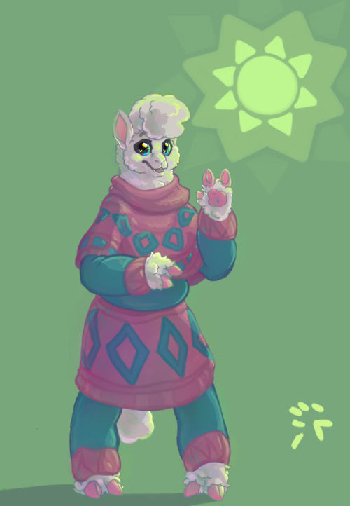
When I drew this picture, I was dissatisfied with the result. I feel the colors + background are very simple, and almost bland. How would you go about making this piece feel more vibrant/colorful?
My gosh, this character is so cute. And such a nice design too!
You’re on the right track in using your current palette, as blue red and green make for a natural split complementary selection. These colours will always make one another stand out, which means that your piece will appear vibrant if given just about the right amount of saturation.
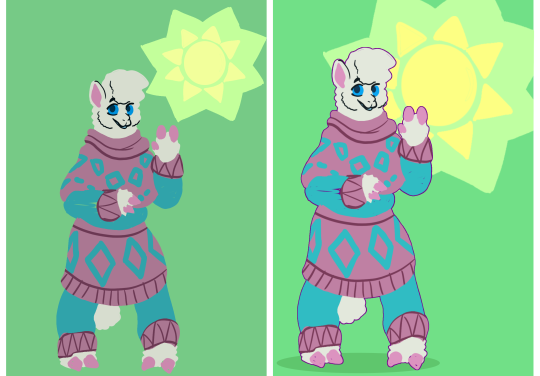
The first thing I would do is to amp up the saturation of the colours just a smidge and add a hint more light to them to make them more pastel. This way, we get rid of the “washed out” feeling and make it look fresher. Up until recently I, myself have been very nervous about my colours being too saturated, but lately, I’ve been trying to amp them up in order to give my pieces more life. From what I can understand, it’s pretty normal that people are hesitant to use really bright colours out of fear that it’ll irritate the eye of the viewer. However, if you lean enough on your colour theory you can actually get away with quite a lot.
Just for fun, ( and to give the composition itself a little more of a dynamic look ), I pushed the character slightly off to the left so that their head sat closer to the eye’s natural focal point ( see the rule of thirds ). I scaled up the sun/flower and added a fourth colour to the piece, by making the centre of the shape yellow. Why I did this, I‘ll get back to- but for now, it’s to add a complementary colour to the pinks and blues.
Now, you’ve done a really nice job in shading your character. The observations are good and the character looks soft and cuddly. There are a few rim lights that I would probably remove ( See the purple rim light following her left cheek ), but in overall it’s really nice looking.
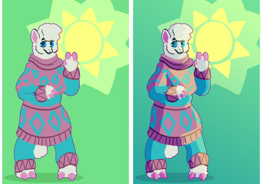
My suggestion would be to shade with colour, and not a grey-tone. And if you are already shading with a colour, then shade with more saturated colour.
It makes the character look at a lot more vibrant.
Now here’s why I decided to make the centre of the sun/flower yellow. In the original, you’ve used the shape as your primary light source. This is a great idea!
But; since the shape is green then it would naturally cast green light. Here’s the thing about green light, aside from a very few yellowish shades of green, a green light will frequently produce a look that can feel “ sickly “ or otherwise hazardous. It is somewhat of an unpleasant colour. Changing the colour of the centre of the sun allows us to cast yellow light on the character, a much more pleasant colour that adds warmth to the character.
If you want to add a bit more to the background but stick with the theme you’ve got going, you can add a little blue gradient to it. The gradient will give the picture a feeling of progression and enhance the light coming off of the shape in the top right corner. I picked blue because you already have blues in your design, and I wanted to bring it out a little more.
I hope this helps!
- Mod wackart ( ko-fi )
from The Redline Station https://ift.tt/2IRFpLK
via IFTTT


No comments:
Post a Comment