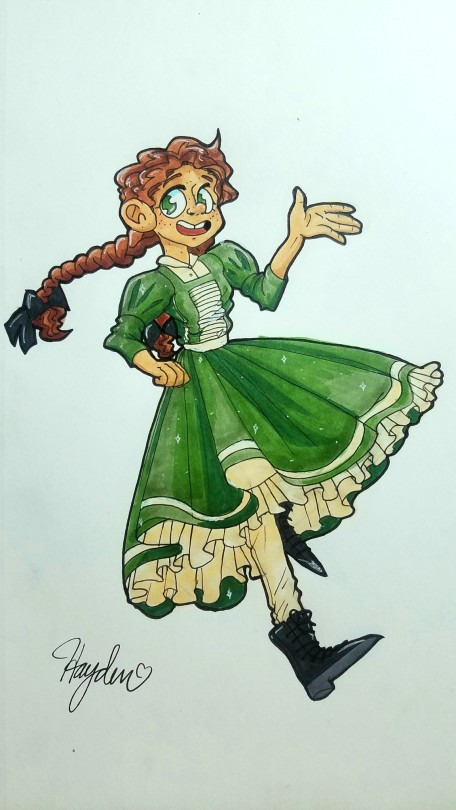
I tried to make a dynamic pose at an angle, but the more I look at it, the more it looked wrong. It was hard to find references for this so I (unfortunately) just didn’t use one. How do I make it look right?
This looks SO cool! And to your credit, I too had to go through this multiple times before i was satisfied with the redline. It’s a very particular pose in a very particular perspective that takes a lot of work to get right in the construction phase. Though, by the virtue of your style, your original piece actually gets away with it pretty nicely without looking that off.

The most “erroneous” thing i found about your drawing was that the character’s physique itself looked a little flat here and there, due to a lack of curvature of; for an example, the top of the thigh. Which is what gives us the impression that something has volume in perspective. Same with the fingers, who were posed in such a way that it looked like they weren’t really in perspective. I suggested a new pose that takes advantage of the exciting angle you’ve got going.
In overall, not that much to “correct”, you already have a pretty good piece, that just needs a few tweaks here and there to read even clearer.
- Mod Wackart ( Ko-fi )
from The Redline Station https://ift.tt/37C8szR
via IFTTT

No comments:
Post a Comment