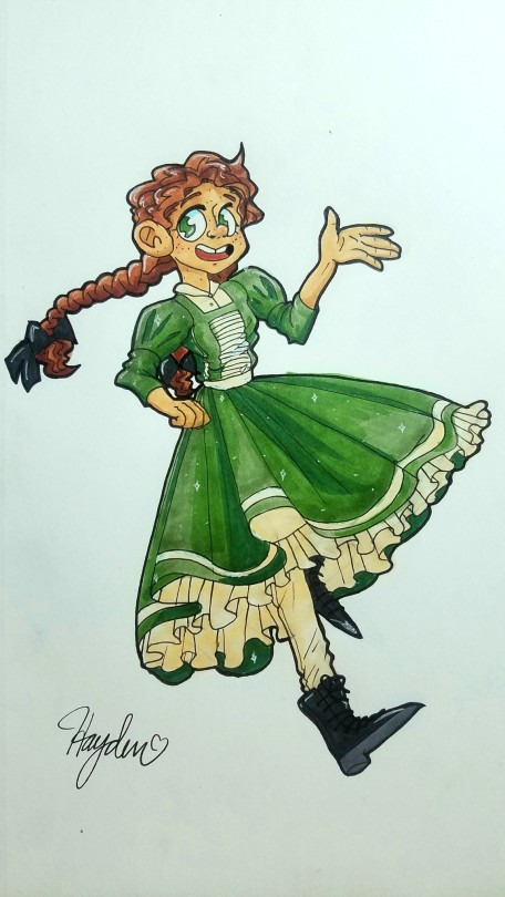
Um… Hello! I need some help with basically everything but especially with clothing folds, color theory/skin tones and hair. The dots on this character’s chin/jaw are supposed to be shaving scars, and his ears are meant to be slightly pointy. It was supposed to have the perspective of someone taller, but, uh… I need help with foreshortening/perspectives too.
submitted by @ theyonagoda
Redline by Mod Future
Okay, I’m going to choose the three topics I think would be most helpful to you. Clothing folds, perspective, and the hair. I’m unsure what you mean by color theory. Familiarizing yourself with the practice via Youtube videos and other texts about color theory might be a good start in that regard. The color palette you’ve chosen for this character is naturalistic and the colors work well together.
Clothing folds
The biggest issue here is with the interior lines not giving a connected sense of flow. The creases we see in clothing is because of the fabric draping and being pulled by opposing forms of our bodies.
The key creases are the ones at the armpit. Adding the seamlines can also help give it a more realistic look. I like to simplify those creases with a V shape. For the rest of the shirt, since it’s a regular t-shirt with no irregular tension (i.e. being pulled by something else), I just put a few lines to indicate where the shirt “hangs off from”, and where it lands. Usually the shirt will hang from the widest part of the body, which is usually the chest (or stomach).
Here is a clothing fold tutorial by juliajm15 on deviantart: https://www.deviantart.com/juliajm15/art/Clothing-and-Folds-Tutorial-543588852

Hair
I would think of the hair as ribbons, or for more curly hair, as sculptural 3D forms. Right now the issue is that many of your strands of hair do not group together into larger shapes. There are lots of little strands, but no big or medium groupings of hair.
The shape of the hair is important as well. Exaggerating the shape language of the hair - whether with sharp points or poufy curls or limpy flat blocks - can give us insight into the character.
Last, and this applies to all design, have a variety of Big, Medium, and Small shapes. This gives contrast while still retaining a balance of shapes. Study the designs from any animated character, and you’ll find this principle applied.

Perspective
This is a little tricky. Even I struggle with heavy perspective. My best advice would be to be able to break the human figure down into basic, simple parts such as with boxes, cylinders, and spherical shapes. Then you need a lot of patience to learn some perspective.
https://www.instagram.com/p/CDKYLefDoZl/ This is a good quick guide by Bridget Underwood (brigitiri) that can help you get started with perspective.

Storyboard artists are good people to follow. They know a little bit of everything: environments, perspective, staging, acting, the works! Storyboard artists saved my life ToT
-Mod Future (ko-fi)
from The Redline Station https://ift.tt/34waHl6
via IFTTT

No comments:
Post a Comment