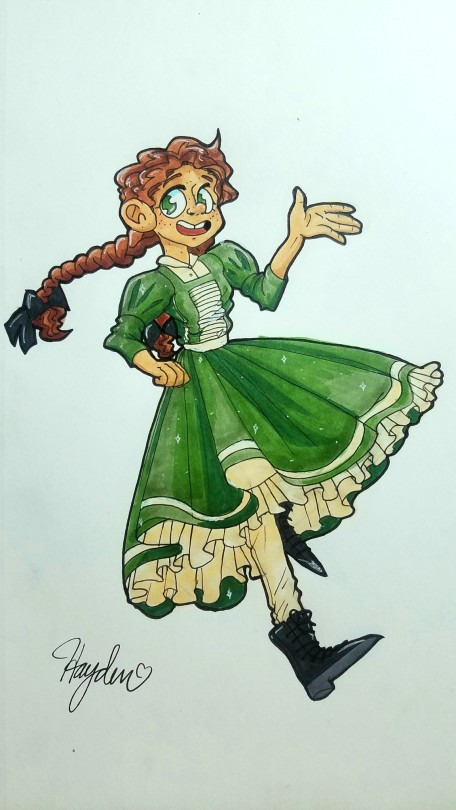
this is a character from an existing series (kingdom hearts), but i’d like to see how i could improve on anything, particularly the pose since i feel like it’s stiff, and choice of clothing to make it stand out more since it seems a little bit bland right now! thank you so much!
–
i tried to be as thorough as possible in my text analysis, but tl;dr i really like the outfit and concept here, you just need to think mood through a little more and pay attention to quirks of character. thanks so much for the submission!
Hi! I’m hoping you can help me get the clothing to look more natural. I have trouble getting the folds to look right, and making the forms of clothes look 3d while still being cartoony. Thank you so much!!
Breaking your outfits down to very basic shapes, and then working on top of that - to make subsequent shapes can help you map out how your textiles might fall around a character.
Often - what I see, is that people who get confused with clothing folds often end up taking shots in the dark and accidentally overdoing the amount of folds that might be needed for a textile to convey. You’ve actually managed to keep it moderated- which is really nice, now we just need to find out where these few folds should sit.
Drawing your outfit like a wire grid- on top of your simple shape-sketches will also help you determine the flow of the shapes. In this particular piece, you have ample opportunity to make the sweater really pool around the waist, on top of the singed belt. I would amp up my shapes if I were you. Give your textiles that much more volume by making the shapes larger on top of your character’s anatomy. This way the textile looks like it really sits there. And don’t be afraid to let your clothing’s outline deviate from that of your character’s body form.
Usually, with textiles, the folds only come up visible where there’s stretching or compressing happening. In this pose we’ve got here, there’s a lot of compression going on, and not too much stretch. The armpits, the pits of the elbows, the crevice between the legs, these are just some of the points where folds might become visible. And if we’re really cheeky, we can add a little bit of a line where the belt nudges up against the sweater to indicate that the shirt sits loosely on the character.
Quickly I’d like to mention that the density of fabric will also affect just how long and thick the folds will be. On denim materials, the folds tend to be short and shallow, since the stiffness of the textile keeps it from stretching and compressing much. Meanwhile, a big, soft cotton sweater will fold in much larger, softer lines.
Despite how much eyes can carry the emotion and expression of a character, you can achieve very ( if not just as ) powerful expression by focusing on utilizing the remaining emotive features.
Such as the mouth, the nose, the eyebrow, general posture, micro-expressions, such as wrinkles or visible muscle tension.
You can also use the environment and the composition itself to express an emotion related to the character.
you can read more about some of these techniques through these links :)
Its me again, I’ve gotten better this past year at digital art and recently got procreate and its helped my art so so much, but im still v confused and don’t understand how to color dark skin or lighting, this pic is the closest I’ve gotten to it
I tried highlighting and lighting but i just can’t understand it, ive watched videos and looked through advice blogs but it just won’t make sense in my mind
Submitted by pastelpurpleprimadonna
Redlined by Mod Future
Hello again! It’s nice to see you back ^^
To understand how light falls on an object, we first need to understand the planes of the form it is falling on. Where light hits directly, there will be a bright highlight, and where no light hits, there will be the darkest shadow. I recommend you take a look at some art guides or youtube videos about the “planes of the face” to understand this concept in depth!
For this redline, I first looked up photos of models who have similar toned skin, and how light was used in those photos. For the horns, I found a similar material to reference as well.
Then, I blocked out shapes first. I usually cover the form with the midtone, then I block out the BROAD highlights and shadows. Finally, I will add the darkest darks and the lightest lights.
Notice how I also blocked out color that doesn’t fall into highlight or shadow. This is used to give the skin a sense of depth and translucency - to make this person feel like real flesh and blood.
I hope this was helpful to you! Using a hard brush to block out shapes first (before smoothing them out if you want to) will give you better control over how your overall design looks!
Hello, Mods! I finished this picture recently, but I feel like the wings are all off. It was my first real attempt at drawing wings and they just came out the wrong shape and I don’t think the pose of the wings works well with the pose of the character. I’m at a loss Q-Q.
Could I get some help with the wing pose and how to frame my character better in the picture? Because right now I feel like the wings are just ruining the whole thing TT-TT
-
Hello, Hello! First off let me say I am in love with this piece and the feathers are looking amazing! They’re a huge pain for us mods to draw too, so take it from me when I say you did really well on them for your first attempt!
For the wings, there isn’t much wrong beyond some anatomy mistakes!
(I will work with the pose you have but will post some quick sketches of other poses that could have been done for this image!)
In this piece, the wing’s anatomy turned out a little too bendy in places which can make the character feel a bit unconnected to them but by stiffening them up and dragging the wing top up (on the character’s left wing), it will be a more smooth transition and not so curved at the bend of the wing there.
Going to the bottom of that wing, you can see where there is a hard break of the primary and secondary feathers but in reality that harsh of a break doesn’t happen. Making the primary/secondary’s all the same size (or least transition them into shorter feathers when you reach the secondaries, since there are some birds with longer primaries on edge of the wing that shorten as they get to secondary feathers) and perhaps making the secondaries slightly more spaced out will help cohesion with body and wings.
One last thing on the wings is that when looking at them both, it seems the right wing is actually smaller then the left wing despite being closer to the view so you will want to drop it down slightly to match the left wing size.
I would definitely recommend in the future to making small studies of wing positions from birds next them so you could plan out the human part pose then try the wings to see which best flow with the image. For an image like this, the best wing poses tended to be ones from ones of birds in flight mid flapping wings, diving to grab something (i.e eagles/hawks grabbing fish from water), or even in fight.
Below are some small quick sketches of other winged poses but remember these are fast simple things I do to choose a wing position without paying much attention to anatomy beyond what I see quickly. Once I find a pose I like, I will find multiple pictures close as I can with the pose to draw and study since some birds have longer wings, shorter feathers and more differences!)
Now for framing, you did a very nice job with the background actually! What I could have done is either:
1. Make the image background larger and not so cramped around the wings. Giving the character space to ‘breathe’ so to speak will help not make it seem too busy and feel like you have to look everywhere.
2.Slightly shrink the character and get the foot off the ocean line (as seen in the redline piece). With those two dark colors on each other, they can make it seem to flow to the ocean since you have the guiding point of the figures (dark color on light color which will always gather attention) straight leg to the hard line of the ocean. With the boots being darker then the wings, I would be tempted to dilute the color to not be so strong so the dark colors of the wings will stand out more.
3. Add some clouds! In the example redline I did, we can see I added clouds which help frame the character but also break up that hard line the ocean presents too. (You can also make this mist, or adding ‘wind’ too.)
4.Take the ocean out completely and make it a sky piece. They could be in the sky, falling back to earth or flying high in the clouds!
from The Redline Station https://ift.tt/33d55NV
via IFTTT
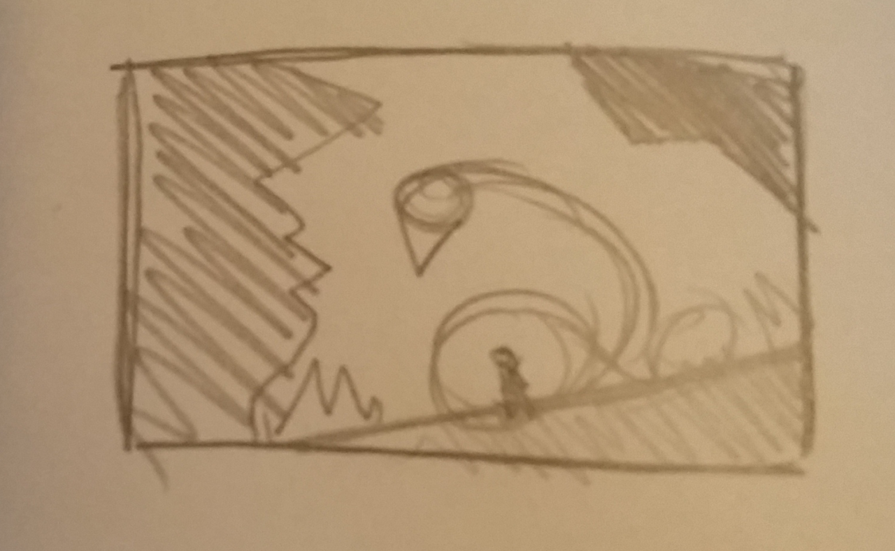
An older piece that I cropped since I want to focus more on the character in the drawing than any of the background elements.
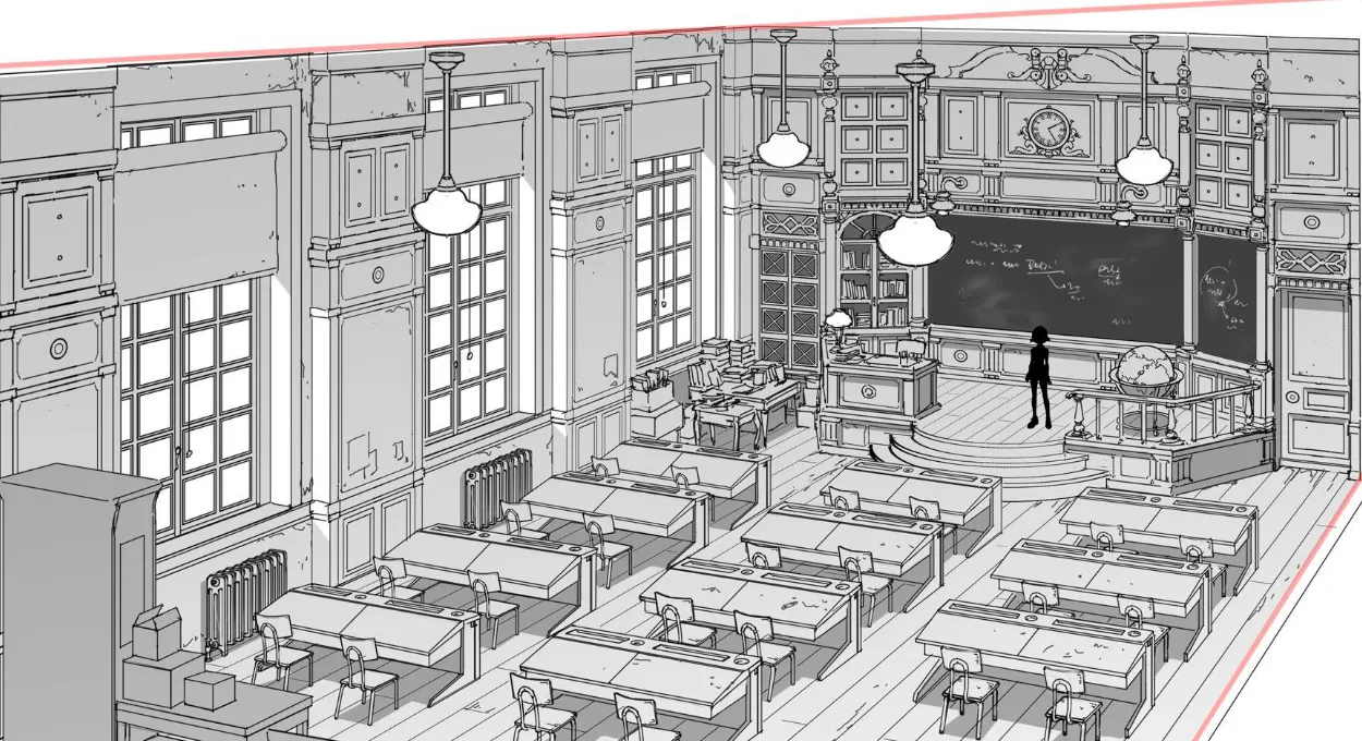
i mainly want critique on the design of the character in specific, along with the posing of the character. Hes suppose to be sitting in a laxed, unprofessional way on the chair, but the pose seems stiff to me.
I also feel like the design of the character is too busy, but i don’t really know what to take away without him looking bland, so i wanted a second opinion to see if it really is too busy or if im just thinking too hard into it.
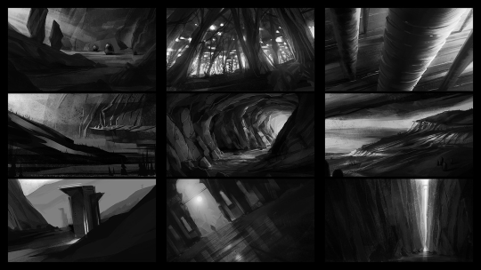
Struggling with backgrounds are a very typical problem amongst growing artists ( and established artists too even ). We have a tendency to gravitate towards drawing characters, animals or objects when we start out - then as we progress we want to branch out and tell stories with our pieces, which is where the presence of a background can become an invaluable tool.
Though knowing how to construct backgrounds is a very timeconsuming endeavour. Especially due to how different each environment, scene and atmosphere can be, and what matter of fundamentals the likes of drawing scenery requires to look convincing. Because of this freedom and variety in what backgrounds can and cannot consists of - it’s possible that you’re looking to improve your skills on drawing anything that you haven’t practiced before.
So let’s take a look at it.
Backgrounds as a scene, not an afterthought
First and foremost, considering which background to incorporate into a piece is, for many who have predominantly been drawing characters or objects with no background, secondary.
We tend to consider our character the star of the illustration. That’s why we tend to give that character the majority of space in our illustration. This can work for illustrations that should feature the character in a context where their presence is the most important part. But if we put our character slap-dab in the middle of the composition, taking up the classic 2/3rds of the canvas every time - we miss out on the incredibly powerful ways a fleshed out backgrounds can tell the story of the image. Sometimes, an environment needs to take center stage to tell the story most effectively.
For inspiration on this, we look to comics. Comics and graphic novels have long been contending with the masterful craft of compositioning characters and backgrounds into meaningful images, that through the background and the character(s) placements conveys a comprehensive scene.
Especially eastern comics have perfected this particular way of compositioning through some of the genre’s great works.
But like comic artists, we illustrators ( and aspiring comic artists ) must start considering the use of the environment as a key part of our planning progress.
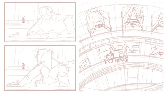
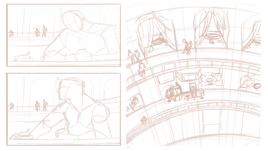
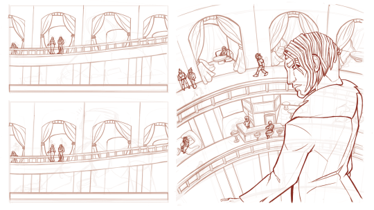
This conscious design process can be explored through the use of thumbnails. Small experimentative drafts that shifts our character(s) and environments around to find the most optimal placement for each, in order to tell the story of our illustration the best.
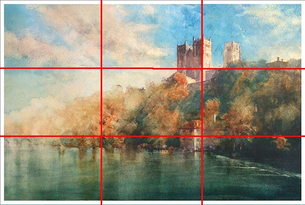
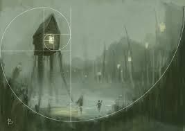
Naturally, knnowing how to composition an image properly is going to help you find out how to layout your background the best. I remember at first ‘knowing’ that good composition was ‘good’ for your art. But the moment i realized how much the layout of an image can change the way viewers percieve it, i was immediately hooked on exploring the matter, and make it one of my predominant studies for the better of two years. This is still very much a craft i’m only getting started with, but after having studied composition somewhat consistently, the discipline completely re-ignited my interest in visual storytelling as a static medium.
Learning the basic grips of composition, such as rule of thirds, fibonacci, the way contrasts frames focal points, and how to create flow in your illustrations - is going to elevate your pieces before you even start planning out the fineprint of your backgrounds.
Another appealing thing about knowing your way around composition, if the promise of stronger pieces isn’t enough for you, is that putting down a solid layout for your background, means that you have a lot more freedom to be as simple or complex as you want, and the piece will still look compelling due to the strengths of it’s composition alone.
Just like the basics of composition, i highly recommend you start looking into the fundamentals of perspective. The use of perspective makes for very dynamic compositions, and in backgrounds - it is a cornerstone to conveying environments ( unless you do more abstract backgrounds for your pieces ).
And if you master the skill of seeing, planning and executing things in perspective, you will have immense and incredible freedom to do almost whatever you want with your environments. From basic street layouts, to fish-eyelens shots or warped, distorted dreamlike landscapes, you’ll be able to make almost anything look interesting.
I personally think it’s worth trying your hand with as many perspective types as possible, but for starters - i recommend looking into the basics of 1-point and 2-points perspectives. These are typically the ones we encounter in real life, and thusly will be the more common kinds of perspective used in illustration for storytelling.
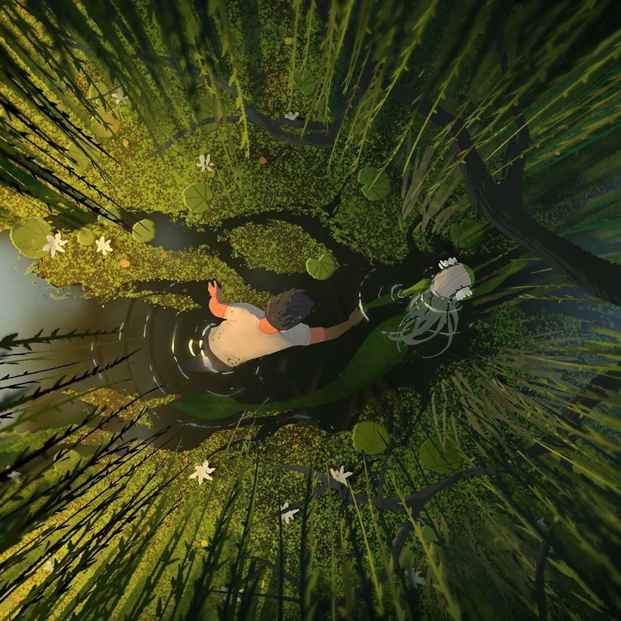
When planning out your composition, there are little tricks you can deploy to make the character integrate more with the environment, and more effectively convey the story of your image. Having your character interact with the environment in some kind of way is a very effective method for this kind of intergration. Above^ - the mermaid and her companion cause ripples in the water, and part the algae on the water mirror as they move through the lake. This indication of motion and interaction is not that complex, but it still relays plenty of information about direction, speed and movement to our viewers, which makes us merge the characters with the background itself.
Subcontextual symbolism and metastorytelling
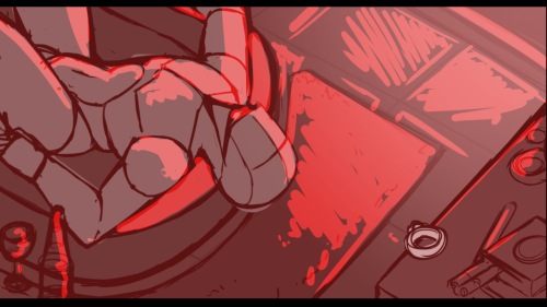
In addition ( and yet not really ) to the point above: you can relay subcontextual storytelling to your viewers by having characters react to objects ( or other characters ) in the environment. A hungry child staring at a cake through the baker’s window. A scared girl hiding away from a grandfather clock. A man glaring at his reflection in a mirror. Or as in the example above, a character staring at a ring on his sill from his bathtub.
All of these setups tells us that the character is in some state of mind, prompted by the environment they’re in. This makes our characters, not just “ additions” to an environment, or an environment a “prop” to the character.It makes them co-dependent and working symbiotically, as the story would’ve never have been conveyed at all, had one of the two been missing.
Interaction across the planes
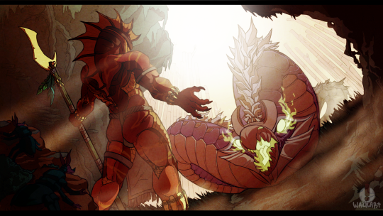
Usually, we divide our compositions into layers depending on which plane is closer to the “camera” and which isn’t. Something like this: ForegoundMiddlegroundBackgroundThere’s nothing wrong with doing this, it can help you in the early stages of planning, and also help you decide on colours and lightsetting ( say if, for an example - you want to work in the LMD (or DML ) spectrum for that cinematic light ). However, incorporating objects, characters or other elements that travel through multiple layers of this 3-part division ( like the snake-creature above, which stretches from the middleground to the background ) conveys depth and gives flow to the piece. Now for this - you are going to rely heavily on your perspective skills, so make sure you have those at the ready when trying for something like this.
A common pitfal for the likes of us who aren’t used to putting much thought into backgrounds is that we forget to research the design for the worldbuilding we want to do for the illustration we’re making.
This can result in us falling into stale, overdone or plain shapes and sizes, that never really takes us out of our comfortzone, and fails to interest our audience.
This can be especially damning if you’re working with environments with lots of architecture involved. We all know how to draw a house, a birch tree or a field of grass - but do we really know how to draw it well and interestingly?
Never skimp on your research. Let yourself be inspired by any specific type of foilage, building or layout, so that your background will spice up and live up to your characters.
So you planned it all out, you’re ready to start drawing your background. Nice!
Remember to go slow. Construct everything from the ground up, so that you don’t miss out on crucial perspective flaws, or errors in the consistency between shapes.
It’s okay to spend a long time on backgrounds. Especially if they make for a significant part of your image. So take as much time as you need, and don’t let yourself be stressed out if you have to go over certain parts again and again, for it to look right.
If you work digital like me, i can recommend “building” up your background in layers. Use a new layer everytime a new layer of “depth” is added to your background. Like this you can always toggle layers on and off for the perfect overview of your environment. Plus, you have all the freedom to go back and erase, change or alter something in the base shapes wihout having to disrupt the more detailed layers.
I don’t typically add the final lines until i’m completely satisfied with the background. Everythings constructed and very little is left for later-me to fill in. This helps a lot, as i am also new to backgrounds, and need things to be pretty cut out for me the moment i start laying down the final linework, otherwise i might misinterpret part of my sketch and get something wrong in the lineart.
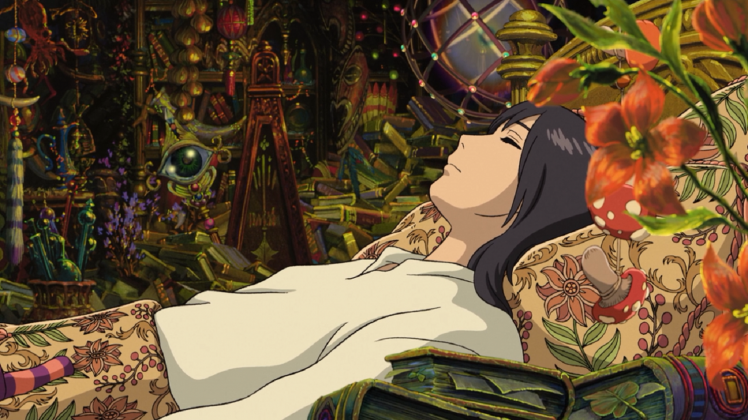
When drawing backgrounds it’s worth asking yourself how much detail you want to add in. Usually, this can come naturally as part of your style. Though sometimes the likes of clutter, detailed textures or a busy background can forego the confinements of style and relay information about the story. The clutter in Howl’s room for an example, tells us of an eccentric character who has been far and wide collecting all these marvelous items. This walks hand in hand with Gibli’s use of highly detailed environments in this ( and many of their other movies ) flick. Though, it is not always that the presence of many “objects” is the solution to a naked looking environment. In fact, sometimes this kind of clutter can, in worst case become too chaotic looking to fit the scene, and at best- a lot of work that could’ve achieve the same as something half as cluttered.
To know just how much detail you should put into your illustrations, it is worth diving into how many other artists have done backgrounds, take inspiration from them, and tweak it to fit your style and to your illustration.
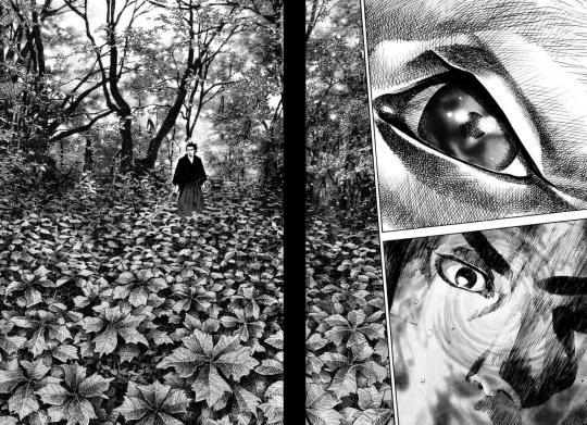
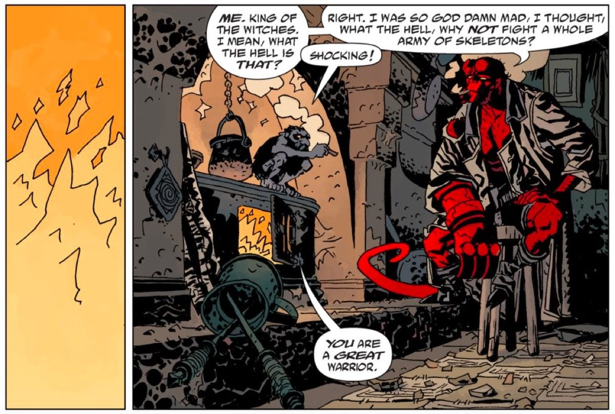
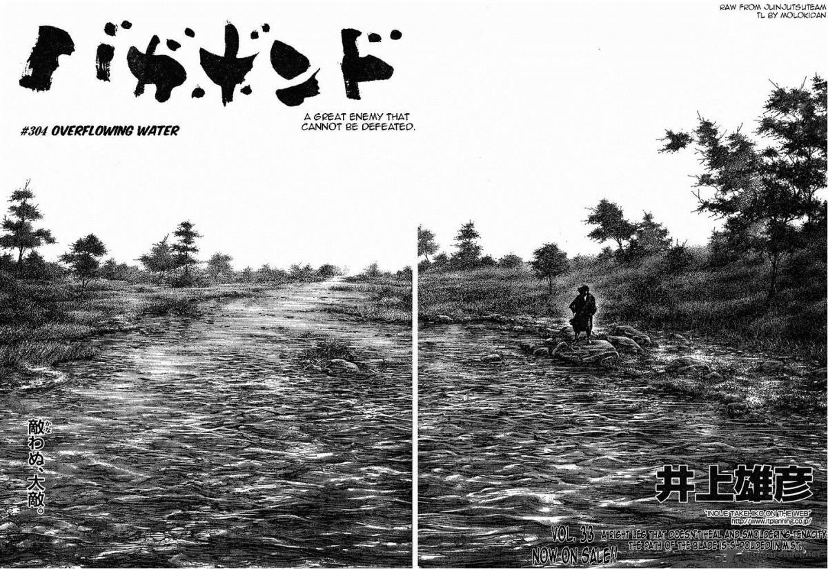
Opposite Ghibli, comics like Hellboy and Vagabond frequently show environments with “few” objects in them, or at least very simple objects.
Hellboy treats its backgrounds with a level of roughnes derrived from its use of pitch black shading to carve out blocky textures in the objects in the environment. Giving us just about enough information to be able to decipher the feel of the environment, but not much more. It has a simple grade of rendering
Vagabond on the other hand, makes use of pen and ink and a painter-esque approach to its backgrounds, which results in the objects in the backgrund often boasting thousands upon thousands of penstrokes that conveys depth and value. This comic has a complex grade of rendering.
Both of these comic book’s styles are highly artistic and effective in compliance with their own styles. Though they all invoke very different feeling for their environment and their respective story.
You should delve into your own use of detail and rendering when you set out to draw backgrounds consistently. Find out what level of detail you’re willing and able to default to, and what benefits your style most. Keep in mind that just because a background has many things in it - doesn’t necesarily make it a good background. It just makes it a busy one.
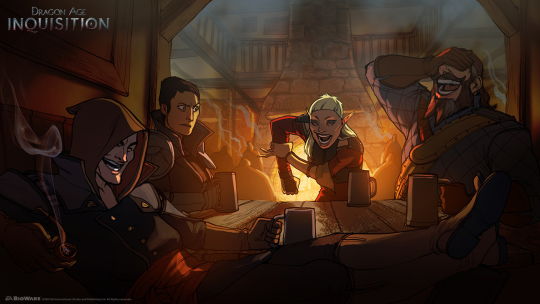
Naturally, you might want to try and integrate the pallette of your characters with the lightsources and pallette of your environment. At least unless you’re working with some more abstract techniques to frame your character in the environment.
Seamlessly blending your characters into the environment consists of mastering ( editing ) your colours so that their values correspond with the hues in the scene. Like above ^The characters, despite wearing blueish outfits are all topped off with a red overlay, that mimicks that of the firey light source in the room. Some people can plan for this kind of mastering in the pre-stages, but for me, i mostly always get around it at the later stages of my process.
A good, directional light can set the mood and lay down the atmosphere for a illustration perfectly. The use of light is easily one of the most effective ways to establish the tone of your piece. So make sure to pour some much needed attention into it. No matter if your environment is simple or complex, splashing it with anything but ambient light will make the composition jump out at the viewer.
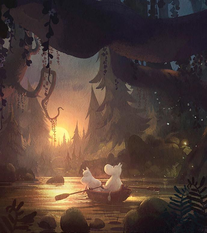
And remember to colour your light! The colour of your light and your ambient shadows will relay information about the temperature of your scene, or information about the general environment you’re in. Say for an example, how the golden light of the image above^ tells us of a warm sunset. Or how the picture below indicates a cool, mystical room.
Last but not least i want to give a quick nod to the use of special effects in art. ( predominantly digital art ). Where the use of a well placed gradient between your foreground and background, or a dab of fog, godrays and clouds can make anything look epic and grandscale. As well a help us distinguish the planes of the background from one another, by giving depth to the invisible space between the planes. Naturally, not all styles or scenes can make use of these kinds of effects. But i reckon you’d have fun experimenting with them nonetheless, and maybe you’d be able to develop your own little tricks for your backgrounds.
Whev, ok! I hope this was of some help. I know this one took forever to go through, but i needed a while to contemplate how to methodically go though something as broad as backgrounds.
There’s a lot to it as you can see. And i’ve only touched on some of the more meta-contextual things you can do with a background. So to actually go and study the likes of architecture, perspective, landscapes, etc - is next up for you to do.
Remember that it takes a long time to master something like backgrounds, because you are teaching yourself a completely different skillset from drawing characters or objects. But don’t give up! Slowly things will click into place, and you’ll start seeing your pieces get a lot more interesting to look at.
It is great that you are seeing improvement from your art classes!
We always need to improve, and branching out is a great way of doing so. Really hope you can get into animation in the near future!
We’ve had some posts regarding cartoony stuff ( + semi realism ) here’s the links:
All right so we’ve gotten a few of these. Where you guys ask us to elaborate on something specific in some certain of style, that unfortunately isn’t super descriptive.
We would LOVE to help you out, but we just can’t decipher which styles you guys are talking about.
So in the future, just to make everything a bit smoother ( and prevent your asks from hanging in our askbox forever because we can’t tell how to tackle it ), if you want us to talk about anything with any sort of stylistic overlay, we kindly ask you to include either a reference or a name of the style you are asking us to look into.
So please:
Include the reference of the specific style you want us to tackle, or a name on the specific style. So that we can look it up for ourselves.
This should help expedite asks faster and prevent us coming out here asking for you guys to elaborate.
Thank you so much!
We hope to help you with feathers later anon, after we’ve gotten a reference from you :)
- Mod Wackart
from The Redline Station https://ift.tt/2D0rgf0
via IFTTT
For me, a good way of drawing anything would be through having it look somewhat realistic enough to seem plausible, but abstract enough to add visual interest ( or portraying realism depending on what you wanna go for ). But that’s just cause of my preference in style. Far from an objective “good way”.
I think; like with drawing humans, animals, or knowing what colours go well together. You will have a harder time drawing anything ‘good’ unless you know some kind of fundamentals. If you want to mix a good palette, you need to know your colour theory. If you want to draw a human, you need to have some kind of grasp on how the human body looks and works.
Any and every subject you draw requires some kind of base knowledge about it to look good. Though, naturally, you don’t have to be a surgeon or a biologist to know how to draw a convincing body.
Nor do I think that you need architect-levels of knowledge on buildings to be able to draw them well.
What I do believe is that if you sit down and study architecture, you will inevitably learn some fundamentals that can help you conceive ideas and depictions of buildings that look more convincing. ( I am personally planning to look into these fundamentals of architecture to boost my building-skills for a comic project ).
So just like anything else. No, you don’t need expert knowledge on something to draw it. Yes - you might need to study its fundamentals and basic build to draw it convincingly.
from The Redline Station https://ift.tt/3fXThSZ
via IFTTT
There are a plethora of mythologies which has combined a number of creatures to make for incredible beasts, gods or heroes. Most famously perhaps that of egyptian or greek mythology, which sees the fusion between human and animal on numerous ocassions.
We’ve always been fascinated with combining animals together ( humans too ) to concieve new, exciting creatures. I am personally a huge fan of this method of designing, and it is one of my prefered, primary ways of working with creature and meta-contextual character design. As much as i’d like to say there’s tricks to be had in designing creatures like this, the fact of the matter is - i don’t know one surefire way to go about it. Just like character design, i believe that one’s best bet is to delve into the matter with curiousity and a willingness to explore the combinations on more levels than just the surface details. Something that goes beyond pallette swaps and switching ears, noses and tails around. And of course: working with your particular style in order to find out how it can accomodate these creatures the best.
What i mean specifically by “going beyond surface details” is the swapping and combination of creatures structural and behavioural builds. Well then, what do i mean by that?I want you to look beyond the colour of the fur and the shape of the muzzle. I encourage you to consider the posture of the creature as well. The angle of the spine, the breadth of paws and the placement of the head. Take only the interesting parts of the animals you’re trying to combine, those that make the individual creature distinguished from one another, leave out the rest. A fox might have a pretty red and white/black coat of fur, but is that really what makes the animal itself so distinct from other mammals?
How does that work?
Let’s try to construct a chimera:
Underneath i’ve collected traits from four animals. Two of which i have referenced. This is a completely random selection of animals that would probably need a lot of anatomical reworking to function in any realistic setting. But for the sake of the experiment, i wanted to mix four completely different animals together.
This creature is a mix between a Lion (tail), bull (hindlegs), Bear (torso and front legs) and a pangolin (head). As you can see, i’ve nicked the two humps and the overall build of the torso straight from a prowling bear. These are, next to the bears iconically stumpy tail and specifically shaped head, one of it’s main, structurally defining features. Along with its dense and large paws ( which i’ve included as well to make the creature appear very front-heavy ). Due to the weight distribution being primarily on the front legs, those of the bear, we can assume that its run/walk -cycle will look mostly like that of the bear. With the hindlegs of the ox peddling behind, probably looking rather strange in motion.
From the pangolin, i’ve taken the distinguishable shape of the head, and will later be implementing scales from the little critter too.
The lion’s tail was brought in to add some kind of contrast to the otherwise dense and massive limbs; thinking in contrasts and making sure that you have them incorporated in your design can make for great amounts of visual interest, and make your creature look more dynamic.
Now, this is mostly a personal preference, but for me, in my style - i like to make the parts of the creature blend as seamlessly as possible in sihlouette. Meaning that i try to smooth out the features of the different creatures into as few coherent shapes as possible. ( See, how the torso of the bear blends smoothly into that of the bull’s legs and pangolins face ). This is mostly due to how i tend to work with creating creatures from the ground up - creatures that are supposed to look alien and unrecognizable to us, yet familiar still. If you want to make it clearer which parts your creature is made up of, making the transitions clearer to dinstinguish feature from feature will help seperate the creature out. Like the classic chimera:
When deciding which creatures to combine, it might be a good idea to take a quick look at their bone-structure and muscular anatomy. Like this - you can easier make decisions as to where you’d want the traits to fuse and join. This is especially important if you want your creature’s features to have that seamless blend. Understanding how and why muscles work the way they do on certain animals will give you a deeper understanding of how you can combine these animals together without your design looking crowded or mishapen.
Lastly, i’ll always encourage people to try to combine animals that aren’t commonly seen combined, or even commonly seen. If you want to create something unique, then you need to look for unique animals to combine. Or new ways to combine commonly combined animals. The results of a good combination can come out looking wildly interesting.