As it is with watermarks, signatures and other protective measures you can schlap on your art, it always comes at the cost of the clarity, and maybe even quality of your original piece. One has to make up their mind about how much they are willing to compromise their work in order to protect it. Me, someone who hasn’t had many problems with my stuff ending up places - other than your typical bots snatching your stuff for generated storefronts, i try to maintain the clarity of my pieces over enforcing the more extensive measures to make sure my art isn’t distributed without my consent. This might change in the future. As we grow as artists we need to take different measures to keep our property safe and moderated as we meet with new audiences.
Designing a logo, signature
- I recommend you make your signature or logo Monochrome, At most dual-chrome. Too many colours don’t make for a very versatile logo. These many colours can clash with the pallette of the individual piece.
- Simple, clear and easy to read.
- No complex patterns or shapes, think of your signature as an icon or a logo for a company or a brand.
- Should be in lieu stylistically with the typical aesthetic you dabble in.
Basic placement of the watermark/signature
Smack-dab centre of everything
What I normally see, in regards to watermarks, is a very central placement on the given piece. This gives anyone wanting to crop the image a very hard time sectioning off pieces of the art to use without cutting into the watermark. It’s pretty effective for sure. The downside is that a large watermark like that typically compromises the readability and composition of an image.
I could recommend it as teaser-thumbnails for potential patreon-rewards, or as previews of commissions ( or process images for your client of a commission yet to be paid ).
The tagline
More elegantly, you can put your signature somewhere near the focal point. This only works if your signature is versatile enough to blend with the composition somehow. Text or very small, simple logos should do the trick.
By placing your signature or watermark near the focal point of your piece, you’re able to ensure that anyone trying to crop the image will have to make a pretty aesthetically unappealing cut to crop out your signature or risk losing the important parts of your illustration. The downside to this one is that a watermark or signature in itself isn’t diegetic ( part of the narrative in a given scene, in this case, your illustration ) - unless your illustration is of a more graphic nature ( magazine-cover. Text-art. Etc ). Meaning that if you are drawing a story-heavy scene or an atmospheric piece of abstract art, a signature like this can break with the immersion.
Classic simple signature
If you’re more inclined to simply having your signature there for the sake of ..well. having it there, assuming or not worrying about someone cropping the image and redistributing it without your tag on it, you can stick the signature in the corner of the piece. I tend to do this on a lot of my smaller pieces cause I’m a lazy bum who can’t always be arsed.
The Motif of a watermark
Working off of the placements I just presented, here are a few more ways to incorporate a watermark or signature into your work. some more or less brazen. Valuing either protection or clarity.
Shutterstock’s text
I saw this on a Shutterstock image somewhere, and i kinda liked it as a watermark. It’s either just basic text with the name of the owner of the image, sometimes accompanied by little lines running alone the image either vertically + horizontally or diagonally. Supposedly to prevent someone from cropping a significant bit of the image without getting a bit of the watermark too.
Full logo
Just like with the preview with the logo at the very centre of the composition, this kind of watermark is very effective at keeping croppings from leaving out your signature. But it obscures the rest of the image pretty badly. As previously mentioned, I’d only keep this for art that is supposed to “tease” its full resolution. Or protect unpublished material from the public.
The stamp
I’ve actually been considering switching to this particular kind of signature. It has a really neat compact look, is easy to read and fits with my style very well.
The strength of a stamp is that the logo frames itself in a rather basic shape. Which makes it pretty self-contained and is easy for the eye to read. It also fits pretty neatly into any corner or nook with a composition depending on what you need it for.
Including links
On principle, I think it’s worth injecting your presence into every piece you churn out. But ultimately, not all pieces are going to have the compositional weight to maintain a load of links on it. I think it should come down to whether or not you think it looks passable. For me, I would never cover a sketch in a ton of links unless I knew it was going to a demographic that could generate some sort of revenue or clout.
I think - keep your full set of links for your bigger pieces. Then use a simple, elegant and link in your less complex works ( a little tagline in a corner somewhere or something ). For me - I keep the full link-collection to my “big” official illustrations, those that go in my portfolio and those I push to the forefront of my platform to generate attention and interest. Or if I am foraging into a platform where credit can easily get lost ( Tumblr for an example ); ie. anywhere where I feel like it’s crucial for people to know exactly where to find me at all times.
I hope this was useful to an extent. So sorry for the premature upload, I’m old and don’t know how Tumblr works. God help me.
This is actually a great question! And something the broader artistic world could probably benefit from asking themselves once in a while. Properly taking inspiration without infringing on someone’s else’s idea or product can be difficult, since we tend to get attached to concepts we like pretty wholesale. There’s no “ right” or “wrong” way to take inspiration ( Only a right or wrong way to dodge copyright infringement ), but let me lay out how we are taught to do it at the design-school I’m at.
There’s been a stigma about the notion of taking inspiration for the longest time. And it hasn’t gotten much better with the advent of the internet, where we’ve had quite the debates about whether someone’s “stealing” someone else’s idea. So let’s just get on the same page really quick.
You can’t really hog an idea to yourself. Sure, people can copyright an iteration of an idea, ( a character design, a logo, a certain piece of art ) but the source of inspiration and the concept of that idea is pretty much public domain so to speak. The original artist didn’t come up with that idea completely on their own idea but was inspired by other sources more or less close to their end product. So we’re shaking the idea that “copying” someone else’s idea is inherently bad. Sure, it is good form to credit your inspirational sources and shed some of the spotlights on the person you got your idea from, but ultimately there’s not really anything -wrong- with “copying”, especially if your work is non-profit.
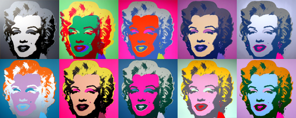
Famous Pop artist Andy Warhol worked on top of screen-printed photography, that he lifted/copied off of the movie “Niagara” from 1953.
Finding what appeals
Naturally, when you want to take inspiration from something - you need to find out exactly what it is that appeals to you. This way you weed out all the other stuff that isn’t necessary for satisfying your want for your new iteration, which could otherwise make your design look unoriginal. If you like the hair on a character, just go with the hair, leave the eyes and nose. If you like how a character dresses, then leave out their exact skin tone. Take a moment to pick and chose elements that are absolutely necessary for your own iteration, and be brutally honest with yourself when you do so - simply picking, or not picking things because of whatever reason is just going to have you run in circles. It sounds obvious but it really isn’t.
Going to the source
When you’ve identified exactly it is about a concept that you like, and want to re-iterate in your own design, it can be worthwhile going to the sources of which the artist before you were inspired. If you, say, want to iterate on a dress that a character wears for your own design, you can try to research the era and regional belonging of that particular fashion. This can open your eyes to a host of other options within the desired niché of the idea you want to iterate upon. Maybe you’ll find something similar but not the same? At the very least you’ll learn about the garment itself and ways that you could possibly alternate little details in it to make it look more unique. Researching topics of all kinds also build on your visual and referential library - and can improve your concept-variety long term, so perhaps make it a habit always to study the real-world origins of the material you want to iterate.
If there’s one thing my soon-to-be-obtained degree has taught me, it’s that your work is not simply done by the moment you finish drawing the first reference sheet. Designing and iterating takes many many iterations, in more or less polished forms. Some designs never stop taking on new iterations in fact.
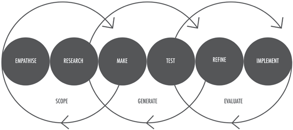
This illustration’s not -as- non-designer friendly as I would’ve wanted it, but it was the best one I could find at this point in time. This model is the Iterative Design Process model. A model that I’ve been exposed to pretty much non-stop for three years now.
What it basically says is that you, as a designer goes through the cyclic development of a concept by constantly going back and forth between researching your material, making prototypes, reflecting on the prototype- and then starting all over again. Each of these three-point cycles is called “ iterations”, and they can go on indefinitely until the designer finally decides that they’re satisfied with the final product.
What this means to you as an artist is that, just like the designer - you can benefit from going through multiple iterations and work-cycles. This is particularly true in terms of making something original from its source material. If you stick your focus on making just one tiny change to the design per iterations, you will gradually move away from the source as you go. It takes time.
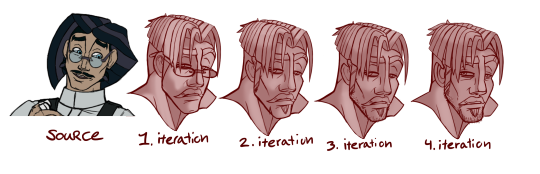
I’m currently working on my own design project, where I am trying to break away from using one of my pre-established characters in a setting he doesn’t belong, and instead draft up a new character that shares some similarities to the former, but can stand on their own as an original character for an original IP.
Here, I make use of the three steps above and the iterative process. Most importantly I’m patient with the process. For each iteration I let the idea simmer a bit in my head while I do something else, meaning that I have multiple design-sessions and research-sessions to let everything properly marinate before I make any new iterations.
I hope this will suffice as a quick introduction to derivative/inspired design thinking. Taking inspiration from something is the literal baseline of art, so getting the method right is really important, really glad we got this question.
Sounds great! Animation’s such a cool medium and I hope one day to dip my toes into it, even if just for a little while.
Since I don’t know which software you’re using or if you’re using analogue mediums, imma leave it to you, yourself to find the tutorials you need for the software. But I’ll link you to some of the more abstract know-how.
Inspiration and community
I reckon, that if you’re doing a short animation, especially if using music or the likes to overlay the animation, I’d go look into the animation-meme community on Youtube. To those who don’t know this community, it’s a niché ( but rather large ) community who content themselves with making short animations featuring their own characters, or characters from IP’s. Usually animated to the sound of music, and following a certain theme or atmosphere.
If you want to get really artsy with your inspiration i cannot stress how cool animation anthologies are. The stuff like The Animatrix, Disney’s Fantasia or Love, Death and Robots are cornucopias of inspiration ready to be taken inspiration from.
It is also important to look into the basic terminology of animation itself. Here’s a quick rundown of some of the foundations of the animation-vocabulary in regards to frames:https://www.youtube.com/watch?v=VcBwDHx_oDk
Principles of animationIf you’re already up to date with the basics of the art of animation, perhaps you’d want to know some of the more abstract basics that any animator should know. Here’s a really good video on the 12 principles of animation. A set of rules/laws that can be applied to help your animation look more fluid and dynamic. https://www.youtube.com/watch?v=uDqjIdI4bF4
The survival kit
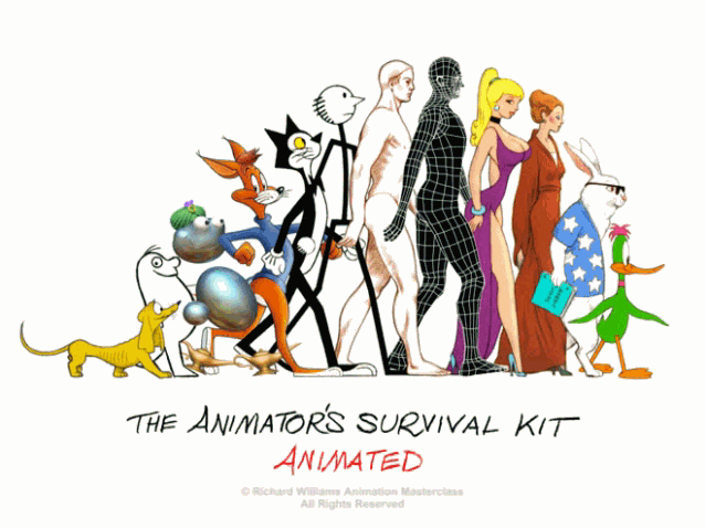
If you want to get into animation really, ( or just like reading books or watching animation-tutoring ) I can recommend The Animator’s Survival Kit. One of the more comprehensive collections of lessons in animation. I’m personally out for the book lately, but I reckon that the DVD could be just as good if you’re more into that format.
In which Wack rants completely incoherently about why the fixed definition of art as an aesthetically pleasing end-product relies on a dated and time-worn consensus that doesn’t necessarily hold up today. Before you read: Note that this is not a rebuttal to the fact that one’s subjective perception can change how one personally values a piece. But moreso an address to the people who put the phrase “ Art is subjective “ in their mouth to assert their subjective perception, as objective, culture-spanning truth about what makes an “art piece”.
If you’ve discussed art with people a number of times. You might have had a conversation or two about what makes art - art. Either in regards to a piece where you and your mate cannot find consensus in liking or disliking a piece or just as a deeper philosophical conversation.
“ That ain’t art!” is a pretty common phrase to hear when people, usually otherwise not involved with the art-world gets into a debate about the validity of a piece.
There’s nothing wrong with having a negative opinion about an art piece, but the act of judging a piece of work’s validity as art solely by the aesthetic value, or immediate reaction, has been and is still used to make some types of creative expression more prestigeful and culturally relevant than others.
There is a reason that the phrase has begun taking on a more derisive meaning between artists. Who will throw it around to actively short-hand criticize a piece which they do not personally like. And that is because the statement, whether in its original phrasing or in any other veiling shows a disregard for the piece beyond the viewer’s personal liking.
Defines that art is the expression or application of human creative skill and imagination. This is typically in the form of visuals, such as paintings, sculptures or fine arts.
This ^ Is one the most agreed upon takes on the modern perception of what art is. And though the definition of art continuously changes and disputes, this seems to be the current consensus across multiple partners, and an understanding which has objectively survived through the eras.
Some ways history has shaped the definition
Why is Europe considered the common artistic hot seat through history?
As a European who won’t bother you with the long-winded history of colonialism: Europe was a bunch of conniving twats through a good bit of recorded history, who spread themselves thin across the globe and imposed their norms onto other civilisations, stealing their art history in the process and upholding that as “ exotic pieces of fringe art”, never fully incorporating those into their own art culture as much more than curiosities OR veil the presence of the foreign culture so much that its native art was simply assimilated into our art history without much credit - and therefore managed to superimpose their own preferences onto the broader perception of art.
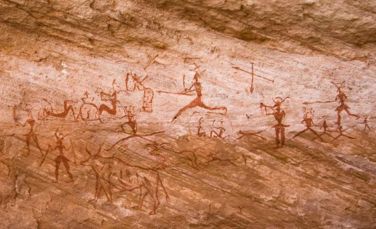
The definition of art has changed drastically over the course of human evolution ( and even in recent history ). Undoubtedly, our ancestors weren’t out to provoke some greater political movement when he or she scrippled their stickmen and oxes on the cave-walls. They were telling stories, passing knowledge, communicating and conveying experience down to those who where with them, or came after them. It’s unlikely that they even considered art something of higher cultural standing, and moreso just a means to develop their kind, maybe even entertainment.
Cave-paintings was perhaps a cognitive learning tool:
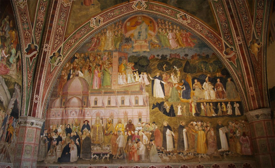
As cultures developed and societies grew, we saw that art became a tool for religion, once again to tell stories - this time from the scriptures, breaking the barrier between the literate priests and preachers, to the illiterate common folk. Making the spread of their religion quicker through increased accessibility. During this time, being able to capture a narrative as cohesively as possible using the limited resources you probably had access to became what could probably have been considered a definitive talent of “artistry”. This tendency held a firm grip on the art world for eras to come. The church was one of the few instances in public that had the resources to hire artists for their projects, and thusly - ( along with the international spread of the religion ) became the most prevalent facet of art history at the time. This monopoly, however, came under threat once the printing press was invented in Strasbourg, Germany during the 14th century once the newfound widespread literacy began the era of reformation.
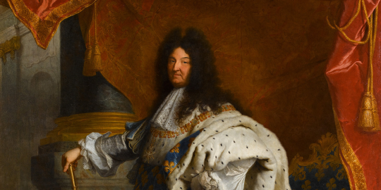
As our societies kept growing richer and more complacent in a classist system, noblemen and women would pay handsomely for art pieces as a luxury. As portraits became a symbol of societal importance and wealth. Now, capturing the reality as closely as possible, as to give a truthful depiction of your subject became the standard for painters and sculptors, and possibly what could be considered artistry within the institution at the time.
The church was still a major patron of the arts, but it was now common that local nobleman and royalty splurged on these very realistic looking paintings, in order to flaunt their riches to the masses.
It was all the way until the 18th century before we’d seen any significant epokés concern itself with the subjects of the growing middle class. ( Bidermeier, Vienna )
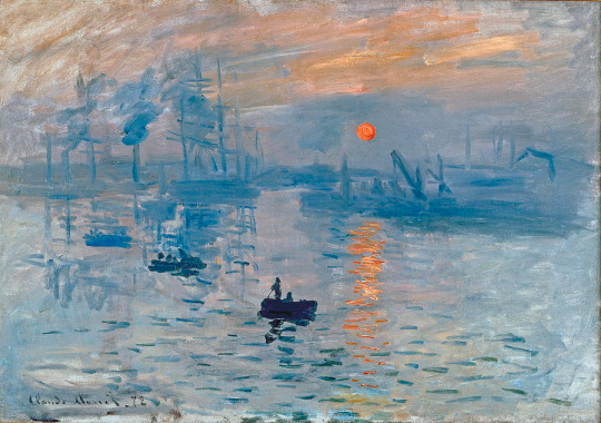
It wasn’t until the onset of the 19th century where a considerable amount of abstraction began to slink its way into the public eye, through the genre of Impressionism. ( Of which the french conventional art community was pretty salty with, as impressionist painters were elegantly dodging the normal expectations for how an art piece should look ). The impressionist era revved up in the wake of Claude Monet’s painting “impression”, from which the term was coined. This genre was a lot more subjective to the atmosphere that the painter was feeling when painting the piece, and pretty much instilled the concept of deriving value from an art piece through the feelings it could instil in the viewer.
This also brought the subject of these pieces down to the trappings of domestic and social life. Something that the Bidermeier movement had also started back in Vienna a century before. Despite the major pushback it got at the time of its conception, Impressionism still moved onto push the bar for what was acceptable with artistry.
After Impressionism found a foothold in Europe, many more movements would pick up the mantle of decimating the previous understanding of art as a medium focused on aesthetic polish. A century after Impressionism had made its first bounds, Expressionism shot up in Europe featuring iconic works like “ the Scream” by Edvard Munch in 1893.
Later, we saw a cascade of countermovements such as Cubism and Dada, and even later - contemporary movements that we know of today like Pop art
( 1950s ), Psychedelic art ( 1960s ) and most recently Unilaianism ( 2019 )
Each of them facing their own share of pushback from the conventional art scene, while pushing the envelope for what was considered “artistic” and what wasn’t.
This is why the consensus of artistic method between artists across genres and formats still stands as a viable validator for whether or not something can constitute as art. If we look at it at its deepest banality, the mere application of creative skill and innovative problem-solving constitutes as “artistry”, and that any product thereof by that extension is to be considered “art”.
As history has proven, our understanding and validation of artistry has been changed over the course of innumerable epokés and period to fit with the preference of the contemporary norm. But one thing that had always stayed true is the method of creative application with which the artist has conceived their piece.
And whether or not you agree with the statement, would very likely hinge onto whether or not you desire art to fit within a certain formula ( be it a vague one or not ).
The public problem with Modern and Scandal art
So from what we deducted in the first chunk of this behemoth of an essay: What people actually mean when they say “That isn’t art” is
“ I don’t like this particular piece, and I don’t understand/care about the context it is presented in”
Now, just disliking something for the sake of it not fitting with your preference is not problematic at all. You can dislike something just for the hell of it, and your opinion would still be valid.
Where the problem crops up is when we assert that our dislike invalidates whether or not something is art - rather than whether or not it is in fact -good- art.
The horse-sacrifice
Modern art especially is versed in this kind of criticism. As many people don’t see the appeal of artistry that utilizes the draftsmanship itself less, and the reaction/ post-production history of the piece more.
My favourite modern piece is by a Danish artist: Bjørn Nørgaard, who slaughtered a horse ( the ageing horse was properly euthanized by a vet prior to the process, which - let’s be honest, is probably more humane than what the factories do ), and sectioned it up into 199 jars, where it was preserved. ( Do not look up this particular piece if you’re squeamish ).
This piece was what has been more commonly coined as a “Scandal-piece”, a piece of art meant to inspire outrage. Bjørn’s horse was a protest towards the Vietnam War. It’s intent to rile up the people over something so mundane as a horse while turning a blind eye to the brutality going on outside our own borders. It worked, perhaps a little more effectively than the artist had expected, as he could not return home to his own house up to three months after the happening.
The controversy that followed had a lot of people rolling their eyes about whether or not this act could be considered artful. Undeniably, it was creative even beyond its own controversy, and it got the reaction that it had set out to get - even if it overshot its mark. But still, people refused to regard it for what it was, and instead declared it the doings of a madman.
Now - the horse is on display on ARoS in Aarhus and the national museum of Art in Copenhagen. It is heralded as one of the most controversial, yet effective pieces of modern art in danish history, despite many people rolling their eyes.
What Bjørn’s horse told us was that even if we don’t understand an art-piece on our first or even second experience, it doesn’t take away from it serving its purpose. But still - people will blatantly disregard the definition of art if they don’t like the piece personally.
When we validate an art piece for ourselves, we tend to base it on whether or not it resonates with ourselves first. And next how it might resonate with a broader demographic. There’s nothing wrong with this. The problem comes when we try to assert our own internal opinions on the value of the piece as a whole. There’s always going to be someone who dislikes a piece, and someone who likes it. Even better, these numbers can fluctuate if the piece is moved through different contexts. If you stick a shovel on a drywall and presents it to someone who doesn’t really care about Modern art, they might not really give a damn about that shovel either. If you shove it at a group of wine-swirling connoisseurs of modern art, they’d probably be much more inclined to like the piece.
If we assert that the validity of art is truly subjective, then we’d have to pick one of the two groups to be of the “right opinion”. And by that extension invalidate the other group’s. Both groups consume art in one way or the other, but somehow one group would for one reason or the other happen to have more legitimate experiences of art.
This could lead to a lot of people to say that “ well. Art is subjective”, which in its writing indicates that the individual- based on its liking or dislike to the piece, will validate or invalidate the pieces’ status as “art”.
Which leads me to the next bit:
Quality in art can be subjective
Now what most people who throw the phrase about might actually mean with this statement is that an individuals perception of an art piece’s quality is subjective.
And that it is!
If you don’t care much for draftsmanship, then a painting won’t appeal to you. If scandal art irritates you because the artist hasn’t constructed the subject of the piece itself - then you probably won’t regard it as a “good” art piece either.
( I personally don’t really care for Expressionism or by that extend Impressionism, personally much more of a classic and renaissance type)
It all comes down to appeal. Can you resonate with a piece? And if you can, you’ll probably say that the piece is good, or at least has a host of redeeming qualities. ( unless you’re liking it ironically, which is fine too )
People who are trained in art, or generally dabble more in artistry will likely have a broader regard for what they consider to be quality outside of their own preferences. While someone who isn’t might stick with their preferences. Either of their experiences is legitimate.
Your experience with a piece is your own. No question about it.
Rebuttal: The extent of the global art community and why a non-vague classification is difficult
Another reason why a classification fixed in subjectivity can become troublesome, is when we consider the mass accessibility artistry has seen with the invention of mass media. Now, anyone and everyone can upload their pieces to the internet, and garner reactions from people with widely set opinions.
All artists have the option to work out of the vacuum of their own desk, and once again we’re seeing them push the limitations to what constitutes artistry. But at the same time - they ‘re exposed to exponentially more people and opinions, who all have a subjective ideals to what art should be.
That is why the consensus of method lends itself better to artistry’s ever-expanding scene.
Rebuttal: Do we uphold all creativity to the same standards as exhibit-pieces?
Just a quick one: If a child brings you a piece of art, do you consider it art? Probably not in the same sense that you’d consider Picasso’s or Van Gogh’s works - art.
It is worth acknowledging that anyone has the capacity, and once in a while - will produce art, whether by intention or as a by-product of a process. The consensus that Art is in the creative thinking propagates that this is true. Does it make the child an artist? Maybe not.
Artists are generally classified as individuals who intentionally produce art on a “regular” basis. But that’s a topic for a whole other discussion.
My point is that, just like I’ve previously argued, there is no real “bar” to climb with the more vague classification of what constitutes art. We live in a world where everything can potentially be viewed by billions of people, so inevitably, someone will garner an audience way beyond what we personally think they deserve. But regardless they leave their mark on the art world anyway. And fame and recognition can be random as fireworks. The culture of today leans heavily on liking ( alongside genuinely appreciating ) things with irony or in rebellion to something else. It’s how the impressionism came to define an era. It is what counter-culture is in part.
Invalidating these pieces would mean excluding huge influencers in our community, and potentially missing out on what they can do for us.
So once more just to sum up:
“Art is subjective” as an argument to whether or not you like a piece can be just fine if by that you mean that your opinion and your companion’s hold equal weight in regards to the perceived quality of a piece.
“That isn’t art” as a means to subvert whether or not a piece can be classified as “art” by whether or not it pursues the value of artistic virtue (The appreciation for fixed methods, aesthetic or ideas in art ) poses a host of questions and issues that can be understood to disregard the evolution of art and how the environment is constantly developing.
All of this supports and lends itself to why we are currently at a stage where we would rather define artistry as an application of the artistic method, rather than the end product.
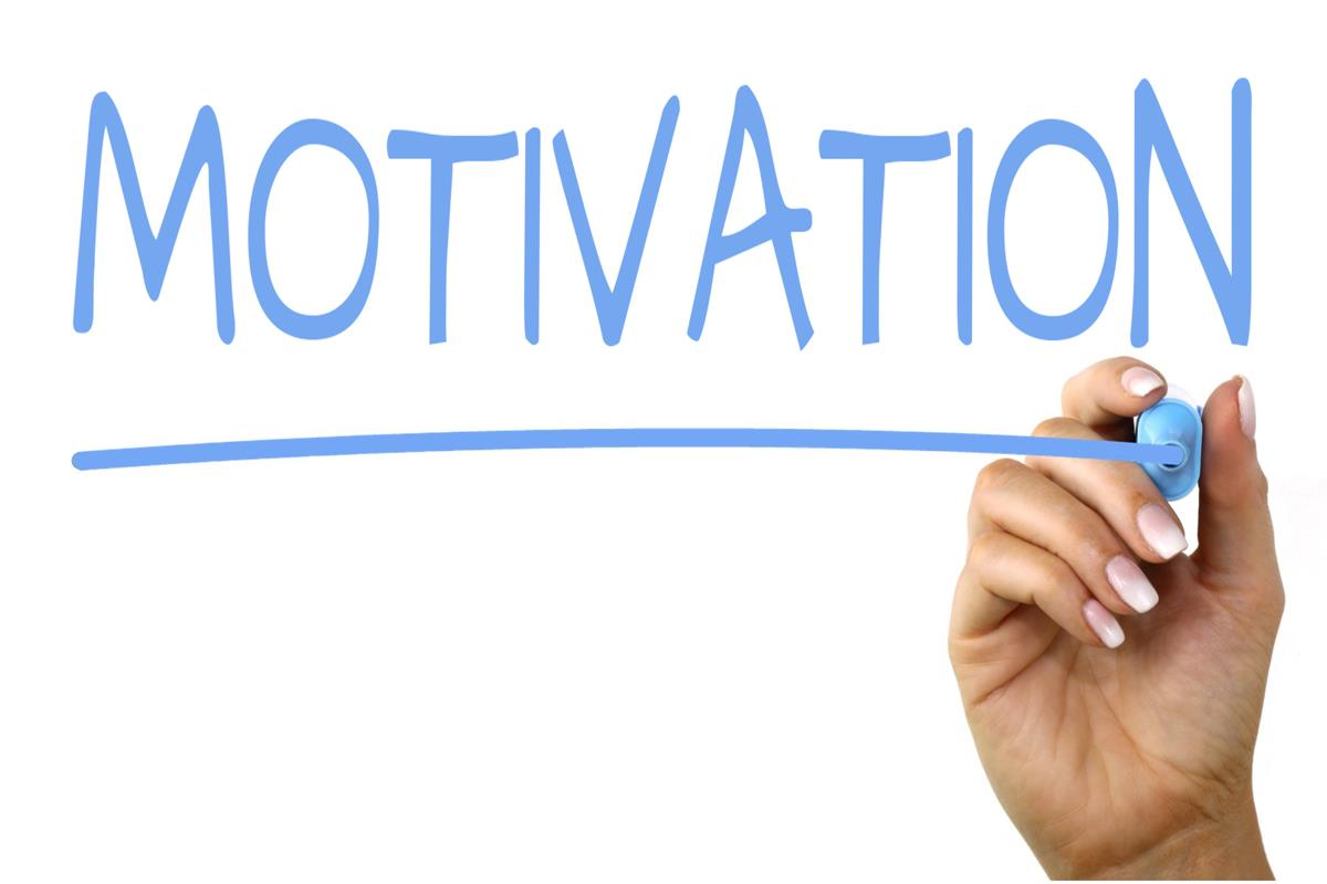
It sounds like you’re experiencing a perfectly natural cycle of motivation and demotivation. Here are some things to consider in regards to that.
Finding something you like
In regards to whether or not you should find a subject matter and ‘stick’ with it: I feel that as long as you are just striving to draw consistently and not building up an audience, there’s no point in forcing yourself to draw one specific type of content. If you have a favorite thing to draw- then you’ll probably gravitate more towards that naturally, so I wouldn’t go out of my way to put your mind on a one-track kind of direction.
If you want to build a fanbase up, then yes, showing consistency in your content ( reoccurring characters, a specific style, or medium ) can definitely help you entice people to stick with you for a longer period. But since you mention that you’re not exactly showing anyone your stuff, I don’t see that as being your goal as is.
The reason I don’t want to lock you in a box is that it sounds like you haven’t built up what I’d like to call Artistic insistency ( although I’ve heard someone call it redundancy, both words work IMO ). Insistency is the regular, consistent return to your craft. Insistency is what makes professionals and highly active artists able to keep on producing art even if they aren’t feeling overly motivated.
Insistency is not something you have or get by default. As a new artist, your first goal is to build Insistency, which - if you’re very young, could be cultivated by your parents supplying you with paper, pencils and the time and freedom to explore the craft in order to build your passion to it. As an adult, cultivating it can be indulging in experimentation or invest in supplies that feed your curiosity.
Basically: it’s about finding that one thing about your craft that keeps you coming back, and then keep on doing that till eventually the fulfillment you get from indulging in it has you motivated to engage with the craft on par with your other hobbies.
It sounds as if you already have a certain amount of insistency build up. But that it could still use more cultivation to really spark your passion for the art. It’s completely all right not to have that insistency too by the way! There is nothing wrong with leaving art for a bit and then coming back. But of course, if you want to turn stuff out on the regular, this might be something worth looking into.
Something I’ve found that people talk about shockingly little is the natural pauses and the cyclic nature of motivation. Especially since in a field such as the creative one, we only have our motivation to rely on when it comes to churning out quality content. If we’re not feeling motivated, our minds can be scattered and inattentive when we draw, which results in a frustrating process and perhaps a product beneath our usual standard.
I didn’t learn about this until I spend some years in art-school. And it wasn’t anything anyone told me, but something I had to experience myself. I’ve later talked to more artists about it, and it seems that everyone has some kind of cycle to their motivation and growth. Typically consisting of periods of high motivation, medium motivation and no motivation at all.
For me, a cycle consists of about 1-2 months of medium motivation. I get stuff done, but it’s mostly commissions, comic pages, reference material, etc. I don’t typically go out of my way to produce anything that challenges me or explores new territory. After this, I’ll feel a short period of high motivation. Usually a week or two. Here I’ll be churning out art that consistently challenges me, forages into new experiments and generally resides above my typical standard. After a rush like that, my motivation tends to crash for two-three weeks again. Sometimes I’m able to crank something out, but its usually only the least required.
Your cycle is individual to you, so pay attention to how it fluctuates. And respect your downtime! If you’re experiencing fatigue or low motivation, don’t push yourself to draw. In fact, I highly encourage that you do something completely different. Start sculpting, knit, or just play video games and read comic books. Take the time to recharge your batteries, or you might actually burn out for good.
Undoubtedly, getting involved with a community that shares the same interests as you can help you stay motivated. Whether that be digital or not, both are useful. Though I must admit, to me at least - nothing really beats physically sitting in a room with other people, talking about art face to face. The internet is great and I love chatting with other artists online as well - but there’s something unique about cramming a dozen artists into a studio. So, if you want to involve yourself more ( whether by showing your own art or not ) I definitely recommend finding these little niché communities if you have the spoons for it.
Thank you so much for the kind words :)
We are ecstatic to be able to help and grow a community like this, and hope to see it continue flourishing as we move into 2020!
- The Mod team
from The Redline Station https://ift.tt/34klsor
via IFTTT
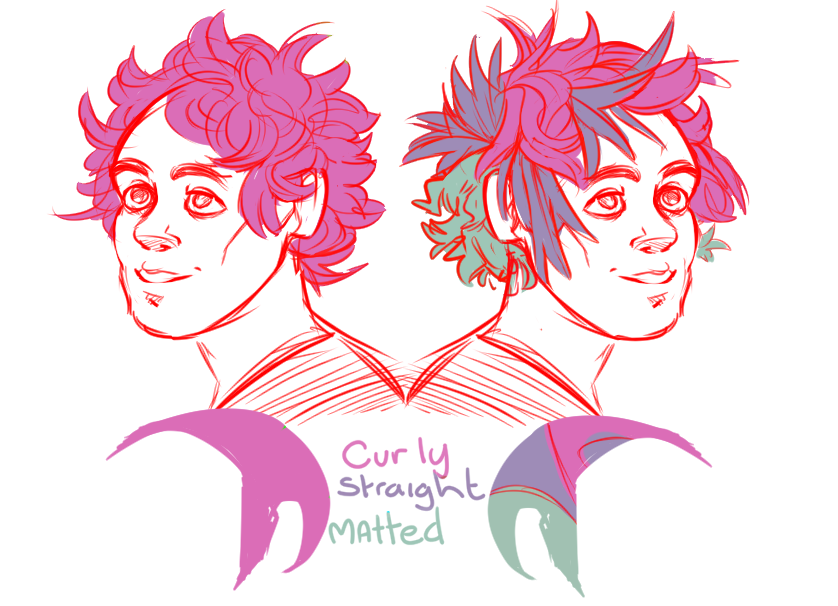
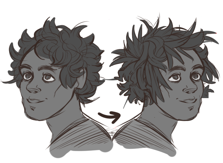
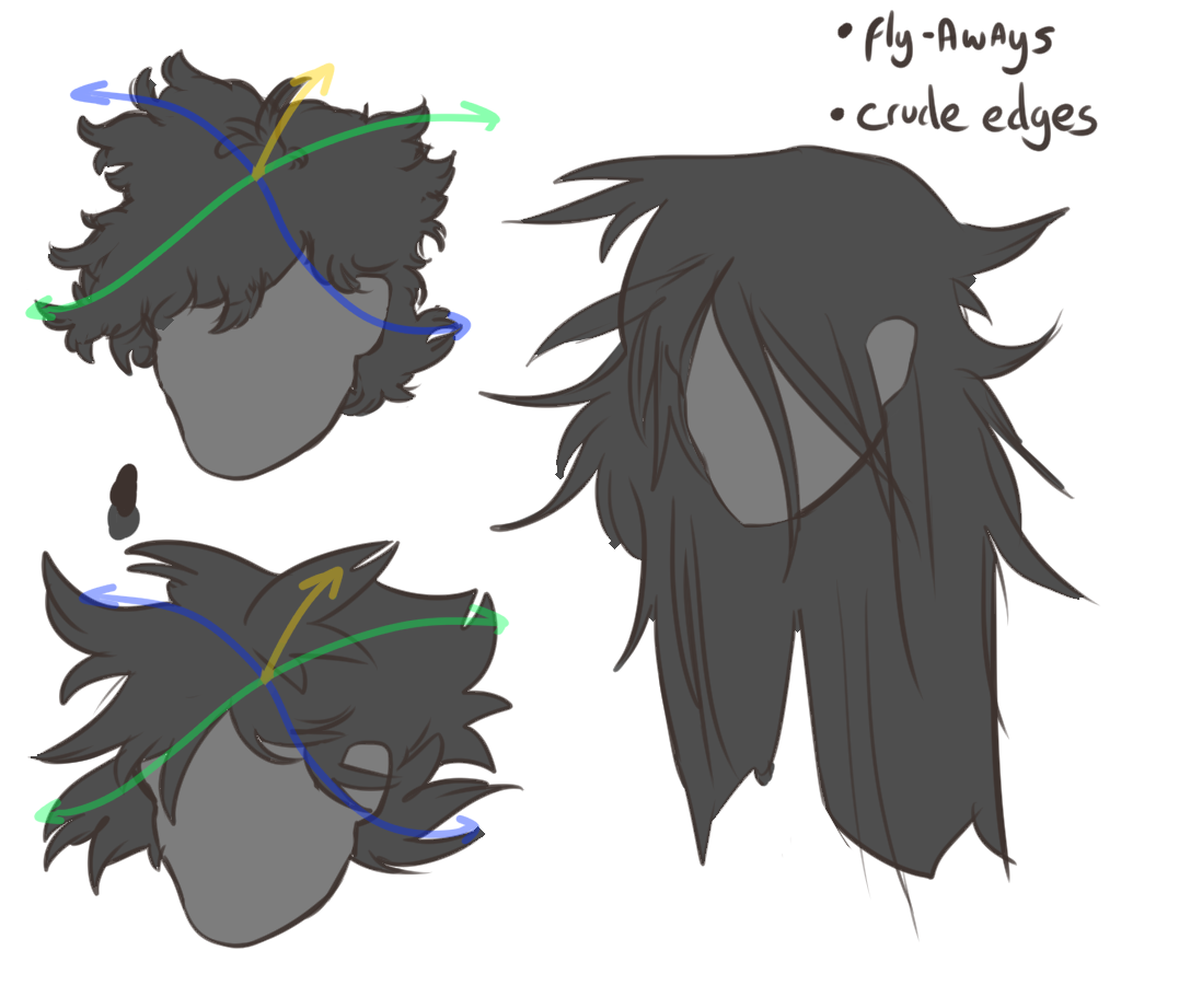
Using a variety of hair textures and abstract hair shapes can help create the messy effect you want;
Here’s an example for hair textures, The left is a full head of curly hair; on the right I made some generals shapes on the base to guide where the textures would change, this could be as smile and complex as you want!
If your character reference doesn’t allow for different hair textures, you can always try building abstract or conflicting shapes out of the hair itself. Long hair which is messy generally has lots of fly-aways you can shape, as well as crude edges or bunching together at random. Short hair is more diverse in my opinion, it depends on the texture and the cut, but I would try to group part of the hair together at random, and direct the shapes to give a sense of asymmetry to the silhouette. The simpler your style needs to be, the fewer general the shapes you may want to build into the body of the hair.
I hope this gives you some fun ideas!
(With Love from Mod Koikro55)
from The Redline Station https://ift.tt/34hJz7t
via IFTTT
so, as a little Friday-fun activity I’ll be on my twitch-account, experimenting with the streaming format by hopping around photoshop and talking about art and drawing with anyone who wants to pop by. I’ll also gladly answer any questions relating to the art of drawing, RLS or just anything creative in particular. Might do a few request drawings too - who knows!
You can hop on in on my Twitch where I’ll be available shortly ( just need to grab a drink from the fridge ), and possibly onward till 11 pm CST. Hope to see some people there! https://www.twitch.tv/wackart
- Mod Wackart
from The Redline Station https://ift.tt/2ORj8km
via IFTTT
Simply put, in order to use a reference image without tracing, you have to make sure that your reference is off to the side instead of directly underneath whatever you are drawing.
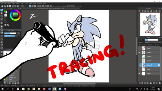
Tracing is when you rely completely, or almost completely, on someone else’s art to literally copy it. Basically, instead of drawing it you go over each line with your own.
Anyone can trace - it doesn’t require much focus or active engagement. You just have to have good enough motor skills to draw lines over lines. When you are tracing, you are not producing your OWN art, you are simply copying something someone else has made.
This is why tracing something and saying that you made it yourself makes so many artists grind their teeth in frustration. You might have physically participated in making it, but the idea, the pose, the concept, were not yours.
Even if you go off and draw something a LITTLE differently - like change the eye direction, or draw the arm a bit lower… if your drawing was directly drawn over the top of another artists’ work,that’s still tracing.
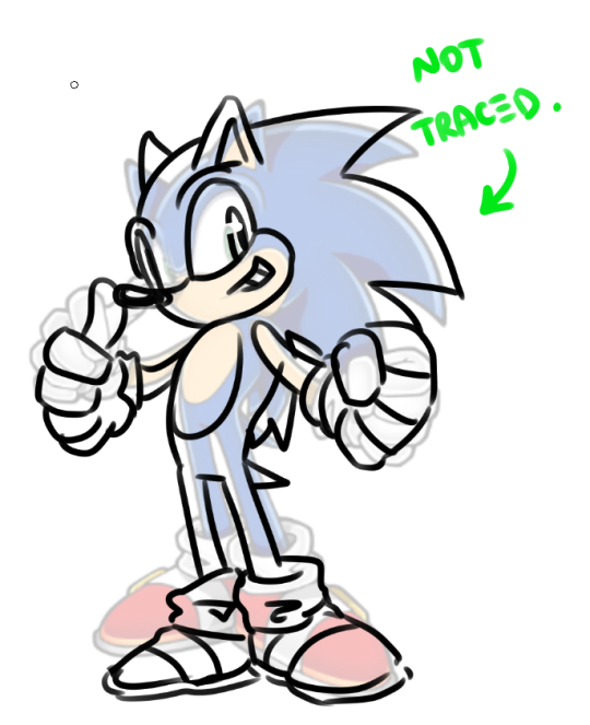
On the other hand, using a reference means having your reference off to the side - open in another window, or in a book beside you, or somewhere on the canvas - and drawing it by attempting to sketch the details as you see them, without immediately relying on the details of the original to guide you along.
When referencing, you are probably still attempting to copy the style or the pose somewhat - but you only looking at the reference, and then going back to the blank space and deciding where to put the lines.
Using a reference image doesn’t guarantee that your art will be identical to the original. In fact, that’s kind of the point. It’s a REFERENCE. but the outcome should be your own art. So maybe it’ll be a little taller, maybe the hands will look different, etc… but that’s all expected.
Now, here’s the kicker, because I know tracing is a controversial topic in some art communities:
Tracing is NOT inherently bad.
Many people trace when they are beginner artists. In some circles, tracing in order to train your hand to remember the motions is even encouraged!
However.
There are two big questions for BEFORE you start tracing something and for AFTER you’ve traced something.
1) Before you traced it, did you ASK the original artist whether or not they are okay with having their art traced?
If the answer is NO, then stop tracing and ASK or simply DON’T trace.
2) After you traced it, do you post your traced art online and try to pass it off as original art? Or even worse, try to use it to make money?
If the answer is YES, then you’re profiting off of the work of others, and that is terribly rude. It is only a step away from posting someone else’s art online and lying by saying that you made it yourself.
I have, unfortunately, ran into many people that thought that tracing art is normal, and claimed that all artists trace for their art. The reality is that it’s not true. Drawing by tracing directly over something else - be it a screenshot, or a photo of a painting, or an illustration in a game manual - is not original artwork, and it is not the same as using it as a reference image.
PS: Sometimes, there’s three-step referencing, in which you first trace over something to study the form and THEN use your traced work as a reference. For example, you might do a basic-form breakdown on a photograph to help you understand the anatomy, and then use that as a reference.
This is a valid way to reference as well - because your final piece is NOT a product of copying something via tracing.
Looking at things is important - we draw not only with our hands, but also with our heads. So strap yourself in, slap that reference image down and go to town! The end result should be entirely yours - even if it’s inspired by another piece. :)
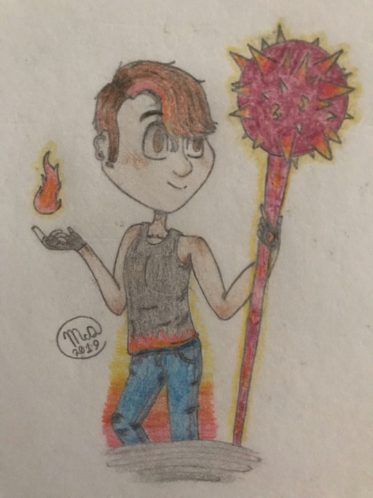
Hey! So this is a character of mine that I drew awhile back, and it was also my first time drawing a male character (due to the fact that I primarily tend to draw female characters, maybe it’s because I’m a female myself?). While I am quite proud of it (since, once again it was my first time drawing a male character-) I definitely feel like there some things could be improved. First things first, that anatomy is just… eughh- (I swear I’m being my own worst critic again aren’t I-) But anyways, on the same note but a different key, I honestly feel that the head to body ratio is preeetty off, like, I’m not exactly a realist, but my style’s not that cartoony. Ya’ feel me? It’s a bit semi-realistic, and while we’re on the subject of anatomy, I feel like the neck is a bit to… thin? I guess, I’m not exactly sure how to do a neck semi-realistically so… uh. Yeah. But I also don’t want it to be super thicc either. So, there’s that. Last thing on anatomy, I feel like he looks a bit to… feminine? Yeah, that’s the word, as I stated before, I primarily draw females, so any recommendations on how to make look a bit more masculine would be helpful. and Second, overall, the face. I feel like the expression just so, lifeless… and it just feels off. I was going for a slightly serious look, with a good bit of sass and a touch of confidence to it (which is not at all what happened, big rip, I was having a bad art day when I did the face), and the eyes, I’ve been drawing them like that for a while, and I’m not a fan of lemon eyes either. Sooo, any advice on semi-realistic eyes? (I kinda got inspired by Steven Universe with the eyes a bit). But uh… one last thing… if possible… Could you have CheckHov Redline this? If not that’s perfectly fine, I know that they’re probably pretty busy with other things such as the Steven and White Pearl Ask Blog, and etc. I was just wondering. Anyways, that should be all! and I’d like to say, thank you for your time! :3 and have a nice day! :D
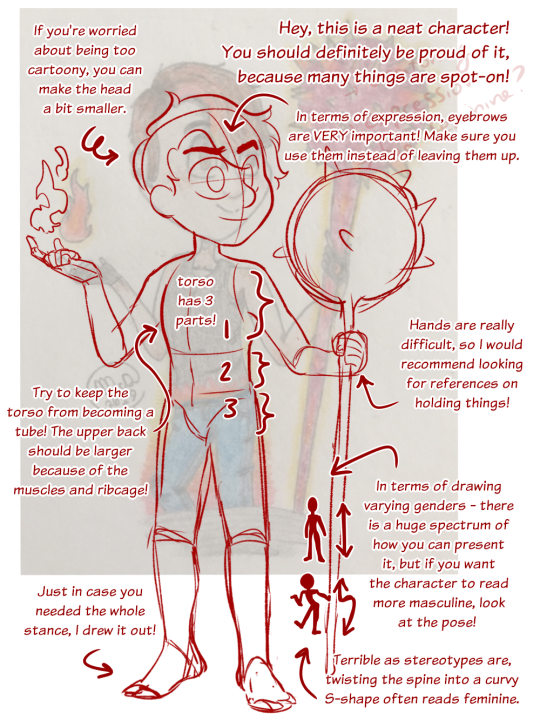
Hey, and thank you so much for the submission! We’re sorry it took so long to get to it!
Overall your construction is good! I think you’ve made the face shape read as quite masculine, and I love all the details you gave!
In terms of balancing a cartoony style vs a realistic one - I recommend checking proportions against a human body to see how much you’re swinging away from the realistic ones of the human body.