I touched on this briefly in a recent redline. Take a look!
https://theredlinestation.tumblr.com/post/632537602134769664/hey-overall-this-was-a-piece-i-was-pretty-proud
- Mod Wackart
from The Redline Station https://ift.tt/3oLe3dq
via IFTTT
I touched on this briefly in a recent redline. Take a look!
https://theredlinestation.tumblr.com/post/632537602134769664/hey-overall-this-was-a-piece-i-was-pretty-proud
- Mod Wackart

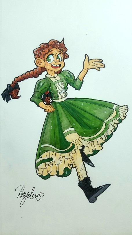
Hi there!! So, this was a redesign for a swimmer-type character of mine that I finished just a day or two ago, and I’m pretty proud of most of it. I was trying to work hard on picking colors that harmonized well, as well as creating a more unique silhouette than he had before, such as adding the jacket around his waist.
That said - looking at it again now, I feel like the design might be a little too simple, so I’m wondering if you have any advice on how to do character design while balancing simplicity/complexity? He’s a pretty bright and outgoing character, though somewhat naive at times, if that helps at all, since I know personality is a big part of character design. That’s the part I’m most concerned with, but I’m also having difficult balancing soft versus hard shading, especially with in the clothing - so basically, it’s all just one big balancing act I’m struggling with. Thank you in advance, and thanks for running such an awesome blog!!

A quick look at the shading, maybe i just have a bias towards harder shading, but i would amp up the opacity on your shading a bit, so that the light is allowed to describe the forms more clearly to your viewer.
As for the overall distribution of the shadows, in this particular piece, i would be a little more generous with the amount. Naturally, if you are having a day-lit scene with no pointed light or shading, the amount of shadows would be much less, but since we are working with a backgroundless piece, we can take liberties and make the light-situation a little more exciting.
The complexity/simplicity of a design hardly ever determines the quality of the design as long as whatever elements are in the design are used to their full potential and with intent. Depending on the purpose of the character in a meta-media context ( whether it is used for a comic, a cartoon or a single illustration ) also determines the quality of the design in regards to how fitted it is to its intended use. So for what it’s worth, this character is by no means too simple. In fact, there’s some elements i would even remove to strengthen the design in its simplicity.

You already mentioned the use of sihlouette in the design, and i can totally see where you are coming from with the coat tied around the waist, and i think in fact- that we should use that specific feature to make for the primary shape of his sihlouette.
^ Above i’ve divided his sihlouette ( + some few key details ) into shapes, and ranked them accordingly to how dominant they appear in the design. Keeping these three rankings refers to the thumbrule of “Large, Medium, Small” which is used sometimes in characterdesigns, but also in composition. And it proposes that if you can strike a visually appealing ratio between the shapes frequency in the design ( Few large shapes, some medium shapes, more small shapes ), your design will come across as balanced.
For this character, we’ll let his shirt, the coat tied around his waist, and his shoes make for the primary shapes, those who make for the bulk of the sihlouette. These shapes are easily identifiable which will make him instantly familiar to a returning audience, and easy to read by his sihlouette.
The knot of the coat’s sleeves, and to an extent the shorts ( though not shown here for clarity’s sake ) serve as the secondary shape. Providing the “medium” shapes. And then finally the necklace and the knot itself bringing the tertiary shapes in, and rounding out the design with a bit of detailing.

When working with shapes, especially those of the Large/Medium kind, i incline you not to be shy in exageratting and stylizing the heck out of the shapes you’re working with, since these are the shapes that will make your character stand out, even if they don’t have wildly intricate pallettes or detail levels ( in fact, in some of the strongest character designs, it is exactly the intentional and precise use of shapes that makes the characters so iconic. For an example like with Sonic the Hedgehog^ )

So as you can see, i’ve taken the liberty to go back to your picture and implemented the shapes we talked about before. In practice, that meant making his shirt baggier, the coat poofier so that it really stood out from his body. And making the shorts and clogs larger as well. This means that all of the iconic shapes won’t melt in with his rather normally proportioned physique. The shapes have now become enhancors of his sihlouette, to such a degree where, if we black the whole thing out - we would be able to tell the individual shapes apart somewhat easily.
- Mod Wackart ( ko-fi )

We have a few posts lying around about how to make poses look more dynamic :) here are the links
A baseline in pose dynamics:
https://theredlinestation.tumblr.com/post/179527681309/hi-there-i-really-want-to-start-drawing-more
The line of action: https://theredlinestation.tumblr.com/post/186778137851/whoop-i-think-this-one-got-deleted-somehow-but
Mapping out poses: https://theredlinestation.tumblr.com/post/187541985300/i-just-asked-a-question-so-i-hope-its-okay-to-ask
Adding tension to a pose:
- Mod Wackart

If we knew exactly what the key for earning a stable income as an artist on the internet would be, let it be known that we would gladly share it with all of you. However - as is, the fickle matter of gaining and maintaining business on the internet is still an enigma to most. So take this advice as guidelines and by no means requirements for success. Afterall, the most important part of launching youself and your business, is that your strategy is tailored to the specific services you offer, your comfort, requirements and standards.
Before you go on ahead and put yourself out there, it is important that you do a bit of self-evaluation first. This is especially important if you plan on offering NSFW services to your potential clients. Knowing what you’ll want to do, and what you defenitely do not want to do is crucial, and will save you a lot of hard or awkward situations down the line.
Some questions to ask yourself:
- How much time am I willing to put into commissions? ( how much time do I have for commissions )
- What are the general themes or subjects I woud like to be ordered to do, how do i make that preference visible?.
- Am I willing to work with NSFW content, and where are my limitations to this content.
NSFW content
If you plan on working with NSFW content, make absolutely sure that you know the laws about that sort of content, both in production and distribution ( and of course, never distribute NSFW content to minors ) in your area, to ensure that you don’t land yourself in hot water.
If you distribute NSFW content, you might want to get at least cursory knowledge on how the distribution of such content works in the regions where you distribute to ( ie. where your clients are coming from ). Just to be on the safe side.
Always be mindful that a client can be a minor posing as an adult;
If the person is not in possession of their own credit-card (pay-pal), or there’s a discrepancy between the account they are ordering from, and the payment information you recieve- you’re better off doubling down and asking them to prove their age.
It is true that there are many ways that minors can forge an adult identity, but if you do your bid to make sure that your clients are of age in being critical of any suspicious information - you will be able to weed out some offenders and keep yourself out of risk of being accused of distributing to an inapropriate crowd.
That said, I have not personally experienced a minor trying to order off of me yet, so i daresay it is still a rare occurence that situations like these crop up.
This is by no means a must-do for everyone. I just find it comforting to know that i have a uniform way of approaching my clients regardless of their standing in relation to me and my services.
When working as a freelancer ( as you will technically be doing when taking commission ), you are your own store-clerk. And like any store-clerk, you are expected to act in a certain way by your customers. Of course: keeping a polite and open tone with your clients is important, but how exactly that polite and open tone sounds when coming from you - is highly personalized.
I’ve met artists who will put on a big, broad smile, and get really involved with their client’s gossip and sometimes even private life as part of their outward business-persona. Nothing wrong with that at all, i imagine they’re going for the “friendly coffee-shop down the street” kind of vibe.
Personally I am more withdrawn when communicating with clients, usually staying somewhat formal and informative rather than getting into too much small-talk with my cilent.
This has nothing to do with who I am in private, where i love sitting around and chatting for hours and hours. It simply gives me a bit of respectable distance from my client and myself.
Not everyone needs to alter their behaviour at all when talking to clients, but if you like it when work-personality is a little bit seperated from private-personality ( esp if you, like me, is a goof-ball memelord with terrible humour who does NSFW art ) I’d consider how I would most comfortably interact with potential clients if i were you, and then practice the approach so that you can easily slip in and out of it.
I spend forever explaining to my clients how things were going to go down when they would order a piece, before i sat myself down and wrote a proper ToS ( Terms of service ).
It took precious time out of my schedule and became a flat out chore whenever someone approached me and i had to explain the process. That’s why i recommend every commercial artist who gets even just semi-regular orders in, to sit down and write their process, terms and conditions out in one document or post so that they can easily shove it at their client when they’re putting in an order.
Saves you the trouble of having to type it up everytime someone asks’ and also makes it easier to maintain a streamlined process, as you are not in danger of treating customers with different ToS unintentionally.


HOW IT’S DONE
In my catalogue i have three pages in my ToS. The first page describes the in’s and out’s of the process itself, by guiding the client through what’s going to happen. Particularly when the client will be expected to give feedback, as my process has very fixed points in which the client will be able and allowed to suggest alterations to their piece.
Fixed amount of alterations vs. scope of alterations
Sometimes a client will want to keep suggesting edits, alterations or additions to an art piece for whatever reason. This can really drag out the workload, and potentially slow down the process of other orders in your queue.
When this happens, it is important that you take a look at the time spent on the piece, and the time spent on alterations. If you feel like the client is continously hitting you with edits that are prolonging the process beyond what you feel is worth the payment - politely inform the client that they are exceeding the typical amount of edits, and either let them know that their current edit is the last they will be allowed, or add a fee to the order to make sure that you are compensated for the extra time. Do not start working on the edit until the client understands the new terms for the order, and do not start until you have recieved any extra payment that you may have imposed.
This may seem very scary the first couple of times. As the client can potentially break off the collaboration with you ( which is why you should charge the baseprice of the commission up-front. more on this later ).
But remember, you are the one with the product - and if you’ve taken it first, the due payment, and most clients would not want to part ways with the two because of a cap on edits. And if they do anyway, you will still have been paid for the time spent.
Your time is precious, treat it as such.
YOUR RIGHTS, MY RIGHTS
In your ToS i recommend that you take a snippet out to talk about the rights of the work produced. Typically, when a product ends production, some or all rights are sold along to the client who ordered. However, if you want to make sure that you can use the material for marketing purposes ( say, as an example image in your portfolio, or as a graphic for sale’s campaigns ) then you must make your client aware of this beforehand.
Personally, i have arranged it as such, that my clients acquire the right to share, edit and redistribute the image as much as they want with no extra fees, but in return, i have the right to use the image for promotional material. As well as repurporsing all unused material in the process, that didn’t result or contribute to the look of the final piece as i see fit.
RETURN POLICY
It might happen that a client is suddenly unable to continue on with their commission process. In a cases like these, it is very important to have a set return policy in place. And it is also incredibly important for the comfort of your clients to know what happens to their money, and their ordered image - should something suddenly make them or you unable to proceed with their image.
For me, after having been through a few unfortunate clients who left me with partial or no payment at all - i have implemented a rather strict return policy that priorities that the work i have already made is paid, in case the client pulls out.
( If i am the one to pull out, the refunding is in most cases the whole amount, and the client still recieves the material made so far and the rights to distribute, as part a little bit of an apology/goodwill incentive )
To make sure that you can give partial returns on payment, you need to make it crystal clear to the client that they are not paying you for an image, but for your time and expertice. By telling your clients this, you are basically adressing that from the moment you sit yourself down and start working on a piece, you have the rights to the payment recieved for it.
Whether or not you want a no-return policy or partial-return policy in place for unfinished pieces is up to you, though naturally - people generally like it when they know there’s a chance they can get at least some of their money back if something happens to go wrong on their end.
Pricing commissions is probably one of the most talked about topics in the online freelancing illustration business. How do you price something just right? Is it too much, or too little.
It really comes down what you feel like you want to charge.
There is of course the debate about artists undercharging clients and thusly going underpaid- which can skewer the clients outlook on the value of an artists’ time. But i’m not here to tout which side of the debate you oughta take.
Just make sure that you feel that you are paid enough for your work. Afterall, if a person doesn’t like what they see and the pricetag on it, they can find someone else.
ALWAYS, have a portfolio available, either in an online gallery or your own website or downloadable PDF - where your potential clients can get an overview of your style, skill-level, strenghts and weaknesses. It is very important to be transparrents with your abilities to potential customers to avoid disapointing them, which may lead to them being discouraged from recommending you to someone else.
Do remember that your pricing will impact the kind of clients you attract. Cheaper commissions prices may attract a younger, less cash-solvent demographic, who seek out the cheaper options. While more expensive pricing may attract clients with a more stable economy, who will be looking to spend money on unique or quality commissions.
I have personally bumped up my prices quite a few times as i’ve cultivated my skills, developed a style unique to me, and gotten a few credentials and a degree. All of this to make sure that I need to land less deals to cover my bills, while also attracting a demographic with a somewhat stable income.
Charge upfront
I will wholeheartedly recommmend that you charge your custommers upfront to prevent either scamming, or them suddenly being out of cash to pay you. If you work with larger clients like companies or the sort - you may be inclined to take pay after the work is done, but with private clients with private economies that are much more prone to being thrown off by life occurences, charge upfront.
If your clients are unsure about this - ensure them that the money is safe and secured on a seperate account ( cause my god, you do not want to start mixing payments for unfinished commissions with your private economy, mark my words - that is a big no no! ) where they will remain in case returns are to be made. Remember, you are paid for your time - not an image.
There are a great number of ways to advertise your commissions. Most important though is that your advertising should state a few things clearly.
- The overall look of the finished product with clear indication as to what will be included in the final image.
- The price
- Your contact info
I’ve seen a number of price-sheet formats out there, but here are some of the more common ones i come across:
Sketch to shading:

These examples clearly layout what each level of polish costs, and is suitable for artists who want to focus their service around providing images that have variable levels of finish.
Composition:

I’ve seen these used mostly with artists who will always default to full colour and shading in their works. These sheets focus on the amount of the character that would need to be shown in the final image. They are primarily targetting potential clients who are moreso focused on having their character drawn on their own - than on having them included in larger illustrations.
The catalogue:
My personal preference is making a catalogue ( link here for reference )
For me; having the freedom to define exactly what kind of commissions i want to do, and being able to price them individually without having to change up my entire pricechart to keep up with the new one. ( while also being able to make individual sales-campaigns on each format ) has helped immensely in vetting the kind of material i am requested to do. It has also made it easier for my clients to not only figure out my pricing, but what my range of services cover. While also being inclined to read my ToS while they’re there.
It is a little bit of a hassle to upload since some platforms do not support this multi-picture format, though for platforms such as tumblr, or deviantart + furaffinity, where you can slot your commission types in pretty easily on its own little tab, they work a charm.

Occassionally, a sale can boost your traffic a bit, and maybe land you some more commissions for a limited amount of time. Just remember to clearly state in your post ( or in the graphic ) when the sale ends. So that people won’t approach you after the sale is over, expecting to get the campaign-price on something.

Part of my PR strategy is posting all commissions i’ve made publicly to the apropriate platforms ( NSFW content for NSFW platforms, etc ). So that the material you produce becomes part of the promotion cycle. People will come to know what your standards are like when it comes to the produced material, and will also get a feel for what other people might buy off of you. Besides, posting client-requested material often means that you ‘ll get a more varied content stream, which can show off more of your skillset than what your typical content would.
Aside from posting your finished commissions, flaunting your pricesheets or catalogue, and other content regularly is important in keeping traffic coming your way. Semi-regular posting will keep you on the front page of your platform for a limited time, but getting involved with groups or forums for specific themes or subjects can help you spread your appeal even further, and perhaps reach the people with the right interests.

I am personally still using paypal for my commissions, in part due to its accessibility for those outside the states. Though - there are many alternatives to paypal that offer similar or lower rates on their transactions, and more freedom as to what services you can peddle over it. ( Stripe and Google-pay are two of the services that come to mind ). If you end up using paypal, remember to tell your customers not to label their payment with any hints of NSFW content that might be in the image - as that has lead to artists having their accounts frozen in the past.
Some also propose that you tell your customers not to include the word “ commission” in their payment note, as it messes with paypal’s internal algorithm too.
Taxes
Important: check the tax-laws and regulations in your area to make sure that you are paying the right amount of taxes on your work, as to prevent yourself from being slammed with a tax-bill later when you least expect it.
I am personally working as a freelancer under a specific circumstance, that is dictated whether or not i earn over a certain amount of money, which means that i have to account for my own tax-payments. I do this by simply splitting my payment in half and saving one half for taxes ( which should cover any tax-bill with some in spare in the unlikely case that i miss filing one payment ), and keeping the rest as income.
This method may not work for you, and depending on your specific region, tax laws will be wildly different - so make sure to look it up for yourself.
No-brainer here, but just to include it: when corresponding with your client, make sure to stay polite and proper ( even if you have a very friendly/outgoing sales persona ). Remember to communicate clearly, and leaving nothing vague - as to avoid the risk of any misunderstandings.
And lastly, give yourself the courtesy of logging out once in a while. It is totally fine to have daily correspondence with a client if the job begs for it, but don’t let them hawk you more than you feel is necessary. It is completely fine to pull the plug and just work for a bit if you are not discussing alterations or feedback in the designated feedback periods.
Let yourself work.
We all have to start out somewhere, but simply throwing your stuff out on facebook might be a waste of effort. If your art is partial to a certain demographic ( like how anthro-art is partial to the furry-community ), then you might be better off pouring your energy into scoping out the different forums and platforms from where your content will hit its target demographic with the least work on your part.
You can always branch out into multiple platforms, later. Afterall trying your luck with new platforms, only to realize it didn’t work out ( or in fact, did work out ) like you thought it would is a stable part of trying to find out where your niché and your crowd is.
Just remember that managing a social media platform often takes a whole lot of time, so watch out for which platforms give you the most interaction and clout, and try to expand your presence from there, as your first priority before foraging elsewere into unknown territory.
And of course, remember to let people know where they can find you elsewere on the internet, if they stumble into your profile, blog or gallery on your main platform.

- Mod Wackart ( ko-fi )

(first off, i’m sorry if this is the 3rd time this comes in, i hope it’s not but tumblr glitched the other 2 times i tried to submit so i have no idea D:`
Hello! I would love to receive some help with this painting. My main issue is composition. I don’t know if this looks okay, or just weird. I haven’t drawn much environments and certainly not cityscapes. I basically just copy-pasted my character from his ref sheet that I was working on into this painting, and I feel that’s one of the reasons the composition is hard to figure out: the character wasn’t made for this painting but for a stand-alone kinda ref. His wings used to be more open but I changed them a bit because I felt they clashed with the composition somehow, but I’m still not quite sure if this is the best I can do with the painting.
The idea for the environment was that the character is lurking somewhere in the city, just outside of an industrial part of the town or something. I wanted there to be that kind of red night light giving the piece some dramatic lighting (since the dude is a villain ’n all), but I ended up cropping the light and the door it’s above out of the picture. Not sure but I think it’s better this way. Originally he was just going to stand in an alley all leery, but then I thought that showing some night sky and building silhouettes would be more interesting. I just don’t know where to place the silhouettes and the character to optimize the composition. I even tried to flip the whole canvas, but I couldn’t decide if it looks better that way or this way. The atmosphere is supposed to be kind of ominous and dark, but have some sorta feel of freedom (thought showing the sky and stars would bring that in). The picture used to be way darker but when I opened the file just now Irealized it was unclear and I cranked the brightness and contrast way up so it would be easier for you guys to see. So yes! I’d wish for help with the composition! And if you think changing the pose is necessary, I’d love to have advice on that too.
Somehow this submission did not glitch, and we only recieved it once :)
By copying and pasting a character directly from another piece, you run into the issue of working with two different contexts. The contexts of which you have drafted your background ( if you happen to do that before pasting in the character ), and the context of your character and where they were pasted in from.
This doesn’t make it impossible to integrate the two into one piece, it just means you may have to allow one of the two to alter and warp around to fit with the other.
In this case, i’ll be warping the context of the background to fit with the character.
First; let me pull out the good old Rule of thirds grid.

There we are, as you can see- i have flipped the character around so that they are now facing away from the camera. I did this so that i could allow them to interact with the horizonline, and guide the audience’s eye to the moon, to where the character is staring as well.
To naturally lead the eye from the character to the moon, i have placed both on each their focal point in the grid. Which will mean that our eyes will draw to both naturally, and if we include enough contrast on the character - we can ensure that they are the first thing our eyes land on.

You may have noticed that i’ve changed the format of the canvas a little bit to give the character more space to breathe. That is, pulling the character further down in the composition, and adding more space for the environment to take center stage. This of course challenges your skill with drawing backgrounds, but sometimes, letting the environment simply speak for itself will make a piece seem more coherent, and also integrate your character a lot more with the world you’ve put them in.
As you can see, i have changed the composition of the buildings just a little bit, to add a kind of “ tunnel” leading from the character and to the moon, which is framed through the use of the negative space left behind the buildings. This naturally guides the eye of the audience through the picture, and connects the moon to the character seamlessly.
Now this reads a lot more like a scene.
- Mod Wackart ( ko-fi )

The scene here is two close characters going for a walk, and the human, Beryl, gets tired and takes a small powernap while Illanipi-the deer-provides a comfy back prop and lookout.
For this piece, I focused on the composition, coloring and background, so I would like to know if there is any way I can improve that, especially since this is the first nature background that I have put effort into. (I’m especially not sure how I did with the human’s posing and if I did the deer alright since I never drew one from the front before.)
While its not something you have to do, could you also tell me how I did on the character design? The human is supposed to be a child of 12 and the deer-creature isn’t a full deer, it’s a deer-shifter which are pretty huge compared to average deer and have a wider range of color.
Thank you so much ^^
This is very charming! I’ll compliment you right away from having two characters interacting in a diegetic environment, it already reads like a scene which can be difficult to pierce together.

First things first, colour. Since you’re working on a pretty limited colour pallette ( what with the deer being close to exclusively white or tan colours, and the human’s pallette being a triadic pallette from what i can see, i’d like to take a moment to give the overal piece a tiny bit of love.
And that can be done pretty easily with an overlaying colour layer. Or by mastering your colours so that they all have undertones of one specific colour.
My only comment for the character designs is that perhaps the girl’s outfit could be simplified down even more to match the detail level of the deer. Though that is really nitpicky and speaks moreso into the overall visual language of the universe than the designs on their own. They’re just fine.
For this winter scene, i gave everything a blueish colour to let the temperature of the scene soak the atmosphere of the whole piece. Now this colour layer is a little rough and doesn’t look super integrated, but im sure you can apply it much better since you have the original file ( and know what kind of mood you want to push with the image ).

To look at some composition, i will be pulling out my trusty rule of thirds grid ( more about composition here:
https://theredlinestation.tumblr.com/post/623115556175888384/can-you-explain-the-rule-of-thirdsthe-golden#notes )
Perhaps you already considered the grid, since it seems the deer aligns somewhat perfectly with the two rows of focal points on the left. I’ll be keeping this disposition but turn the camera around just a bit to reveal a bit more of our characters.

Like this. This angle gives us more context as to how the girl is leaning against the deer. In overal, the angle also gives us a little more to look at, as the original angle of the deer gave us mostly the very front of it, which didn’t describe much about the creature as a whole.
I’ve also added a snippet of a tree in front, just to give us a little bit more sense of depth in the planes of the image ( background, midground and foreground ). You can also add more trees to the background to further enhance the feeling of depth, but that all depends on what kind of environment / forest composition you were looking to do, as the original image shows that there can be quite a bit of distance between the trees, which leads to a bunch of open spaces in their surroundings.

- Mod Wackart ( Ko-fi )
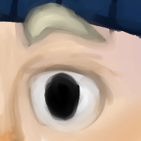
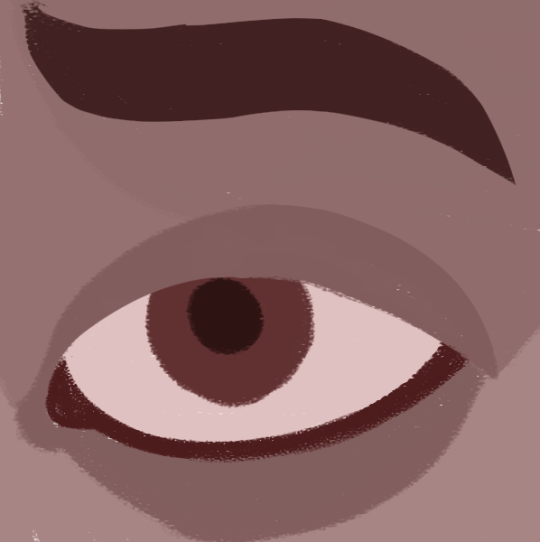
Hi Mods! For ArtFight I made Eyecons (icons hehe) for all my characters by taking the original image, cropping around the eyes, and painting. It was a quick thing for me to do however I don’t like how it looks now. What I’m asking for help with is pretty much Painting Tips and Eye Anatomy help? Thank you!
These are real cute!
I’m not typically a painter, though i really want to get into it - but here’s my two cents on it.
First some eye anatomy:
It’s easy to forego the construction of the eye as a 3-dimensional part if you’re doing semi-realistic or toony art. We rarely ever zoom in enough that the intricate planes of mass that sits around eye are relevant. However, as for closeups like this, we need to address these little, individual and complex parts.
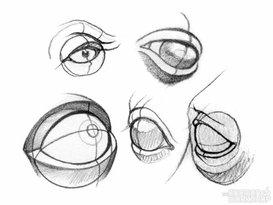
https://www.pinterest.at/pin/462674561717621450/?nic_v2=1aUrbHNU1
Specifically, i’m refering to the skinfolds and fatpads around the eyeball that encases it. In many studies that you’ll find, at least those that focus on realism - you’ll see that the artists draw the upper and lower eyelid as 3-dimensional objects with a straight plane sitting in tangent to the eyeball. Like a little “sleeve” for your eyeball to comfortably fit in. These are going to be important to us, especially if we intent to paint a closeup, as these little “ledges” around the eyeball is where a lot of light or shadow will be caught, which in turn will give the eye volume.
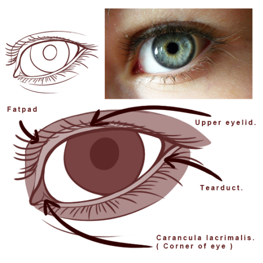
Some parts of the eye are parts we can ignore when doing semi-realism or toony, or when we’re looking at an eye from some distance away. But specific points of interest for us when painting would be the four bits above. The tearduct particularly is interesting since it often catches light, and thusly shows up like the little ledge we talked about in the former paragraph. Additionally, the upper lid, which is seperate from the rest of the brow by a fatpad, which can sometimes also catch the light and stand out like a seperate shape against the fatpad.
Now, painting:
For me; i’ve found that mapping out the base shapes with some degree of precision can help me map out the composition before i even get started with adding volumes, textures and light.
Since i am not super used to painting, i usually do these on top of a sketch or a rough draft.
The colours picked ‘roughly’ match what i imagine will be the final pallette - but as i paint, they change a number of times as i tweak, paint over, and erase while going through the painting.
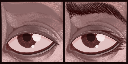
As i work through the piece, i will blend the sections together, by adding a source of light, and letting the light bleed between the mapped sections. While still maintaining certain shapes, those certain shapes often being most visible and “sharp”. Such like as where the upper eyelid pushes up against the fatpad, or the edge of the tearduct at the corner of the eye.
In overall I treat painting a lot like carving a sculpture in wood, you need to bring out the large and crude shapes first, before you can add the smaller, more delicate ones.
Creativebloq.com has another, really nice article about painting digitally and the rough, overall approach to it, all summed up in simple steps. You can find it here:
https://www.creativebloq.com/features/digital-painting-with-photoshop-cc-for-beginners
- Mod Wackart ( ko-fi )

I tried to make a dynamic pose at an angle, but the more I look at it, the more it looked wrong. It was hard to find references for this so I (unfortunately) just didn’t use one. How do I make it look right?
This looks SO cool! And to your credit, I too had to go through this multiple times before i was satisfied with the redline. It’s a very particular pose in a very particular perspective that takes a lot of work to get right in the construction phase. Though, by the virtue of your style, your original piece actually gets away with it pretty nicely without looking that off.

The most “erroneous” thing i found about your drawing was that the character’s physique itself looked a little flat here and there, due to a lack of curvature of; for an example, the top of the thigh. Which is what gives us the impression that something has volume in perspective. Same with the fingers, who were posed in such a way that it looked like they weren’t really in perspective. I suggested a new pose that takes advantage of the exciting angle you’ve got going.
In overall, not that much to “correct”, you already have a pretty good piece, that just needs a few tweaks here and there to read even clearer.
- Mod Wackart ( Ko-fi )
Hello dear mods!
I am currently working on quite the large piece that I want to turn out well, so I wanted to see if you may be so kind as to help me out a bit!
Although I am quite happy with the general anatomy of the human part (at least I think it’s correct?), the wings are what trouble me most, since I want them to be a mix of bronze and black dragon wings, based on DnD dragon models. The folding is what hs me in a bit of a pinch, since leather / skin wings are harder for me personally than feathered wings. Any tips on how to make the folds in thos or a similar perspecticve look better / how to make the composition more interesting?

If it is of any help, the sketch is this rough since I’m painting over it directly later! Thank you in advance :>
I did a post about basic dragon wings earlier, it should be somewhere on the masterlist, but here is the link. This might give you pointers to general anatomical tips and tricks on the matter:
https://theredlinestation.tumblr.com/post/185506043050/do-you-have-any-advice-on-dragon-wings-my-best
We are going to build a little bit on top of this post, since the bronze dragons appear to have more “fingers” or falanger bones than your typical wings.

We’ll be combining the anatomy of the common bronze dragon reference with the reference we have from the post. As such, the extra falangers ( those not connected to larger pieces of membrane ) will be positioned as extra “fingers” similar to how a human hand is compositioned. So, between the upwards-pointing “thumb” and the remaining three “fingers” on the “palm”.

Something like this.
Note: i have also added a secondary bone to the “elbow” of the wing. This also comes from the reference above. It gives the wings a bit more shape, and i imagine aids in maximizing surface-area in flight, as the extra bone makes sure that the membrane between the shoulders and the “palm” stays fanned out.

Now these two fingers are what can make folding wings, which is already a somewhat confusing endeavour, even more complicated, since they would technically be overlapping the other fingers when folded. At least in many poses.
A way to think of the folding of wings, is to consider them similar in structure to your wrists and hand. So just like how a fabric draped over your hands would bend with your hand, so would a membrane fold in on itself.

As for the composition of the piece, we don’t have much in way of background or environment, so i recommend you playing with the empty space. Give the character some space to breathe in either direction of your choice. And note how each choice gives a different feel of the piece all-together.
While i don’t really have a preference here, ( as a head-on image of a character can provoke a certain feeling in the viewer ) you could experiment with the orientation of the camera. Typically, ¾ angles are a bit more universally appealing, but it really all comes down to what kind of feeling you want out of your picture.
- Mod Wackart ( Ko-fi )

Hi! I decided to submit this piece I did a few months ago. I’m altogether pretty proud of it, but I did kind of give up on the shading. Shading hasn’t ever been my strength, and I’m wondering if you could correct my shading here and tell me how to make it altogether more interesting? The fins, which are supposed to be translucent, are where I had the most trouble! Clearly 😅 Any suggested anatomy tweaks are also welcome!
You should be proud! This is a very nice piece.
Let’s take a look at the light and shadows first.

On the original piece, it looked like you weren’t entirely sure where the light-source was coming from ( the tail pointing to the lower left corner as a lightsource, but the ears to the upper left corner ), which would easily have thrown you off when going in and drawing in shadows.
While it is possible that a scene just has a broad, homogeneous ambient light that won’t leave a determining “direction” in the source, I’ll always recommend adding a fixed, directional light.
Here, i picked the upper right corner. This naturally means that most of the shadows will sit on the left side of the character.
I personally like to include shadow in any folds which planes/depths face the furthest away from the camera/ sits deepest in the fabric/membrane/whatever, this gives a sense of depth and volume to the material you’re trying to shade. That is why you see that there are these triangular shadows on the fins, even if they are technically closer to the lightsource than the likes of her hair, which recieves less shadows.

Your problem with the transparent fins has a very simple answer. If something is transparent: it means that you will be able to see what’s on the other side of the transparent material to some degree. But in your composition, there is no background, thusly there is nothing for the transparents material to be..well..transparent with.

The cool thing about merfolk and other serpentine creatures is the flexibility that comes with their anatomy. Especially in a context as weightless as merfolk’s home: the sea.
I would take advantage of the fact that you can twist and bend the tail at your leisure. Making it curve in and out to give a more dynamic feel. Bonus points for making the torso turn, bend and twist a little bit as well.
- Mod Wackart ( Ko-fi )

Hey! Overall this was a piece i was pretty proud of but there’s a couple things I can see wrong with it. For one I didn’t really know how to posr the character or what to else to put in with him. The character is an older man who loves plants. I guess what i’m asking for help with is composition or how to make the piece feel more ‘complete’ and like they’re not just floating in the air? Idk if that makes sense i just woke up. Other thing was I didn’t know how to make his hair look like it was greying and it was hard to find anything on how to do that. Thank you!!
You should be proud of this piece! It is very nice.
As for a way to make this piece seem more complete, allow me to stoop to the first trick in the book for adding visual interest to a composition: Interaction.
The moment you have a character, and a prop, environment or another character, adding some kind of interaction between the two will immedieately make the piece 100x more interesting. An interaction doesn’t have to be complex. An action will always rely a sense of storytelling to us regardless of how simple or complicated it is.
How is the character relating to this object? What is the character doing with said objects? - and is there a specfic way they do it?
All of these aspects relay information about the character, the given situation, and the importance of the object they are interacting with.

I allowed the character to simply touch the plant. Daintly so in fact. Giving a sense of tenderness and affection between the plant and it’s owner/cultivator.

Now for greying hair, there are certain patterns to which greying hair usually appears. I’m just going to show you the two most “ common “ ways of which greying may appear.
Racoon refers to the greying that happens somewhat locally to a few locks of hair, but later spreads into the full mane of hair. This is a trait commonly seen in character designs, and by all accounts also the design-choice that might be easier to keep track of if you’re doing motion graphics, or simply intent to draw the character multiple times over.
Streaking is a much more sporadic kind of greying, that appears as grey hairs interspersing between locks of naturally coloured hair. The distribution of grey hairs are usually a little more even in streaking, though may still localize around certain areas. This can look more like a silver “speckle” than that of the racoon greying.
I hope this helped out!
- Mod Wackart ( ko-fi )

Hi mods! I was hoping you’d be able to help me with some overall scene composition and dynamic posing here for the witch. I was trying to get a fun, sort of “off-kilter” or playful vibe to this picture, but I just feel like it’s a bit stiff. Any help would be appreciated!
Also, this picture is from a switcharound meme/collaboration (with permission), so I’d appreciate if any notes are made in regards to the sketch in particular! (You can find that here, if it’s easier)
Thank you so much! ^^
This is really cute! The palm-broom is a really nice touch.
The tilted camera angle is already providing a bit of a dynamic look to the picture, but let’s see if we can push it further.

The first thing you probably noticed i did was turning the character to face the camera partially. Like this, we can make use of perspective to enhance the “dynamic feeling” of the piece. Having something move between the planes of the picture ( background, midground and foreground ) will almost always make the piece appear more dynamic, as it leads our eye in and out of the depth of the environment.
As such, i’ve also added a bit of momentum to the palm-leaves, that are now all pointing in the same direction-ish, to indicate a flow of air or an arch of movement. In this particular case, it would appear that the character is descending on her broom.
The hat follows the same momentum here, which further emphasizes the sense of flow.

As for the background, I would keep it mostly intact, but add a layer of perspective to it by having the palm move in and out of the image’s different planes, just like the character.
You can use the curve of the palm-tree to make for a framing device for the character and her pet familiar. This will put your character in focus, and easily lead the audience’s eye to the quirky duo.
- Mod Wackart ( ko-fi )

Hello!!! I was wondering if I could get some feedback on the lighting and movement of this piece, I want It to be dark and moody, but still be able to see some of the details. I also wanted to convey energy in the pose but I feel like it looks too stiff? General feedback would be appreciated as well!! Thanks so much!!
The pose itself is already pretty dynamic, but here’s a few pointers to how to push the flow and movement of the character itself, along with some slight alterations to the wiring that’s suspended around them.

As you can see, i’ve tried to avoid using 90° angles, ( as in altering the position of the left-most leg, by pushing it backwards ). Often 90° angles can come across as stiff when compared to stumped or more acute angles. Same reason that I have pushed the bend of the arm that isn’t grabbing the guitar ( of which, btw, I’m not sure if this is intentional or not, but as a guitar-player, i need to recommend you to implement a strap to the guitar, as holding the guitar like the character does in both my alterations, and the original picture is very, VERY straining, if not impossible ).
As you can see i’ve also added larger arcs to the wiring that’s floating around the characters. This is more of a personal preference, but i feel that these larger, smoother curves reads better - and thusly gives an overview of the composition much quicker.

As for the light - it was already pretty damn good looking. I just have a few notes.
First of all, i would darken the background ( and the image in overall ) a bunch more, so that we can get those really stark contrasts from the parts exposed to the dramatic light on the floor.
I also went over the heads on the wiring on the left in the image, which seemed to have been recieving light from above in the original picture, when the main source of light - in fact, comes from the floor.
You will also notice that i’ve added a gradient of green light that’s glowing on the floor. This bolsters the effects of the floor-light and gives the overall image a strong sense of a cohesive colour-pallete, as the green here is plentyful enough to balance out the purples on the character.

For this particular piece, i’d recommend playing around a bit with highlights. A highlights of bright green or yellow ( like in the example above ) can give your scene an extra dynamic feel. I would limit my use of to the areas that should grab our attention first - such as the face.
Experiment a bit back and forth and see what you like the best :).
- Mod Wackart ( ko-fi )
Hey fellas! So recently I’ve been trying to take on a more cartoon style when drawing. I’ve been doing my best to do more unique shilloue...