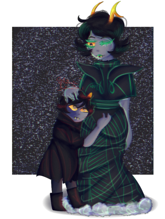
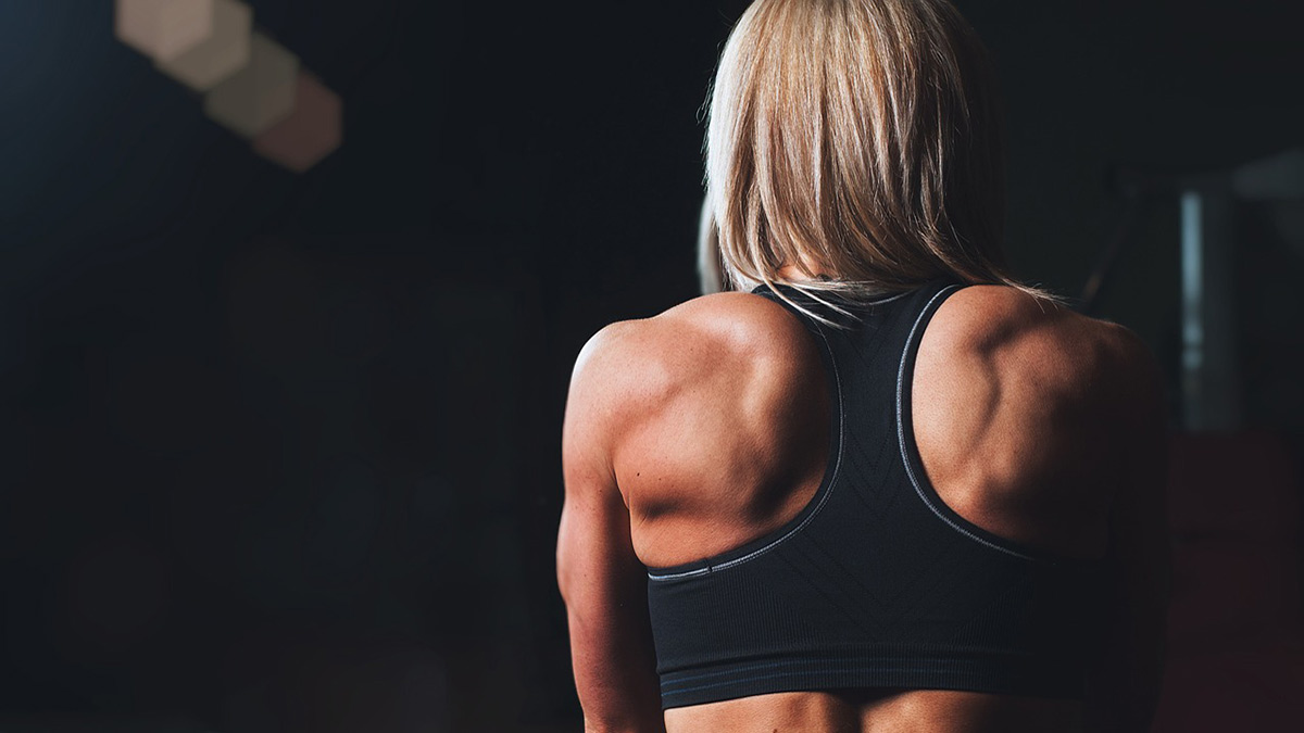
Hello! i would like some help with mainly the anatomy (specifically hands) and the shading! And if its not too much to ask just a few tips on digital painting/lineless? (Characters are from Homestuck) Thanks in advance :3!
This is really cute.
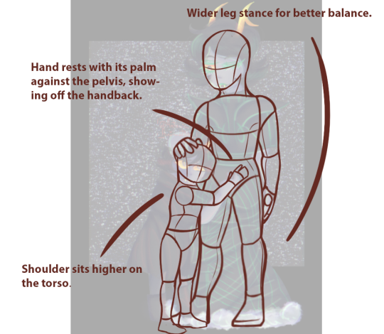
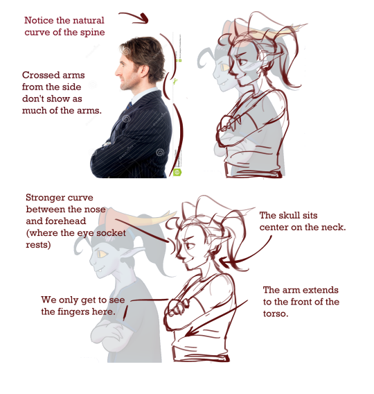
I took a glance over the anatomy. I had to make an assumption on the leg stance since the supposed adult troll’s lower half was obscured by the dress itself.
Based on the dent in her dress I could only assume that one leg was nudged underneath her somewhat. I recommend straightening this leg out in order to balance her better. If the intent was to make her lean in over the child, I would recommend bending her at the back instead of the knee.
I wasn’t certain if the head-size compared to the body was a stylistic thing, but I assumed a much, what with the general proportions of the head was rather toonified as well ( large eyes, small mouth ). If you want it a little more realistic looking, and I’ve misunderstood your intent with the head size, I’d shrink it a bit. This could also make your adult character appear older and physically more mature.
I flipped the kid’s hand to rest flat against her pelvis. In the original picture, it seemed as if he was grasping for something since his fingers crooked upwards. generally, when we rest our hands at something, the palm will sit flat on the object/person, and the fingers will splay out from the centre of our palm.
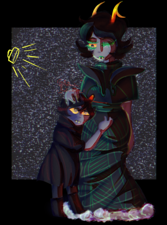
The source of the light was not super consistent in the original drawing ( there was a lot of light coming from the centre of the image, as well as something coming in from the left near the adult troll’s face, and one directly to the right of the child’s face ). So I picked the one that sat to their left and worked my way from there. Working with light coming in from the side is generally easier to start up with if you’re just getting into shading your pieces. That way you can divide your characters down the middle ( or 1/3rd, 2/3rds depending on whether the source sits DIRECTLY to their side or a little to the front or back ), and shade that entire chunk in. Working from there, you can “carve” out your lights into the shaded half, following the form of your figures.
Starting with large primary shadows is easiest, so don’t go into smaller, finer shadows before you’ve blocked out the big ones.
We are still working on a comprehensive painting-post for you digital painters out there. But i can link you up to a couple of sources that can give you a few tips and tricks to the art of digital painting.
CSP can make professional illustrations, comics, and animations with way more features than Sai (including the world-saving perspective ruler). CSP also has tons of brushes, textures, 3D resources, and tutorials created by the community which can be found, downloaded, or accessed directly though the file/resource manager Clip Studio. While the Pro version is everything you need, the EX version will let you manage documents with multiple pages together, export in professional formats, and create long-form animations (Pro is limited to 3 seconds).
from The Redline Station https://ift.tt/2QWBQZx
via IFTTT
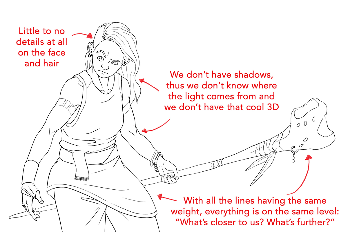
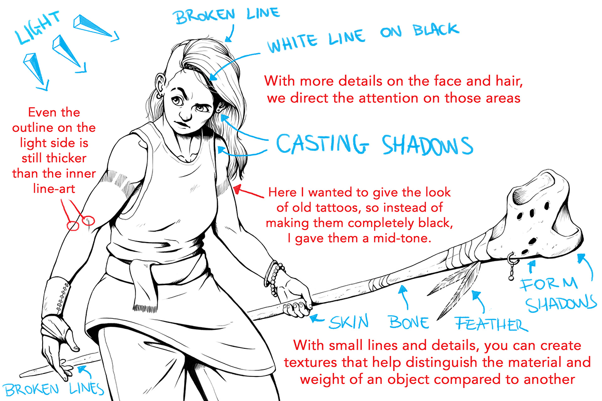
The cool thing about line-art is that, if you know the tricks, you can make a black and white drawing look good without the need of colors!
The weight of a line can express different things, like lighting source, depth of field and the weight or material of a specific object.
(Since Tumblr is being a whiny little baby, if you click on the pictures and they don’t zoom in, thenright click > open in a new tabthat should work!)
So let’s check this first drawing I did with a rather flat line-art:
As you can see, all the lines her have somewhat the same weight. The drawing is nice and clean, yes, but there’s just no personality to it. Of course, it’s not forbidden to use this kind of line-art, but it’s more appropriate for things like animation (check out cartoons like Adventure Time, or almost any anime)because of the simple and clean lines.
Now, let’s check the same drawing, but giving those lines the thicc-ness they deserve!
LIGHT/SHADOWS: When you’ve established a light source, the lines closer to the light source will be thinner (the part being “hit” with the light) and the lines on the side away from the light source will be thicker (the “shadow” side).
DEPTH OF FIELD / PERSPECTIVE: The object closer to us will have a thicker line-art than the ones behind it. This also helps to separate objects from one another.
OUTLINE/ DETAILS:Small details (like wrinkles on the face or scratches on the staff) will always be thinner than the outlines.The outlines being thicker help again with separating objects or characters from one another in the drawing.
MATERIAL: Depending on the material an object is made of, it can have thinner or thicker line-art than another, thus representing the strength, elasticity, softness or fragility or other characteristics of said object.
WEIGHT: The heavier the object, the thicker the lineart will be, and vice versa. Look at the feathers compared to the staff. The staff is made of bone, definitely heavier than a feather. You can see I even interrupt the line-art of the feathers in some parts, to give the feeling of “light” even more. Same as the hair: a lock of hair is heavier than one single hair. Also here for one single hair, the line-art is interrupted.The human brain is able to make out and finish the shape of something even if we don’t see the whole thing.
SEPARATING ONE OBJECT FROM ANOTHER:The main ways I use to give this effect are:- The object on front has thicket outline- The line of the background object doesn’t touch the line of the front object- Using white lines where there’s more black
Here I found other tutorials that show more examples!
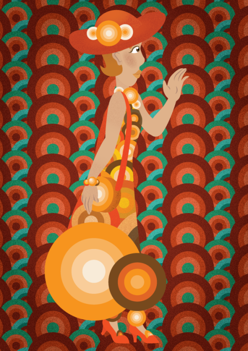
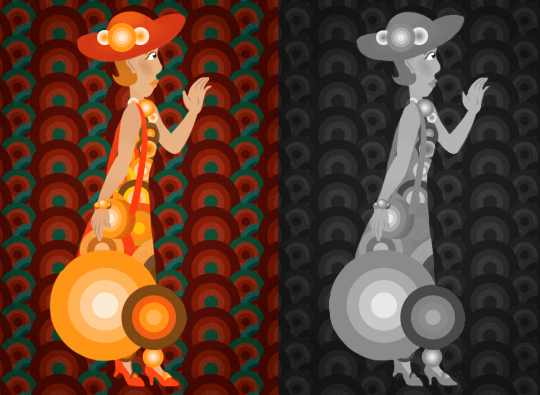
So this is part of a Fashion Illustration Series called “Flat Fashion” that I worked on a while ago. Although the concept is fine, I’m not sure it looks like a fashion illustration enough. Care to help?
P.S. The reason why this is called flat fashion is because they’re vector illustrations and I want to emulate a similarly flat illustration style.
What is Fashion Illustration
I’m pretty sure OP knows what FI is, but just to allow everyone else to catch up.
So I wasn’t actually sure what Fashion Illustration actually entailed, so I went across my campus to talk to some of our Fashion Designers and here’s the rundown I got.
Fashion design is one hell of an old method used to convey ideas through the visual medium of drawing/painting/sketching. They mentioned that there wasn’t really a formula or specific rules that you had to adhere to. Of course, there were norms, but it all came in the context of your project, and what would be required for the final product.
In that regard, I guess I could compare it to general concept art, more specifically concept design. There is no one way to do concept art or design, it is considered successful whenever you deem you have the information you ( or your external partner ) need to fully understand our idea. This can mean various stages of polish.
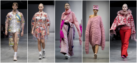
HIGH POLISH / LOW POLISH
The image beneath is a collection of designs which i would consider “high-polish”
What we mean, at least in the concept art world- a visual project with “high-polish”, means that it leans heavier on the presentation being aesthetically pleasing and communicating clearly, rather than catching the more abstract idea that lies behind it.
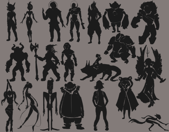
Low polish is often comprised of very rudimentary sketches, paintings or scribbles. In many cases of world-design or character design, you ‘ll see these silhouettes. The quick and often crude, and most of the time they don’t adhere all that much to proportions or anatomy. It’s merely there to flesh out the shapes and sizes that any project will boast. This is the startup-phase of any larger project, and it’s all about speed. You’ll see artists pull out all the stops to crank out as many ideas in as short time as possible.
High Polish is the step beyond the initial concept phase. And incidentally, the stage where things become a lot more marketable as well. still, you can expect artists to try and cut corners anywhere they can in order to preserve speed.
High polish communicates the idea on a slightly more refined basis than the low polish depictions would. Why?
Because from here on out, it is possible that one of these designs will be greenlit and send along to a modeller ( in the fashion industry, this could be a seamstress or a factory ), that would use the image to produce the actual product off of. And depending on the complexity of your design, it is likely that your piece would need to be more or less High Polish in order for someone else to be able to read it properly.
Incidentally, a lot of the “leaked concept” art you see outside of a game’s artbible ( artbooks too, in some certain cases ) are not actually the ‘concept’ work, but promo-art. Which is concept art that has been reworked and touched up to appeal to the masses, and to generate hype.
( Just a fun fact for you guys who are looking into concept art as a career, whether in games, movies, fashion, whichever - the real, rudimentary concept art is rarely published outside the company )
I think your piece can be considered somewhat high polish. Or at least very close to that classification, as there is a lot of information about the pattern itself, along with the accessory and the overall colour choice. The only things missing would be the seams of the dress or the exact way by which the large circles at the bottom of the dress would attach to the fabric: Technical details so to speak.
HIGH CONCEPT / LOW CONCEPT
This is my favourite part about discussing Haute Couture with people cause they get so mad. ( And where you get to see some of the stuff the super-cool fashion design students do at my school )
If you’ve never been into fashion, and you happen to sit down and watch a show. You will notice that some outfits definitely seem more realistic to see on the street or in the shop window, than others.
If you’re the type, you might even get upset that someone would pour money, time and resources into making these wild and sometimes childish costumes that crop up as Haute Couture.
What a lot of people who get unreasonably mad fail to realize is- that Haute Couture is not meant to be taken to the streets. It is merely experimentation. It’s not meant to be mass-produced or celebrated as “pretty clothes”. It’s meant to showcase techniques, combinations or aesthetics that other designers can then get inspired by- and then possibly do a more moderated version of, that can -perhaps- be sold in shops.
In the design world ( including Haute Couture ) we primarily talk about two classifications when it comes to how abstract a product or idea is.
High Concept and Low Concept
Low concept is typically ideas that would sell well as a product in a store. They conform to the usual typical norms and garner general mass appeal. It’s not usually dotted with odds and ends since it typically comes down to the display of craftsmanship rather than expressing wild ideas.
High concept is where you typically see people gnashing their teeth in frustration over the assumed hubris from the artist/designer. It doesen’t neccessarily have to boast any complex and sublime craftsmanship methods or adhere to any sort of norm either. It’s there to display an idea or a rebellion with norms.
I’d probably regard yours as more of a “high-concept” as of right now. Since the picture can be considered rather abstract, and closer to conveying the theme and idea of vector-like flat shapes as a whole, rather than how the garment would actually fit around the body, and how it’ supposed to be produced ( seamlines, textile types, etc ).
So, A “High-polish” somewhat “High-concept” is what I‘ll classify your drawing. This is perfectly fine if you want to keep your idea as more of an illustrative series that can possibly inspire someone else to bring the product along. But if you want it to be considered “viable” to outsource to a seamstress or factory - you’d want to include more technical information. ( as I mentioned before, the seams, the textile, attachment. etc). I would also be curious to see a frontal view of the dress in case I was to consider this as a template from which a seamstress would work off of. But the straight profile-aesthetic does contribute to a very stylistic feel.
One thing I might point to in terms of the draftsmanship on the drawing itself is that the character blends a little bit with the background. I absolutely love the colours and the pattern in the back, but I would darken or lighten it a little bit to make sure that your character would stand out clearly on top of the background. This can be done by valuing your drawing ( bringing it into Greyscale, and then adjusting the dark/light on the composition until each element is clearly distinguished ). Then either reapply the colours or take use the grey-scale version as a reference to retouch the original.
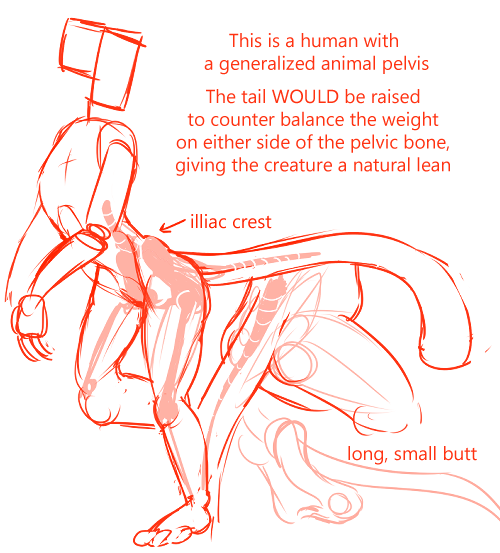
First of all, there’s no way to know what humans would really be like with tails, as probably the only reason we walk upright (and developed as a species the way we did) is because we lost our tail; which was a side effect of changes to our pelvic bone.
If you want a scientific answer, if humans evolved with big’ol tails then we’d have generally the same elongated pelvis as other tailed animals to support one, and if we did walk on two legs then we’d probably walk similar to dinosaurs/birds instead of humans (so we’d probably walk on all fours instead because that’s dumb).
It’s impossible to give the human a structural precedent for having a tail AND preserve the iconic shape of the human’s best evolutionary feature– the gluteus maximus – which was probably the whole point to begin with.
If we retroactively fitted a tail onto a human pelvic bone, however, the tail would be extremely unimpressive, thin for sure and probably very limp if it’s long. You’d be able to walk like a human but your tail would have limited dexterity only.
But we’re artists, not scientists, and therefore the answer to your question is entirely up to your imagination!
I decided to draw a human with an animal pelvis bone for an example;
I bet you could make some really interesting humanoids with different species of pelvis bones and tail sizes! My only advice is that, however you decide to make the tail, think about whether your character is balanced and take a look at references for the species you’re going for /w/
We all know that, in general, knowledge of anatomy will let you make functional, good-looking art, but I don’t want you to get so mechanical over something that could literally be anything that you could no longer be creative. Have fun with this and try not to think so hard about it, just know there’s so many possibilities are out there and creative experimentation is just as important as anatomical knowledge about animal butts (/3/)
(With love from Mod Koikro55)
from The Redline Station https://ift.tt/2OySdZ8
via IFTTT
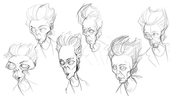
This is a tough skill to develop! but with some hard work and research you’ll be able to do it!!!
My recommendation is to study professional caricature! Even if the end goal isn’t to do exaggerated crazy portraits of the the celebrity, studying the art form can help you learn to apply those concepts more subtly in your own style!
The key element of caricature is studying a persons face and looking for what makes them unique or different from the ‘standard’ anatomical face model, eg how do their proportions stray away form the ‘rules’.
once you take note of these things experiment by exaggerating them in different ways through quick thumbnail sketches
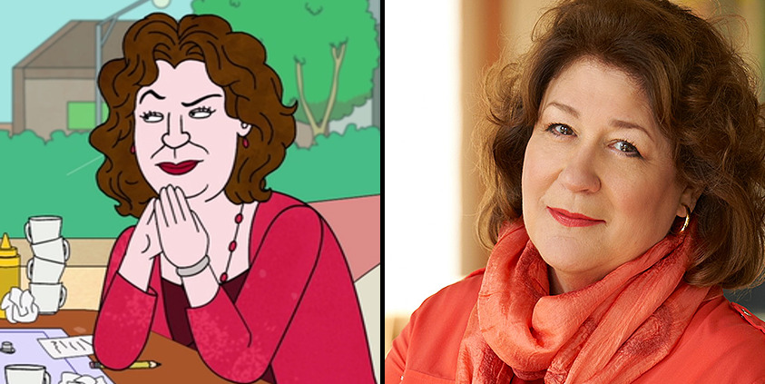
Once you have done this research you can apply it to your style and design the celebrity just like the design team on Netflix’s BoJack Horseman designed Character actress Margo Martindale! She and many other celebrity cameo’s on the show look like themselves but also like they belong in the world of the show!
The final thought I want to leave you with is: don’t worry too much about art style or let it get in the way of learning new ways to draw. There is a lot of pressure on the internet to find your own unique art style and have everything be consistent all the time but this thinking can actually get in the way of your artistic growth if you focus on it too much or to early.
I Personally dont care about consistency at all in my art, I design the style of the drawing based on the project (eg. am I going to animate this character, is it an illustration, what age group am I targeting? what Genre? if you want to see examples of this I have plenty on my instagram)
I have a lot of feelings on the topic of art styles but I dont want this post to be essay length or take me a week to write so please watch this video by Kesh on youtube about it : Stop Trying to Find Your Art Style He talks about this issue way more clearly and concisely then I ever could!
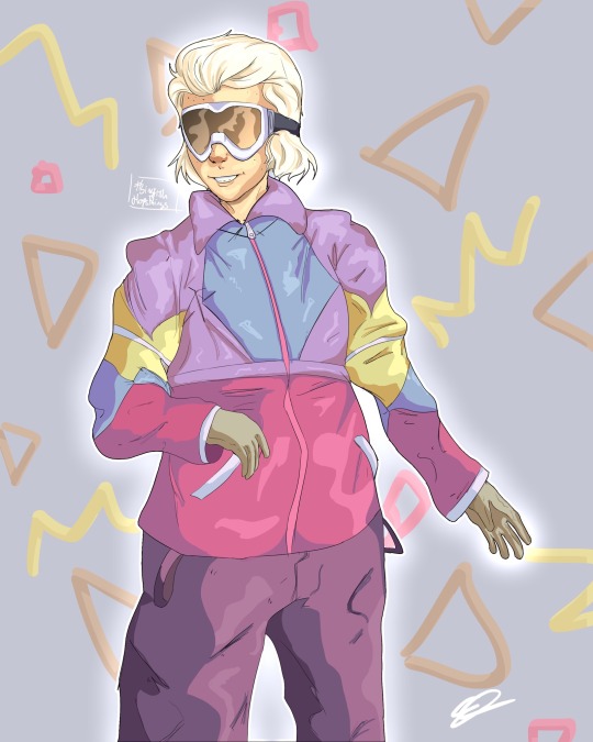
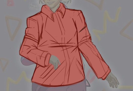
With this piece I was focusing on the lining which I think went pretty well and I do like the over all piece, but if possible it’d be cool if I could get some help with the jacket? Something looks quite off about it, maybe the sleeve? (it’s supposed to be a windbreaker) the highlights also don’t really look as good as I’d hoped, if you could give me some tips on making them look more seemless or less out of place maybe? Thank you!
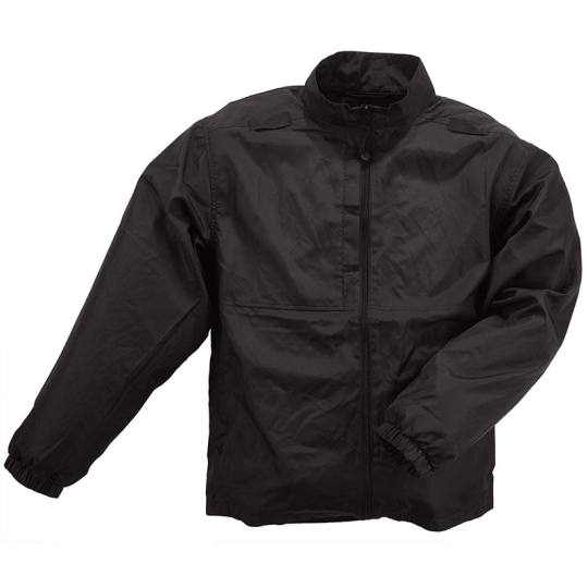
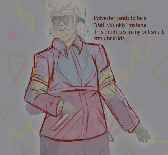
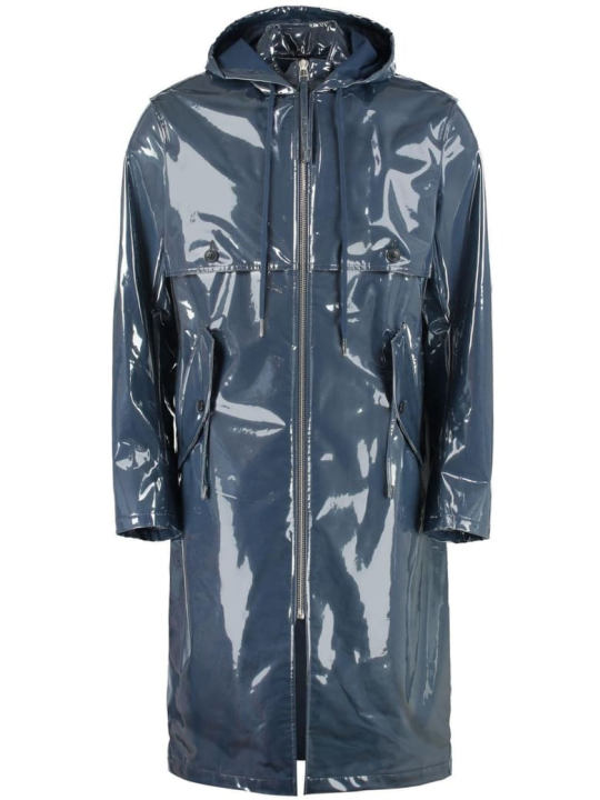
Windbreakers are rather crinkly material. Not very flexible, so the lines forming over a coat like this are usually pretty geometrical. ( See the triangular folds on the reference above). You’ve already made note of that around the shoulders and sleeves. However, with the material being as thin and “crisp” as it is, I would make the edge of the outline of the coat look a little bit sharper/pointier.
Personally, I think less is more in terms of textile folds in the drawing. That’s why I’d probably focus my folds and wrinkles around points of compression, as it gives a clear image of where the fabric is being tugged in or twisted. Thusly, I haven’t drawn in that many lines on the coat where there is little to no tension ( chest, left side of the lower quadrant of the torso. arms minus the crease of the elbows ). This vetting also makes sense with the detail level in the rest of your drawing.
My main points of interests being the nook of the elbows, the armpits and the slight stretch that is going on in the dent between the character’s left side and arm, as he is turning ever so slightly in the image.
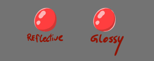
In terms of light. Polyester ( which is typically part of the blend of a windbreaker, along with nylon ) is relatively reflective. Meaning that it’ll receive light and spread it through what we in more digital terms call ambient occlusion ( the spread of light on an object from an ambient light ).
This fabric blend doesn’t typically boast highlights unless the textile is coated with some type of glossy overlay ( like some raincoats are )
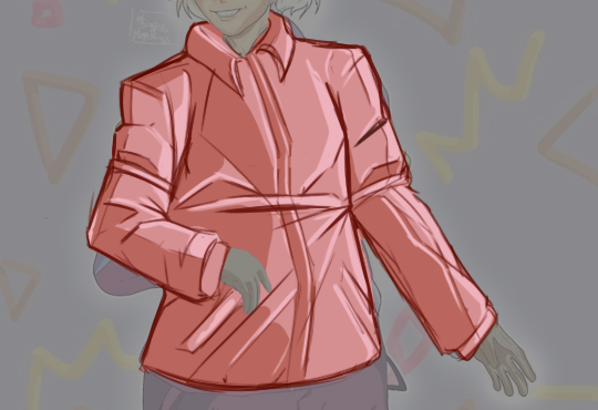
However, if you want to add highlights for the aesthetic, then I recommend you first laying out the ambient light across the figure. In your original drawing, the source of light was included as a mid-tone. The direction the light came from was not abundantly clear to me, so I followed the shadow from the coat’s midsection and build my way from there ( somewhere slightly off-centre of the character).
Adding highlights after localizing the ambient light a bit more made me able to dot in some highlights. Now, highlights just like ambient light, all follow the same direction. In case of the example above- they would all be situated facing towards the light ( every highlight sits towards the right, but can stretch to the left depending on how they’re orientated towards the light).
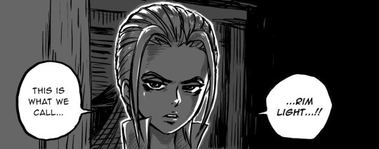
If you want your material to look really glossy - you can add rim light to your drawing. The rim light is a small local light that doesn’t necessarily face the light-source itself but outlines the character or object on the darker portions.
Rim light is often used as a stylistic means rather than a genuine lighting-technique. Often as a means to superimpose characters on top of a background for clarity, or to invoke some feeling of aura. It gives the character in question a slightly graphic look.
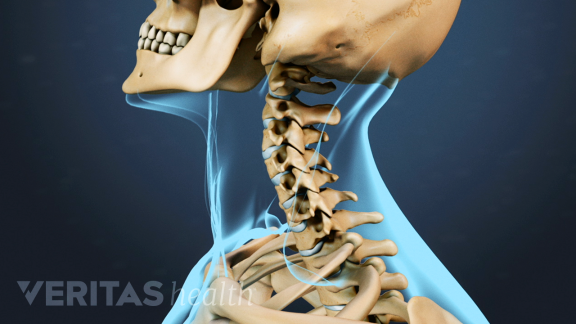
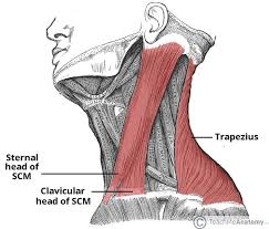
The neck can be a little enigmatic until you get a hold of it. What’s most important to know is mostly what it’s range of motions is, and how two primary muscles move in tangent with the neck and throat itself. So let’s take a little dive.
The neck, as you probably know, is comprised out of the smallest vertebrae on our spine. Their limited size makes this part of our spinal cord highly mobile, save for a full 180 turn, and a complete backbend. The reason we can’t turn our head like owls is a combination of the cartilage sticking our vertebrae together, and the muscles in our neck simply not being long enough to pass our chin over our shoulder blades. We can’t snap our neck back to rest between our shoulder blades because of the little taps at the back of the vertebrae ( the spinous process ) interlock with each other when we bend back. One of the functions for these taps is for the body’s muscles to attach to and flex from.
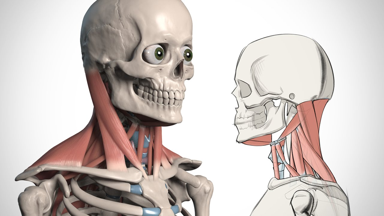
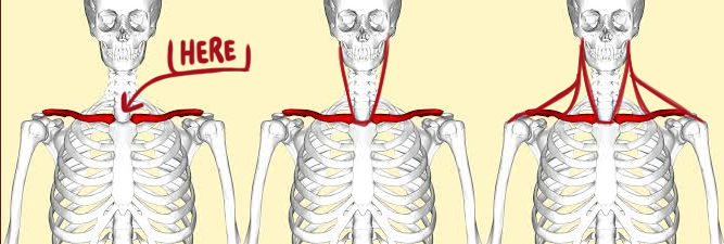
As we can see, the throat and neck are comprised of relatively few larger muscles, and a good few smaller ones. Although, for the most part, these smaller muscles are not something we can see when the skin is laced on top since they sit underneath the larger muscles. So for the purpose of brevity, we’ll focus primarily on the Sternal Head and the Clavicular head. Which is the two long muscles that stretch from the base of the skull’s braincase, and respectively to the collarbone, and right between the collarbones?
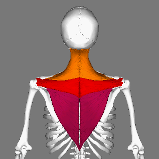
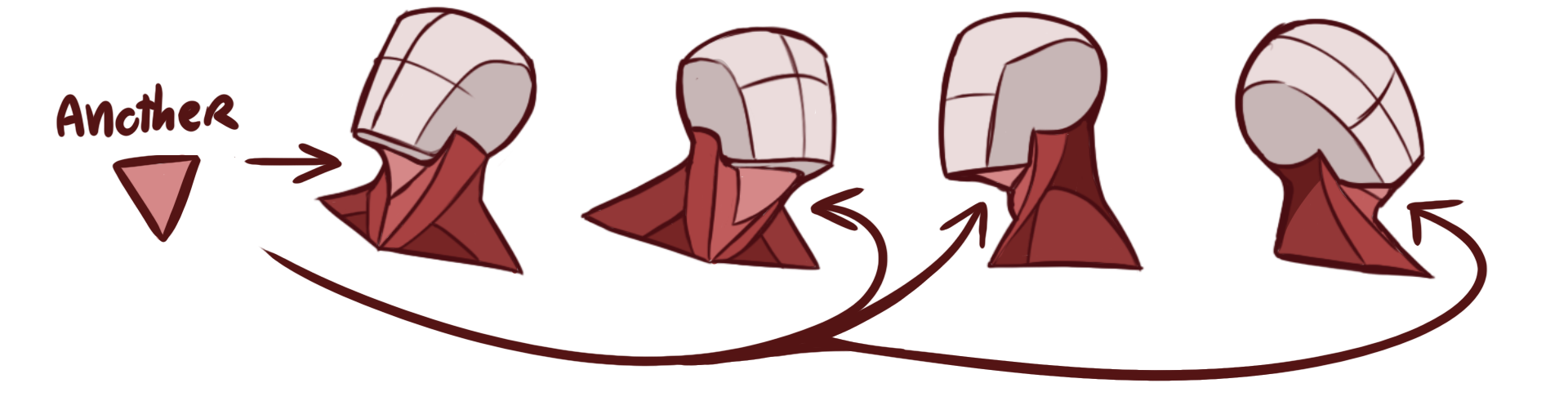
As well as the Trapezius, which connects the outer clavicle to the back of the head ( this muscle also reaches all the way down between the shoulder blades on the back )
The Trapezius is a large muscle that smoothens down from the back of the base of your skull, and all the way down to the shoulder. In people with an average build, the Trapezius slopes very smoothy from A to B almost like a soft piece of fabric stretched out over the muscles. If you work with bulkier characters however, those with above-average muscle mass, you’ll find that the Trapeziuos grows into more of an outward curve when gaining mass.
The combination of the Sternal and Clavical head is typically what you see people depict in semi-realistic depictions of the human neck. This kind of V shape is very indicative of the throat’s overall structure, and can give precise information about how the head is turned exactly.
What’s so important to note about the two muscles is that, like any other muscles, they stay connected to their origin points. In this case, those two origin points are rather simple to find on your character as long as you know where the clavicles sit. They always connect to the same position on the skull though, right behind the ear.
The Sternal head, as indicated by the name ( Sternum) connects to the breastbone, right between the clavicles. While the Clavical head ( also as indicated by the name ) connects somewhere midway on the clavicle. Depending on the build of your character, the Clavical head can be more or less visible. If your character’s a muscular type, then it’s likely that there will be contours hinting at its presence under the skin. But if they’re of normal weight it’s unlikely they’ll be visible. If your character’s particularly skinny, they might also show a bit of definition due to the low amount of fat deposited around the muscle.
So no matter how we turn or bend our necks, these two muscles will always connect to the same points but warp accordingly to the posture of our head. And usually, if you can just place the Sternal heads, you can work off of them to find the point for your Clavical head.
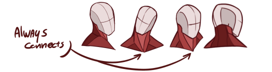
Another important note, the back of the neck always connects to the back of the skull, not in the middle of it. We have a lot of artists come into our inbox who misplace the neck to the center of the skull. You can help yourself a great deal by remembering that the Trapezius connects to the back of the skull ( safe a slight curve-out from the skull’s base to the top ).
Additionally, if you want to get a little more “realistic” you can look for the triangular bit of tissue that connects from the centre of the throat, and out to the two corners of the jaw. This bit can be very useful to remember when you want to draw heads facing a slightly upwards angle, or in direct profile. It is nearly just as flexible as the other muscles we’ve gone over and will warp accordingly to the posture of the head contra the torso. But will always stay attached to the three points. This section bulks up when we tug the chin closer to our neck and stretches thin when we eject our chin from our neck.
I hope this gave some sort of clarity. There’s, of course, a little more to it if you want to get really technical with the muscle layout. But I recommend you looking into medical books or illustrations for more in-depth walkthroughs of the actual build. In terms of the neck’s/throat’s range of movement, I recommend you testing it ours on yourself. There’s a great variety to how flexible people are, so drawing one general conclusion from myself ( a person with a spinal disability and limited range of motion ) is not going to help you at all. But observe yourself and others and draw your own observations, and understand the structure of the bones and muscles to find out the extent of a character’s dynamic range.
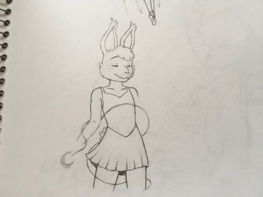
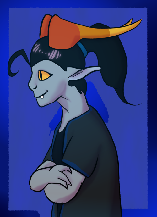
Hello! I would like to know if my character’s anatomy is alright and how to draw the rest of her arms. Thank you!
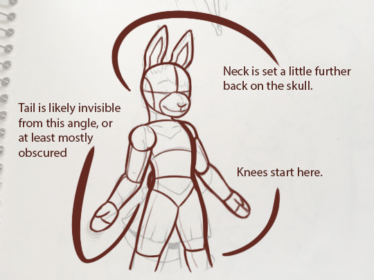
Your style is pretty uniform and consistent, so I’ve attributed a lot of the anatomical abstractions to be part of your style. But I found three small things that might improve your build a little.
Now it could be because the character’s neck is hidden behind the cheek-fluff, but it should connect to the back of the skull, rather than dead-centre. This is a common mistake.
Depending on the length and size of your character’s tail, it would be more or less obscured since we’re seeing them from a pretty forward angle. If the character’s tail is large, it is possible that you would be able to catch a glimpse of it, but it should be very subtle. ( I also moved it up a little higher on the character to match with where the pelvis on the redline is, animal tails usually sit on “top” of it, at the base of the spine ).
Since the skirt obscures where her pelvis actually starts, I mapped it out somewhere above the dip of the “shirt”-part, which would mean that the knees had to sit just beneath the edge of the skirt.
In overall, it’s a really good drawing, and your style is really clean and cute. If I had to recommend anything for further progress, it would be to be clearer in illustrating the different parts of your character’s body underneath the layers of clothing they are wearing. ( I pointed this out with the pelvis-placement bit ). This will make your character read a lot clearer, and help you construct your character more precisely.
As for arms, I didn’t want to invade your piece through my subjective expectation of how the arms should work ( since you haven’t given any indication on what you wanted the arms to do ) So I went for a default posture which you can then alternate as needed.
I can recommend our other posts about arm-anatomy:
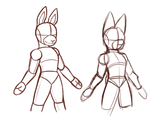
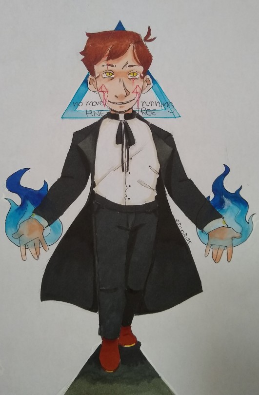
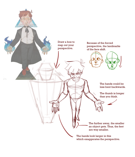
Hello there! This is some fan art that I did a while ago. 1)What I really wanted to do with this was make it look like you are viewing him slightly from above. I didn’t really manage to capture that, so I’d like that to be a focus in the redline. 2)The pose itself also feels a bit awkward, he’s supposed to be holding his hands out and slightly forward and be taking a step towards the viewer. Thanks for your help in advance :)
Submitted by meower808
I may have overshot the perspective in this one, but the logic is the same. I think overall your proportions are good, they just need to be pushed farther.
Basically the idea is you treat the body like anything else. When you look up at a building, the top is smaller than the bottom (farther v. closer). When you look down at a person, the head is larger than the feet (closer/farther).
We’d all have to tip our hat to Chekhov for creating and establishing the blog. Their unique graphic identity and generosity in lending their platform to the rest of us mods are what ultimately got the wheels rolling in this blog. Next, all the wonderful mods here spending their free time producing redlines and tutorials. Lastly, the growing userbase is what keeps this blog going, and we’re honored to have your gratitude, and know that we’ ’re all grateful too.
Any tutorial or redline reblog boosts our range. Although generally, our tutorial posts garner more widespread traction. With that said, redlining is our bread and butter. and ultimately what we’re about.
Way back Chek made a promo post that is still relevant, here it is :) :
Hi! I’ve been trying to figure out how to do side views of the body from the waist up and I don’t really feel like I accomplished it in this image. So can I just get some proportion help on the back and on the arms as well? they’re supposed to be crossed but I’m not really feeling it. Thank you!
Submitted by uwuthundereuwu
Hi! Crossed arms are really tricky to draw from any angle. From the side, you mostly just see one arm, and that can make it even harder to look right. Always search up reference - or get a mirror - to figure out how things work.
Another tip I have for you is that the skull should center on the neck. The base of the skull where the spine connects is almost-center, and the neck-chin area is more of a slope than two planes connecting.
Hello, there and I agree that beards can be very hard to make fitting into a character’s looks, especially if you aren’t used to drawing them! For this, I have three major pieces of advice for figuring out beards with one’s personal style.
1.) If you are wanting to make the beard stick out as a key feature:
For this, I recommend making the beard do one of the following things.
Give it more detail than the rest of the character. By giving it more details to a character’s face compared to other parts of the body, it will call attention towards the beard overall compared to anything else because of the number of details to it as everything else is not as heavily worked on. Most people do this when drawing hair by placing a lot of lines, colors, texture in it to make the character’s hair pop as a noticeable trait.
Give a slight style change from the character using on the beard. With both having a similar style between the overall piece and beard, you must alter the beard in a way that it becomes more pronounced (this can be done with line thickness changed, perhaps making the color of the beard/opposite of images tone. So say if the image had a cool tone around the beard, you could try making it a warmer tone to help pop it or make a color bolder/duller than others around it.)
Make the beard noticeable compared to other features. By having the beard as a dominant feature, other features will get lost thus making it a key feature to a person. (A good example of this is Travis McElroy. In fanart and fan animations we are always able to tell which one he is because his beard is a key feature to his face and if you look at the art, you can see how a lot of artists will actually make the beard taking up almost all of his face.)
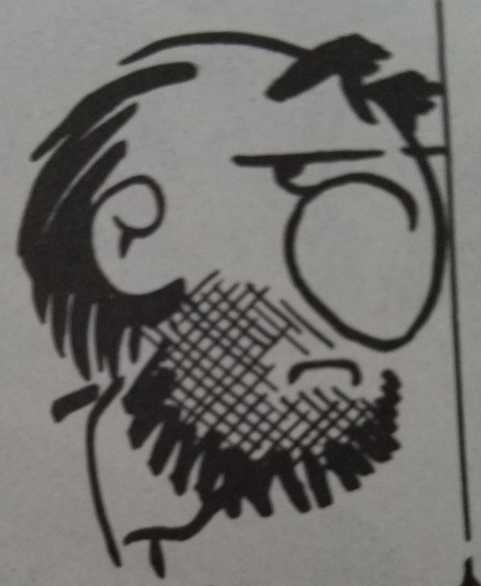
A good example of these is looking at these images from ‘Cartooning The Head & Figure’ by Jack Hamm. You can see how they use simple style and alter the beards to look slightly different, use more details, to making the beard a noticeable trait on the character’s face.
2.) If you are wanting the beard to be of the same style and blend in more without being such a key feature:
For this one, it will come down to your own style choice. When you get to the beard, continue drawing it as you would with the rest of the face without hyper-focusing on it as you do so. By focusing on how drawing a beard you might accidentally focus too much on making it look like a beard and completely changing your style.
Another good thing to remember is an implication of a beard is just as good as a fully drawn one!
*A few lines, texture, and even color are useful to draw a beard without drawing the beard. These images (‘Cartooning The Head & Figure’ by Jack Hamm) below show similar styled beards and ones implied but not fully drawn.
3.) The one advice we all know and hate to hear at times. Just practice drawing beards on the character you want one on! Try your style, try other styles, try colors only, try texture without lines, explore your media at your disposal!
For digital, take a layer and duplicate a headshot everywhere, then take another layer and begin trying to draw on it. Go wild!
For traditional, draw your character over and over onto a sheet (or create a premade one digitally very light then print it out, once satisfied with drawing on it, ink it properly up to see the image) then draw beards on them. A tip for those not wanting to waste time redrawing a character’s face is to use tracing paper or a clear sheet of plastic. Overlay it onto the image and go about filling the tracing paper/plastic with beards using a pencil/pen (I highly recommend using a thin dry erase marker on the plastic or a marker you will be able to clean off once you’re done. That way you can refuse the plastic again for another time!)
Don’t be afraid to look around and get inspired by books, magazines, comics and more!
-Mod RyR
from The Redline Station https://ift.tt/33EqEnK
via IFTTT
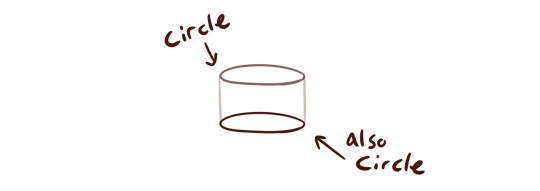
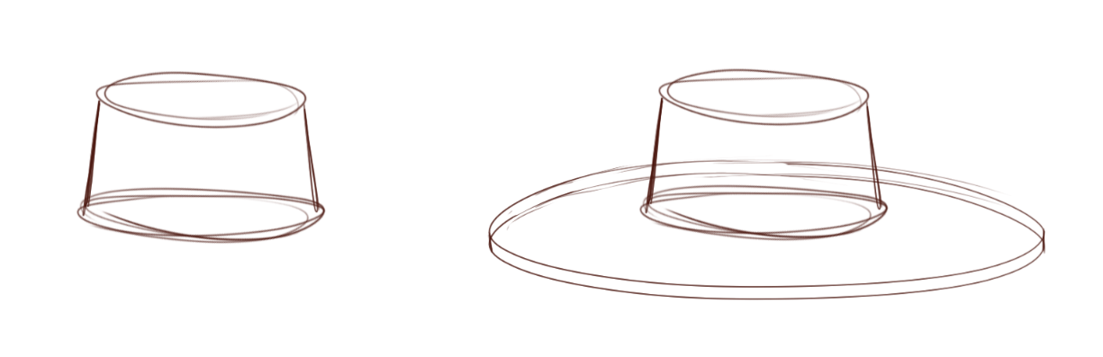
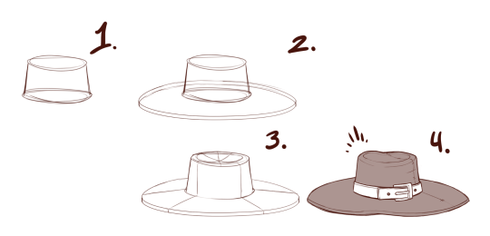
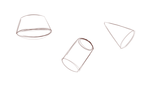
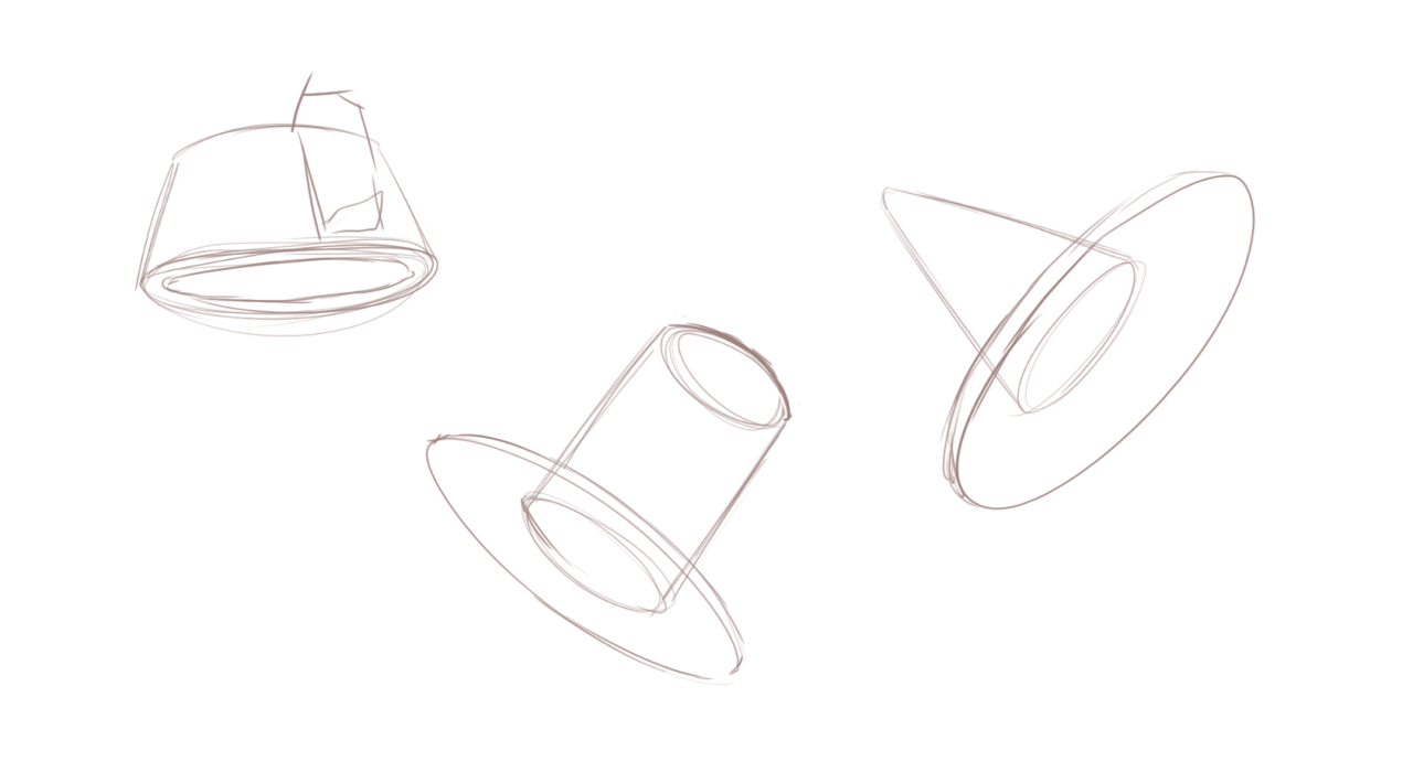
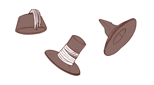
Hats, broadly speaking can be argued to be constructed of cylinders. In term of wide-rimmed hats, cylinders on top of cylinders. Caps could deter from this generalisation, but technically you should be able to use the same method and simply “cut out” a section of your bottom cylinder for the shade.
So hats will naturally rely on your capacity for simple shapes, moreso simple shapes in perspective. Practising drawing cylinders and cones can help you get a grip of this. If you work digitally, you can, however, cheat a tiny bit, and draw one good circle - then copy-paste it and transform it as necessary for the top/ or bottom. then connect the two circles to make for a cylinder ( be it the ‘head’ of the hat, or the rim )
Always remember that regardless of what type you’re drawing, there is almost always a bit of thickness to the rim, which is why I argue that the bottom of the hat can also be sketched out to be a very flat cylinder rather than just a circle. Including an accent or outline to this will greatly improve the tangibility of your drawn hat.
Unless your hat’s rim is completely stiff, I would always recommend adding a little bit of deviation from the perfect circle shape. this can be a dent or a curve. It adds a bit of personality to your hat and - once again, makes it seem much more tangible.