Our submission box is now closed! If you missed it, don’t fret; there will be more opportunities in the future to submit your artwork.
For now, thank you to everyone who’s submitted their wonderful art! Remember, if you have any additional information, or want to check up on your submission, please read the FAQ on how to do that, and don’t send an ask on anonymous.
-The Redline Team
from The Redline Station https://ift.tt/2nleL6j
via IFTTT
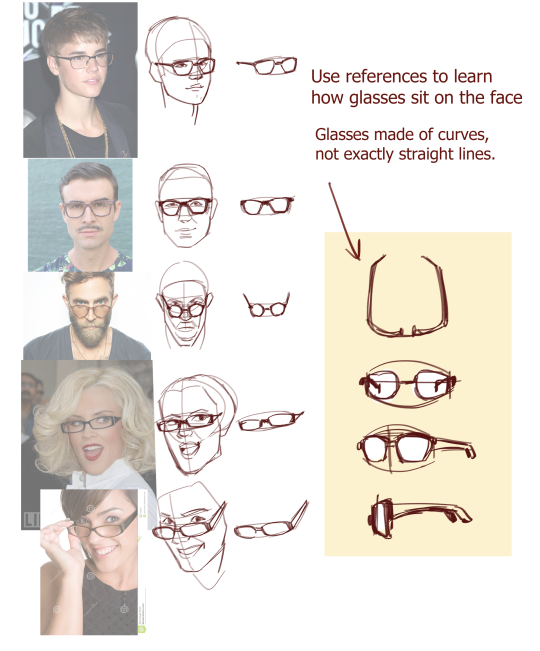
The way I draw glasses is to construct the face under it first, then drawing the glasses structure over it. That way, I don’t mess up the placement of the eyes, for example.
Through finding photos and tutorials online, I have found that glasses have a more round shape than I first thought. This makes sense, since they have to sit on our faces, which are curved on a round head.
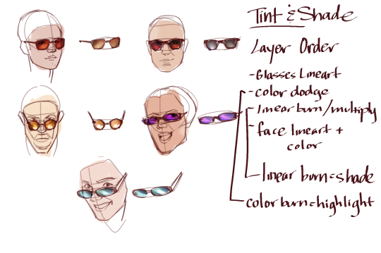
As for tinting and shading the glasses, I usually use a multiply layer for the base color, lower the opacity, then add the reflective light either on an overlay or color dodge layer (if its super intense). If your program doesn’t have these features, you can still achieve the transparency of the glasses with a layer on lower opacity.
If you find you need practice reviewing the proportions of the face, we have a ton of material on our blog if you search. Or, you can study photographs, references, etc.
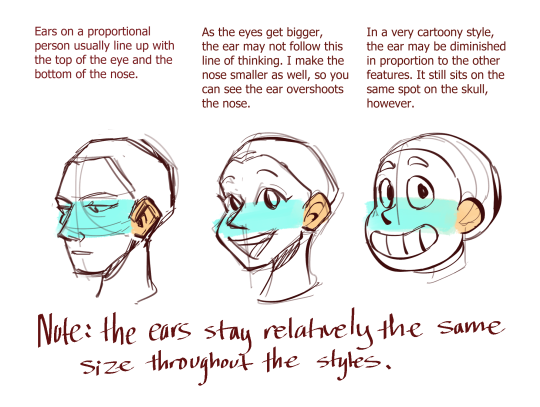
Here are some of the notes I’ve found helpful when establishing the proportions of the face. Cartooning is all about appeal, and it just so happens that more youthful characteristics are very appealing (which is why babies are so cute). Large round eyes and ears on a face can make a character more appealing.
You can see that the latter faces break the rule of the first. This is because the eyes, nose, and mouth (landmarks) are no longer in direct human proportion. All the elements of the body will shift in response to the rest (i.e. you don’t want a realistic ear next to a manga eye). It’s up to you to find out how the things you’re drawing respond to themselves.
The submissions will close again when we hit 56 submissions, as our inbox then would have about 60 entries which would need attention before the submissions can open again.
Go to “ Please read the rule first” on our page and remember to read all the guidelines before submit. If your submission does not follow our guidelines, they will be deleted.
When sending in photographs of traditional art, make sure the picture is top-down and clearly visible!
- mod wackart
from The Redline Station https://ift.tt/2mGQlUE
via IFTTT
Many of you have noticed that we’ve been fairly inactive lately. We’d like to apologize - first for taking so long with the promised submissions - and also for the radio silence regarding our status.
The blog is still running, and we’re not planning on going anywhere for a long time!
Now that we’ve cleared out most of our inbox, we’re ready to take on new submissions!
When we open submissions, you will be able to go into the blog from PC or mobile and click the SUBMIT button on the blog. This button will not be available until the aforementioned time, so you cannot see it right now. Don’t panic.
We have updated a lot of things since the previous submissions and we will not be accepting anything that doesn’t comply with the rules. If your submission doesn’t follow the rules it will be deleted without warning, so please look it over!
Quick refreshers:
- You can submit ONE piece of art.
- You must give us a specific set of things (the limit is two) that you need help with. For example - “anatomy, specifically with hands, and shading”.
- Animals, fantasy creatures, humans, cartoons, typography, caricatures, landscapes - YES, it’s ALL OKAY. Please make sure to add your reference image where possible.
- We will NOT accept inappropriate content, submissions containing hate speech, slurs, etc.
Any asks about submission guidelines will not be answered if they are already answered in the Submission Rules and Guidelines post. READ IT.
How many submissions will you accept?
Due to our past experience with having an extreme load of submissions (in the hundreds) we have decided to curb our current submissions at 50. That means that as soon as we get 50 submissions, our inbox will automatically be closed. If you miss your chance to submit this time - don’t worry! There will be other times to send your art. :)
- Redline Team
Submissions open this weekend! Get excited folks!
We are opening the submit box in just under three hours 🎨
from The Redline Station https://ift.tt/2m7QLD6
via IFTTT
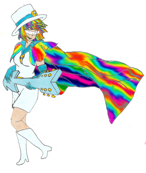
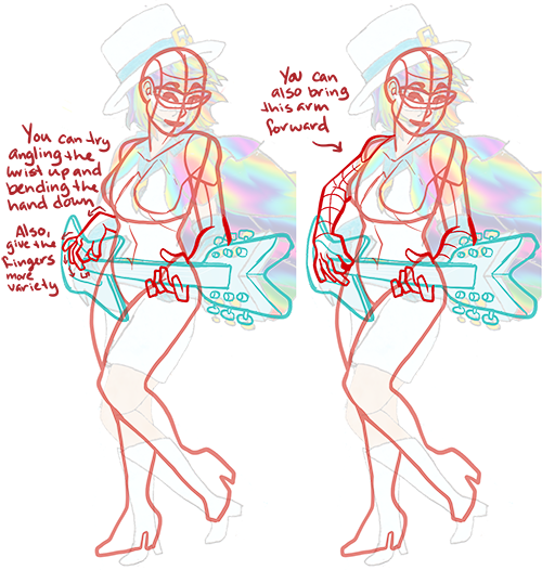
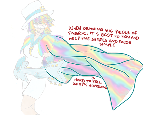
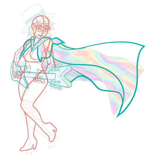
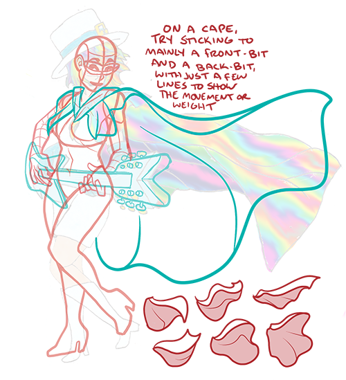
So i drew this for my ask blog while back, and i’m super proud of it! however, the guitar feels rather blocky, and the cape… the stripes don’t feel as if they’re actually stripes along the curvature of the fabric. the hand along the base of the guitar, strumming the strings feels limp, but other than that, i feel my perspective is good and the pose generic popstar enough.
So in Summary: how can i make the cape seem like it’s more solid stripes, THe hand strumming seems limp, and the guitar feels basic, and i’d love any suggestions you have for me.
the hair looks like it does as a stylistic choice, although i know it’s a bit “blocky” that was intentional to differentiate her from some other bobcut characters i draw.
__________________________________
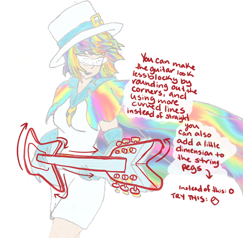
Hey there!! Thanks for the submission!! You’ve got a really dynamic, interesting pose with a lot of movement. That’s hard to do, and you did a great job!
As far as the guitar goes:
Bringing the points of a guitar to a more rounded tip, rather than a pointed one, can help it feel a little smoother and more realistic. Most guitars have beveled, rounded edges, even some of the more angular ones. Like this:
And posing the strumming hand:
Putting her wrist at a slightly different angle can give the hand a little more life; the way it’s rounded and sort of laying on the guitar makes it look a little limp. Lifting the wrist up off the guitar makes it look more like she’s mid-strum. Also, splaying the fingers at different angles can give the hand a little more visual interest.
And the cape:
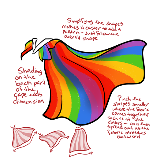
You’ve got a lot of folds going on for such a big piece of fabric moving in a relatively simple direction, plus a very busy pattern. Trying to match the pattern up to all the folds and angles you’ve got going on can make it visually confusing. Try simplifying the shapes, like this:
I hope that helps!! Thank you for your submission, and happy drawing!!
Many of you have noticed that we’ve been fairly inactive lately. We’d like to apologize - first for taking so long with the promised submissions - and also for the radio silence regarding our status.
The blog is still running, and we’re not planning on going anywhere for a long time!
Now that we’ve cleared out most of our inbox, we’re ready to take on new submissions!
When we open submissions, you will be able to go into the blog from PC or mobile and click the SUBMIT button on the blog. This button will not be available until the aforementioned time, so you cannot see it right now. Don’t panic.
We have updated a lot of things since the previous submissions and we will not be accepting anything that doesn’t comply with the rules. If your submission doesn’t follow the rules it will be deleted without warning, so please look it over!
Quick refreshers:
- You can submit ONE piece of art.
- You must give us a specific set of things (the limit is two) that you need help with. For example - “anatomy, specifically with hands, and shading”.
- Animals, fantasy creatures, humans, cartoons, typography, caricatures, landscapes - YES, it’s ALL OKAY. Please make sure to add your reference image where possible.
- We will NOT accept inappropriate content, submissions containing hate speech, slurs, etc.
Any asks about submission guidelines will not be answered if they are already answered in the Submission Rules and Guidelines post. READ IT.
How many submissions will you accept?
Due to our past experience with having an extreme load of submissions (in the hundreds) we have decided to curb our current submissions at 50. That means that as soon as we get 50 submissions, our inbox will automatically be closed. If you miss your chance to submit this time - don’t worry! There will be other times to send your art. :)
- Redline Team
Submissions open this weekend! Get excited folks!
from The Redline Station https://ift.tt/2nXgOgI
via IFTTT
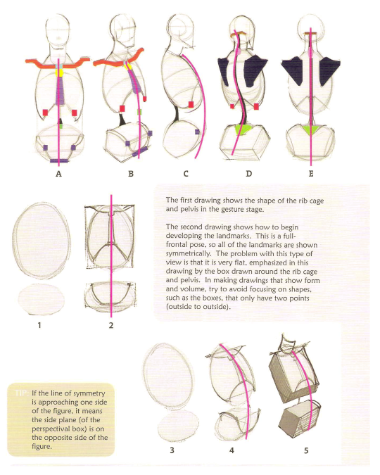
Let’s talk about torsos! Of course, my first piece of advice is to study study study. Try searching for anatomy books at your library, or in an online database. I highly recommend getting some PDF files or actual print of these books to have on hand when you draw. Here are some recommendations:
George Bridgman’s Constructive Anatomy
Michael Hampton’s Figure Drawing Design and Invention
Glen Vilppu’s Basic Drawing Manual
“Anatomy for Sculptors” by Uldis Zarins with Sandis Kondrats
(Source: Michael Hampton “Figure Drawing Design and Invention”)
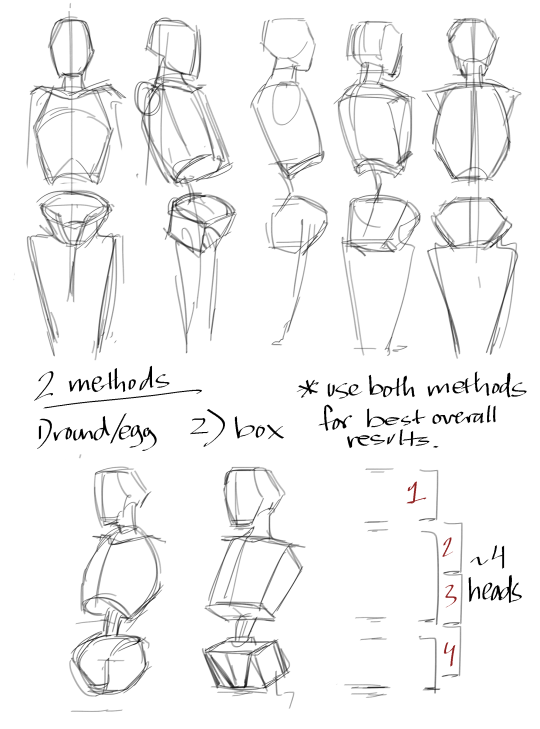
Now I really like the box method, because a straight line is way easier to draw than a curved line (imo). However, all of these methods are pretty valid.
Try to do a turnaround of your basic figure, keeping the proportions in line. Building on top of the basics is the easiest way to construct a figure:
Other than that, my advice is to - you guessed it - practice. My figures now look better than those a year ago, and yours will too. Keep at it, and you’ll grow in skill and consistency.
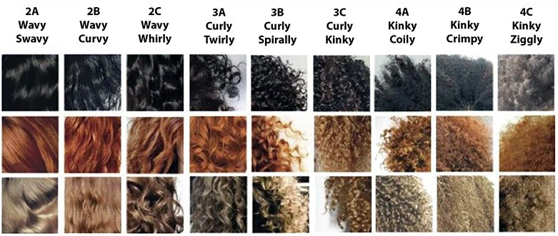
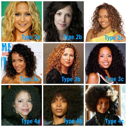
Sure! First, let’s look at different kinds of curly hair. Lucky for us, there’s a whole chart for that kinda stuff. Curly hair can range from slightly wavy to the most scrunchy of curls. >
Here’s how I would approach painting curly hair. As with all hair, I recommend you block out the basic shape, so you know how the hair is being layered. Since curly hair is so voluminous, I then block out the light and shadow, treating it like a 3D object. Then, I add the detail of the individual curls. Variety of big and thin curls will give you a more natural look, and not like a uniform doll.
I hope this was helpful! Here are some more tutorials on how to draw hair:
This won’t be a tutorial so much as a guide to finding what makes semi-realistic styles click together. My first advice is always to find reference. Something must have inspired the way that you draw, so find those shows or artists that influenced your artwork, so you can understand where you’re coming from.
I’m going to be using my own inspirations as an example. This is what I would call “semi-realistic” in my eyes, spanning from more naturalistic painting styles to the sorts of western animations we saw in the 1990s.
From this (Aloy 2 by Lois van Baarle):
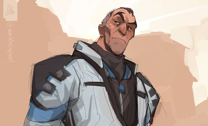
to this (Sigma from Overwatch by @wachtelspinat/ on twitter/tumblr):
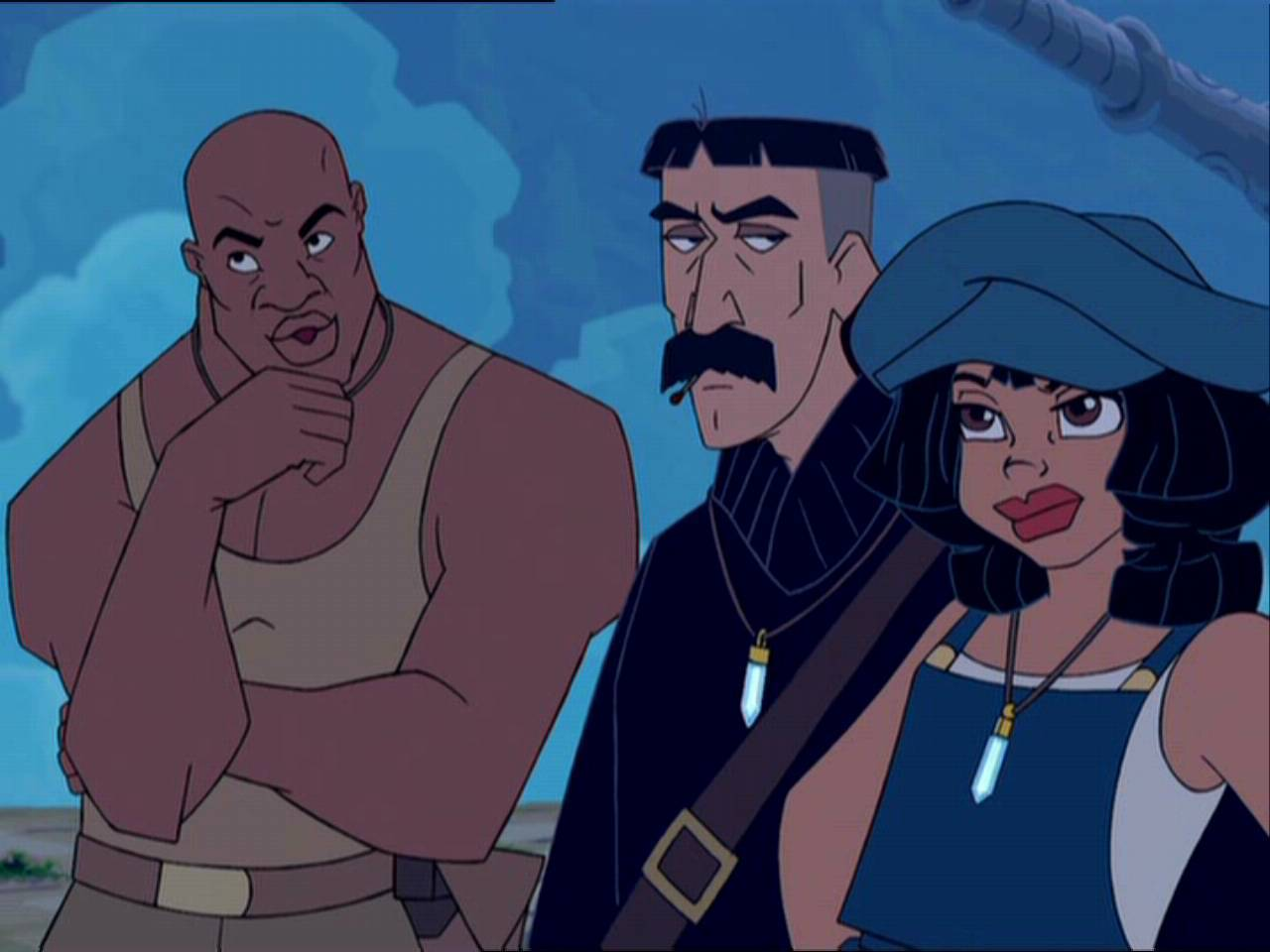
to this (Atlantis: The Lost Empire):
So, what does this all mean? Semi-realism is a very broad term, I think. You shouldn’t try to find an ideal. Rather, you should try to find what your artwork is telling you it wants. Obviously you know that there is something to do with the face that you’re missing. That’s a good start!
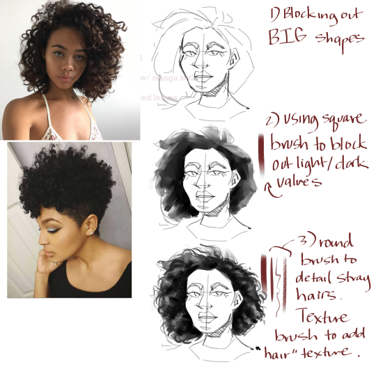
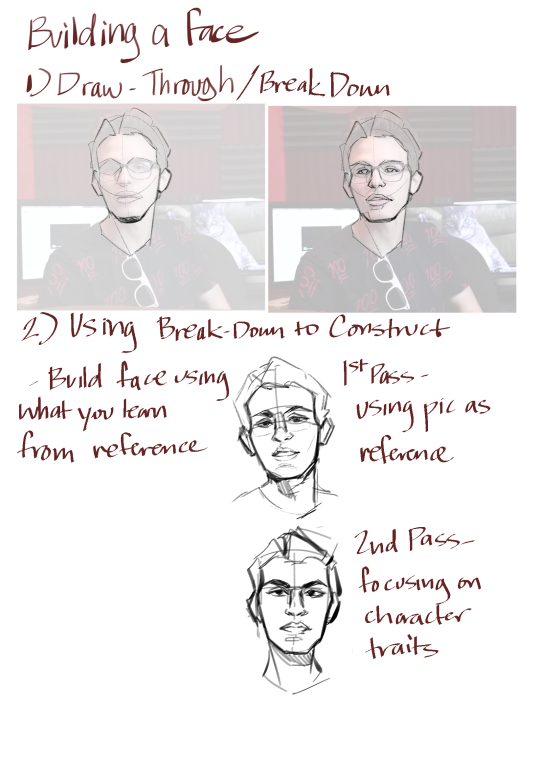
I made a little tutorial on how to use photo reference to build the proportions of your face. As you can see, the end result isn’t truly like the actual photo, but the proportions and face structure have been built by studying the photo.
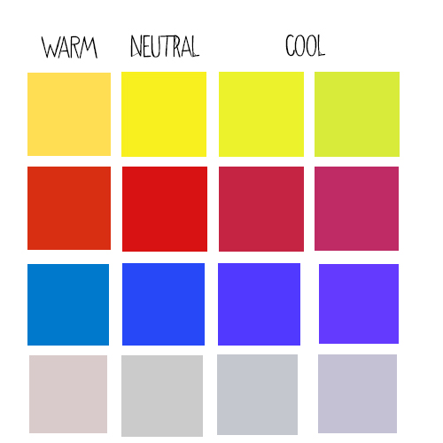
I feel like a concept such as undertones is something that can be overexplained really easily. I base this off the fact that when I read your ask, even though I know perfectly well what an undertone is due to my years being schooled in art - I still had to go double-check on various google sources if I was getting it right. It’s actually fairly simple. So im going to try an explain it as short and simple as I can.
Mass tones
This is the counterterm to undertones. Say you’re looking at a colour. And you immediately conclude “ this is blue “. Then blue is the mass tone of the colour you’re looking at.
undertonesUndertones are the underlying colours you detect secondly when looking at a colour. For example, you see the blue masstone and go “ oh that’s blue “ - but then you look closer, and you realize that there’s a hint of something else too. This “hint” is what we call undertones. “oh, that’s blue! - but there’s some green in it “
How to detect a tone
By just looking at it. V This here could be our colour example. It has a blue masstone, but it’s got a green undertone, which makes it look blue-greenish. You can use a colour wheel if you’re not sure what the undertone is. Grab a sample of your colour and place it on the colour wheel where it fits between two colours. Your undertone will be the colour that is not the mass tone on the colour wheel.
Now granted, we all perceive colours a little bit differently, but what undertones basically boil down to is that a mass tone ( a colour ) having a shade of another in them ( an undertone ).
Wether or not an undertone is “warm” or “cold” comes down to, once again, simply whether the colour used for the undertone is warm or cold. Our blue mass tone up there has a slightly warm undertone, since green is a warmer colour than blue. Meanwhile, a Red with a blue undertone would be considered to have a cool undertone.
Many of you have noticed that we’ve been fairly inactive lately. We’d like to apologize - first for taking so long with the promised submissions - and also for the radio silence regarding our status.
The blog is still running, and we’re not planning on going anywhere for a long time!
Now that we’ve cleared out most of our inbox, we’re ready to take on new submissions!
When we open submissions, you will be able to go into the blog from PC or mobile and click the SUBMIT button on the blog. This button will not be available until the aforementioned time, so you cannot see it right now. Don’t panic.
We have updated a lot of things since the previous submissions and we will not be accepting anything that doesn’t comply with the rules. If your submission doesn’t follow the rules it will be deleted without warning, so please look it over!
Quick refreshers:
- You can submit ONE piece of art.
- You must give us a specific set of things (the limit is two) that you need help with. For example - “anatomy, specifically with hands, and shading”.
- Animals, fantasy creatures, humans, cartoons, typography, caricatures, landscapes - YES, it’s ALL OKAY. Please make sure to add your reference image where possible.
- We will NOT accept inappropriate content, submissions containing hate speech, slurs, etc.
Any asks about submission guidelines will not be answered if they are already answered in the Submission Rules and Guidelines post. READ IT.
How many submissions will you accept?
Due to our past experience with having an extreme load of submissions (in the hundreds) we have decided to curb our current submissions at 50. That means that as soon as we get 50 submissions, our inbox will automatically be closed. If you miss your chance to submit this time - don’t worry! There will be other times to send your art. :)
- Redline Team
from The Redline Station https://ift.tt/2mjscTd
via IFTTT
I’ve been looking around for options like these myself since I’m also doing a comic currently, and having a 3D model to reference off would just be so much easier.
Unfortunately, I haven’t found out yet, but I’ll use this post to make it known that if anyone out there knows of software like that - we’ll be excited to look into them and post about them here on the blog.
- mod wackart
from The Redline Station https://ift.tt/3549wJ2
via IFTTT
Many of you have noticed that we’ve been fairly inactive lately. We’d like to apologize - first for taking so long with the promised submissions - and also for the radio silence regarding our status.
The blog is still running, and we’re not planning on going anywhere for a long time!
Now that we’ve cleared out most of our inbox, we’re ready to take on new submissions!
When we open submissions, you will be able to go into the blog from PC or mobile and click the SUBMIT button on the blog. This button will not be available until the aforementioned time, so you cannot see it right now. Don’t panic.
We have updated a lot of things since the previous submissions and we will not be accepting anything that doesn’t comply with the rules. If your submission doesn’t follow the rules it will be deleted without warning, so please look it over!
Quick refreshers:
- You can submit ONE piece of art.
- You must give us a specific set of things (the limit is two) that you need help with. For example - “anatomy, specifically with hands, and shading”.
- Animals, fantasy creatures, humans, cartoons, typography, caricatures, landscapes - YES, it’s ALL OKAY. Please make sure to add your reference image where possible.
- We will NOT accept inappropriate content, submissions containing hate speech, slurs, etc.
Any asks about submission guidelines will not be answered if they are already answered in the Submission Rules and Guidelines post. READ IT.
How many submissions will you accept?
Due to our past experience with having an extreme load of submissions (in the hundreds) we have decided to curb our current submissions at 50. That means that as soon as we get 50 submissions, our inbox will automatically be closed. If you miss your chance to submit this time - don’t worry! There will be other times to send your art. :)
- Redline Team
from The Redline Station https://ift.tt/2V9q3qF
via IFTTT
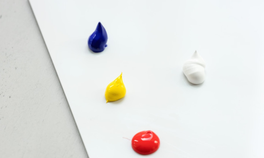
Ahhh, oil paint. To this day, I still get a hit of dopamine whenever I smell paint and mineral spirits. Oops.
My (Mod SugarQuill’s) art degree concentration was traditional oil painting. Note that some of these tips might come down to personal preference and school of thought. Some folks might not agree with everything I say, and that’s okay.
Maxim #1: Color theory is VITAL
Color in oil painting is a lot different than digital art. You can’t just slap on a hue/saturation or overlay layer and call it good. You need to learn your colors so you can apply them directly.
All colors in your painting relate to each other. All that color is is the way light reflects off your subject. I don’t care what color that light is–yellow, blue, green, etc. That’s going to affect what color your background and foreground will be.
Complementary (opposite) colors are your friend! Just make sure you balance them out with the same levels of saturation and value.
The ‘balancing’ above is called color bias, and can create harmony in your painting.
Experiment with mixing an opaque pigment/paint with a translucent paint. A good tube of paint will tell you its transparency level.
MIX YOUR OWN DARN COLORS WHENEVER POSSIBLE!
Unless you can justify it for your idea, Do. Not. Use. Black. To. Shade. Some potential alternatives include a burnt umber, dioxazine purple or magenta, green, blue, or the complement of your base color. (This is not to say that black doesn’t have its uses, just seek other options first.)
Maxim #2: THE BACKGROUND IS JUST AS IMPORTANT AS THE FOREGROUND.
I already hear your whining. Back in the day, I did too. But soon enough backgrounds will become your friend. See the above about color.
Build the background up along with your foreground. This way, your painting will feel holistic and ALIVE, darn it.
In general, it’s easier to build from dark to light.
Maxim #3: Build up the whole painting together. Don’t let me catch you over-rendering one tiny part while the rest is practically blank.
This is how you make anatomy, perspective, lighting, etc. mistakes. You need to address each part of the painting and physically back up often to make sure it all works together.
If you’ve ever wondered why different elements of your painting don’t seem to “fit” together (ie, your subject doesn’t look like it fits in its environment), this is probably why.
This is also how you got yelled at a lot from your professors, if you were me. I used to over-obsess and then screw up my painting because of it.
Maxim #4: Try to hold your brush from the end, NOT like a pencil. Try to sit at least 1-3 feet from your easel.
On this note, unless you don’t have access to an easel, oil painting with the canvas down on a table is really ill-advised. You’re more likely to screw up your perspective.
I make it a point to only ever hold it like a pencil if I’m doing really brief detail work.
Maxim #5: Vary your brushstrokes!
Maybe some marks are thinner, some are thicker. Pick where you want the viewer’s eye to go and make your brushstrokes different from the rest in that spot.
Think about what the brushstrokes mean to you. For example, I did a painting where I thought about how I would physically touch the subject of my work. If my hand would start a little firmer then lighten up to a softer brush, I’d replicate the pressure with my brush/paint. It guided my marks.
Don’t be afraid to let your foreground and background subjects fade in and out of each other! It creates depth.
Maxim #6: Use a medium
Generally speaking, if all you use is oil paint + paint thinner, your work is more likely to appear kinda thin and flat.
There are lots of different mediums that do different things. I personally use Liquin, a product from Winsor and Newton (most of my paints are from either W+N or Gamblin, if anyone’s curious. Many of which I nicked from the school because I paid good money to go there.)
Liquin makes paint dry faster, appear glossier, and can thicken or thin out your paint. It’s also good for glazing, building up layers, and mixing paints.
Linseed oil can extend your drying time.
Maxim #7: Choose an emphasis
This goes along with #5. Don’t just make every part the same levels of rendering, color value/saturation, brush thickness.
IT IS OKAY TO LEAVE SOME AREAS LOOKING LESS FINISHED THAN OTHERS! In fact, I’d encourage this! The more refined parts will be the emphasized section that the eye first darts to.
Heck, is every single thing in your field of vision 100% in focus 100% of the time? No. And the eye doctor says my vision is perfect, so you can trust me.
Miscellaneous Maxims
Work from life whenever possible.
Don’t put your coffee/tea/etc right next to your turp jar :(
Don’t hold your brush in your mouth; I used to until I found out it’s an easy way to ingest toxic paint.
Acquire a product called The Master’s Brush Cleaner and Preserver. It will save you so much time and money, you’re welcome. Miracle product. Pure magic.
A professor once told me, “If you’re not painting, you’re not thinking.” It really stuck with me.
Anyway, I’m no master but I hope this helps. Let me know if you guys have more specific questions. Note that a lot of this can translate to digital painting. But I do adore the buttery feel of paint swooshing across my canvas.
I’ve been looking around for options like these myself since I’m also doing a comic currently, and having a 3D model to reference off would just be so much easier.
Unfortunately, I haven’t found out yet, but I’ll use this post to make it known that if anyone out there knows of software like that - we’ll be excited to look into them and post about them here on the blog.
- mod wackart
from The Redline Station https://ift.tt/34pIUlz
via IFTTT
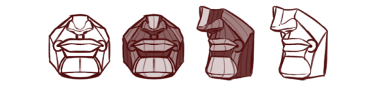
Lips are enigmatic things. Mostly because in most popular media such as cartoons or comics, they’re mostly kept subtle as to not detract from the attention of the viewer/reader.
The trick is to make sure that your detail level fits with the rest of your art style. Something that’s defenitely easier said than done.
Since I don’t know what your style looks like exactly, and since we can learn a great deal from simply looking at how other artists chose to depict them, ( given noses are not only popular but NECESSARY to stylize for almost every non-realistic artist ) let’s take a look at some tips in entertainment.
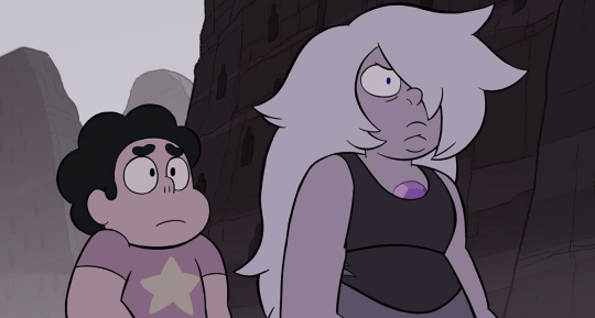
Steven Universe
A show you’re probably familiar with has a very simple way of depicting lips on some of its characters. Although, the universe dictates that lips that don’t contribute directly to the character design, are not drawn at all ( see Steven, Pearl, Peridot + ). Meanwhile, characters, where the lips are a prominent part of their design, such as Amethyst ( as well as Rose Quartz and Garnet ), are depicted with somewhat bold curves facing upward for the upper lip, and downward for the bottom lip.
This plays well into the universe itself, where the focus is more on form and colour, and the intricacies of anatomy are mostly ignored in favour of a much simpler design.
Media that rely heavier on a more semi-realistic style, tend to mark the lips in less brazen ways, but they’re nonetheless still visible. A popular method is to mark up the upper lip and colour it in a slightly darker tone than the rest of the skin. Often, this is accompanied by a curve indicating the bottom lip’s volume. you’ll see a lot of these stylizations in some of Disney’s films aimed at a somewhat grown-child demographic such as “Hercules.
This is personally one of my prefered methods for my current semi-realistic style. It has some sort of stylized maturity to it that you don’t quite see anywhere else.
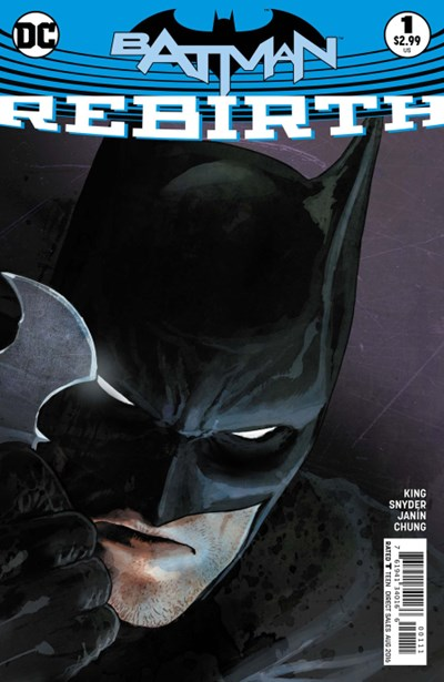
On this very realistically rendered cover, we see that the artist put time and effort into contouring some of the tiny wrinkles in the upper lip, as well as texture the bottom lip with shadows. This works well because the rest of the image’s detail level can keep up with the lips, disallowing them from becoming the focal point, and thusly avoiding making the character appear “ uncanny”.
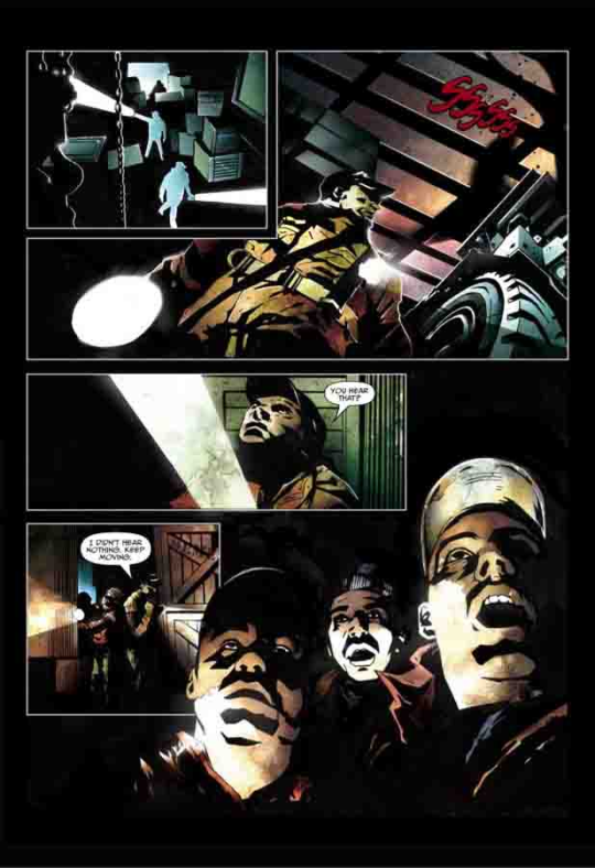
Alternatively, the artists of Top Cow’s “ impaler” comic, didn’t do much to stylize the lips in any sense of lineart or colour. But instead used the other surrounding volumes to define the mass and shape of the lips. ( the shadows, the moustache on the guy in the bottom right ). This is a clever way to prevent having to draw lips while still having them very much present in the art. But may require a good bit of anatomical know-how and a wealth of construction skills.
You can certainly look for more ways people have drawn lips in your favourite shows, comics or by your favourite internet artists. There’s a whole slew of ways I haven’t covered yet, and for you to pick and choose between these and make them work with your style should be a simple task in theory. Although it might take some tries before you find the method that suits your style better.
If you want to buy a laptop on a budget, and you’re not all that confident in your craft ( or if you’ll make more out of it in the future ). Then I suggest you go with any machine that can run the software you’re using. And otherwise pick a laptop that you can use to suit your other needs ( gaming, streaming, browsing, or whatever ).
Generally, I don’t encourage anyone to stretch their funds too thin on an “art”- computer unless they plan on doing it full-time or just spend their every waking moment outside of work drawing.
It just wouldn’t make sense to throw that much money after a laptop if in the end, you’re not gonna need all the horsepower.
I think something in the range of
HP Envy/ Pavillion series, or maybe even a low -end MSI laptop should be your maximum spending. Moreso because on top of being able to handle your software - it’ll allow you to game some and pull a lot of other tasks with it.
I’ve generally not had good experiences with Acer and Asus in regards to working with demanding software on their systems, but I can’t guarantee that there shouldn’t be decent models out there.
But no higher unless you work with the Adobe Package.
Generally no higher than 500-700$.
Alternatively, you can probably build your own desktop and get much more efficiency for much lower prices.
We just want to give you a small update on the going-ons of the blog.
We’re most certainly not dead! but have been (and some lucky chums are still ) enjoying the summer and some time off to ourselves.
So far, we only a very few redlines left, which we are looking forward to sharing with you all.
BEFORE, we open up a new batch of submissions however; we have decided to take a moment to catch up on the many asks we’ve received.
( creating tutorials, producing videos, etc )
So that we can start out with a completely fresh inbox once we open for submissions again. I know I am personally ecstatic to be back, and can’t wait to work with more redlining!
- Mod wackart & the Redlineteam
from The Redline Station https://ift.tt/2ZH0IsQ
via IFTTT