Monday, October 28, 2019

I was hoping you could redline this sketch! I’m having some issues with his head and his hand, but...

image

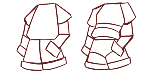
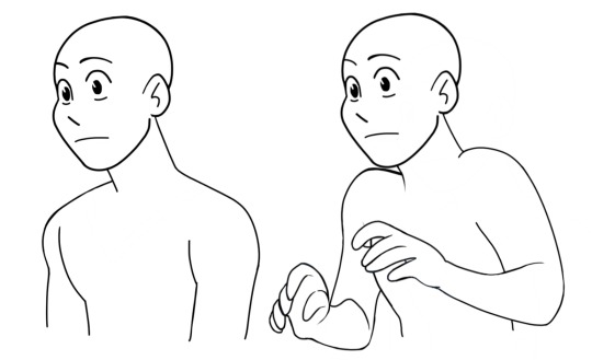
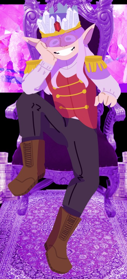
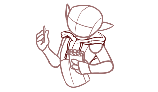
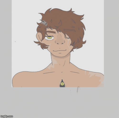
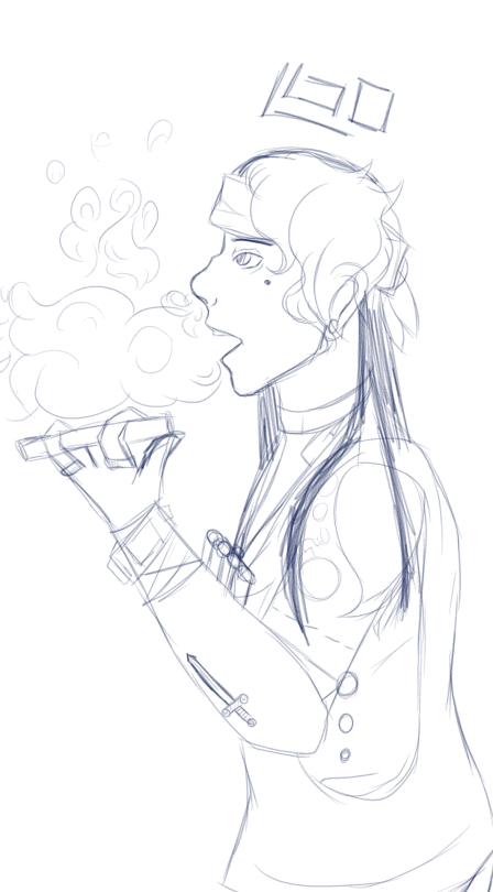
I was hoping you could redline this sketch! I’m having some issues with his head and his hand, but cant quite figure out how to fix them. He is supposed to be holding the cigar like that, but the hand still looks wonky.


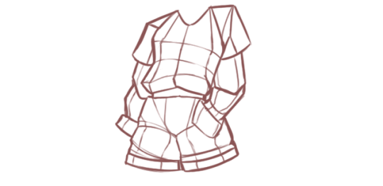
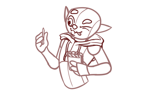
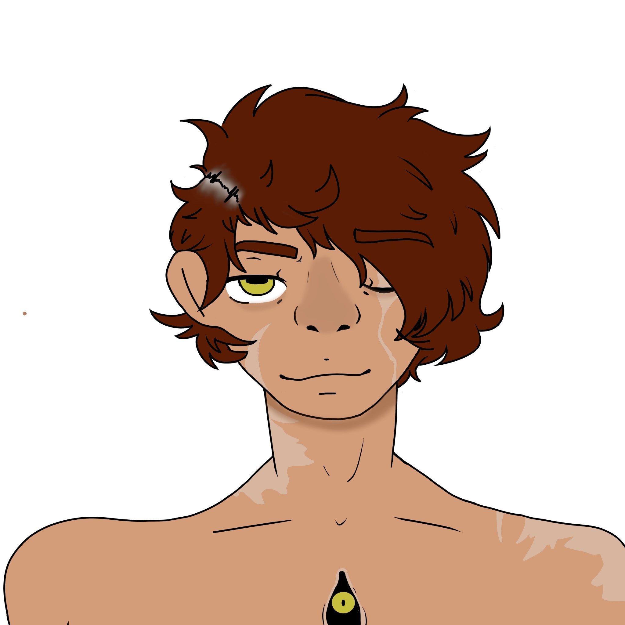
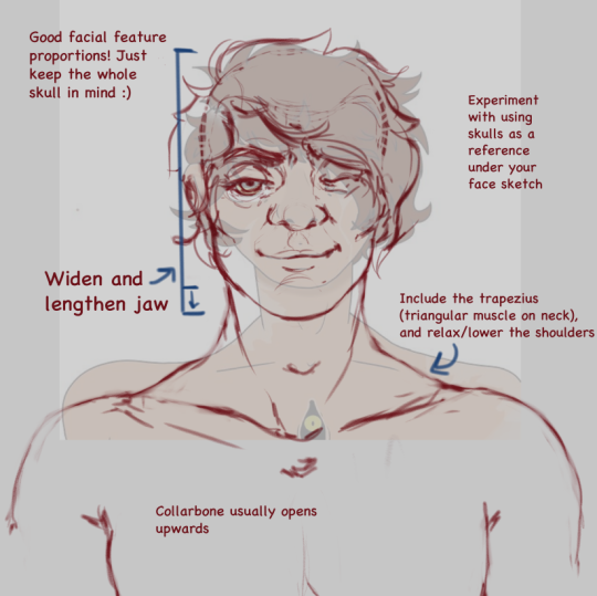
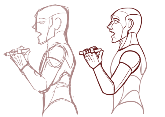
You’ve actually managed to draw the profile of the face pretty nicely. There’s only a few things I’d really alter. Let’s have a look at the overall first though. 

image

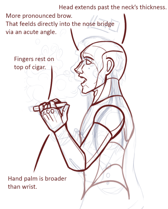
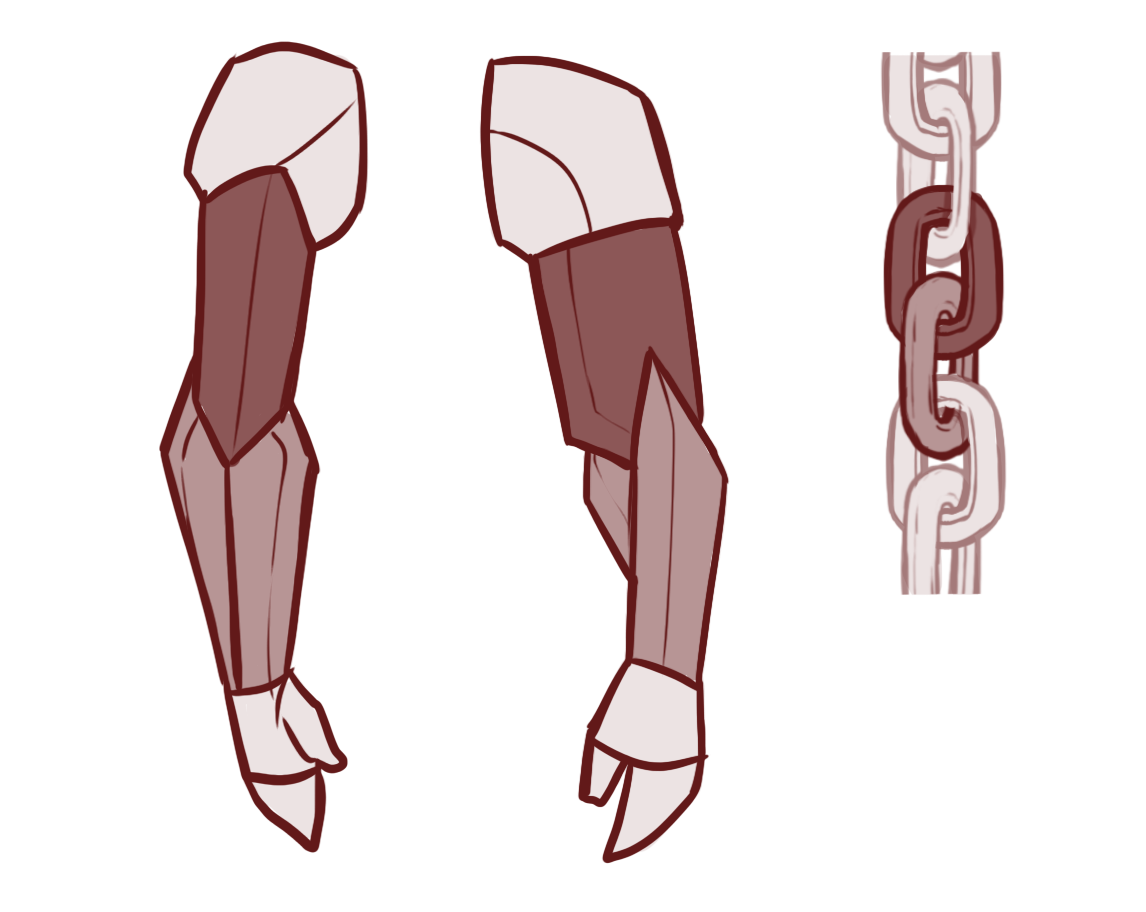
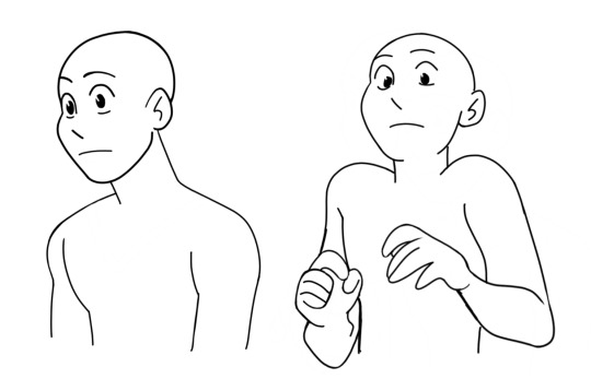
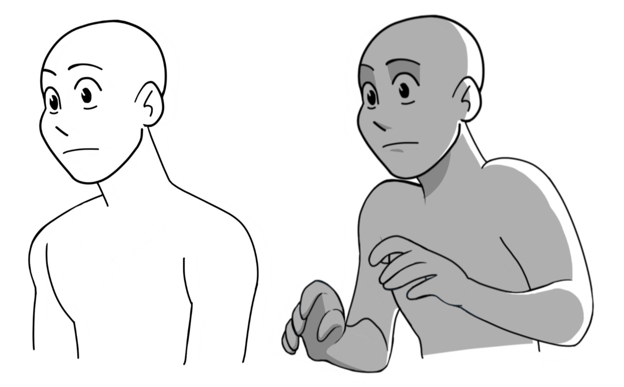
The character’s hand posture with the cigar is supposed to be a character quirk I assume. Which is fun - I like little character-indicatives like this. However, when I tried to replicate the pose for reference I couldn’t for the love of me get my fingers to sit like that holding anything thicker than a pencil despite being in possession of somewhat hypermobile joints. So i wanted to show you the way of how a more ‘normal’ hold on a cigar might look (while still keeping the pinkie and index finger raised higher on the cigar) , knowing that if you want to still keep the character holding the cigar like that - you’d basically have to make the middle- and -ring finger obscured by the cigar itself, since the cigar would rest directly on top of the knuckles. This could be done roughly by just erasing the two fingers. 


image

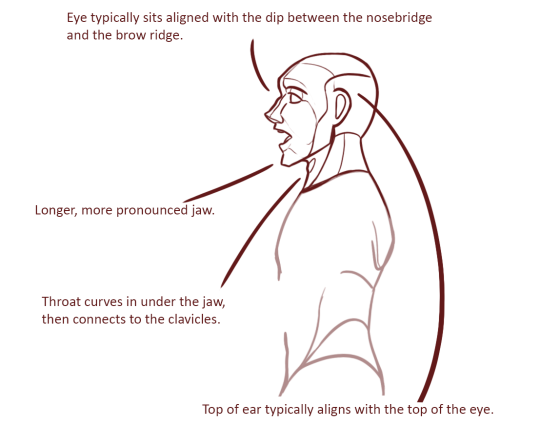
Now the head i could do a lot more comfortably. Most obvious to me was that the character’ braincase didn’t extend past his neck. This is a common mistake and an easy fix. The ear aligning with the eye, which in turn aligns with the nose is one of the profile’s most common thumb rules. Depending on your design, of course, this can be accurate/inaccurate, but basic anatomy rules dictate that there’s a nearly straight line from the top of the earlobe leading into the dip of the nose bridge somewhere. This is also a great guideline to make for yourself when drawing your sketch. 

image

- Mod wackart  ( ko-fi


from The Redline Station https://ift.tt/2PsuY5s
via IFTTT

Sunday, October 27, 2019

Would you perhaps do a tutorial on arm muscles? Or at least link a few good ones you know

Arm muscles took me a bit to figure out when I got started out with anatomy. But the layout of the arm’ muscles can actually be simplified a whole lot while still maintaining a rather believable look. So let’s have a look-see. 

image

One of the first tidbits I discovered that really made it click for me - was that the upper arm contra the forearm intersections kind of like a set of chainlinks. Both in the way, they sit statically but also how they move. If a “broad” or “wide” side of one of them is shown, the “narrow” side of the other should be shown in correspondence. If you just keep the rough shape of these two lings in mind - you ‘ll have an easier time remembering the layout of muscles. 

image

Just for kicks. This is roughly how the main bones are laid out in the arm. We have the Humerus, the large bone in the upper arm. This one’s rather dense and thick. Then you got the Radius and Ulna that start at the elbow and then reach into the wrist. When we move our wrist, the two ends attached to our wrist twist around one another. ( Take a look at your own hand, turn it, twist it, You should be able to vaguely feel the slight shift in angle in your elbow ).

image

So here’s a pretty accurate depiction of the muscle layout in the arm. The most notable muscles ( or at least those most iconic ) are the two large ones on the upper arm ( the Bi- and tri-cep), as well as the brachioradialis on the lower arm. 

image

I’ve gone and simplified the layout accordingly to how I usually consider the layout in my own art. Here we can see the “chainlink” figure again. The bi- and tri-cep forming the “upper” chain link, and the brachioradialis along with the flexor carpi Ulnaris former the “lower” chain link. 

The reason I tend to simplify this is that the many extendors and flexors on the lower arm, aside from the two listed - are rarely defined on people who’s muscles aren’t highly defined. And having these two braid into one another is just easier than having to keep track of 5-6 different muscles that feed into mostly the same shape. 

On the upper arm: We have the bicep in the palest red, the tricep in the darkest red. 

On the forearm: The brachioradialis in the darkest red, and the flexors/ extendors gathered up in the lighter red. 

image

What’s interesting to note is that the flex/ex’ es meet with the brachioradialis kind of cross each other in a V-shape, which opens up into the dent of the elbow and attached - not on line with the elbow- but slightly above it. Attaching this muscle group underneath - or on the line with the elbow was a common mistake I used to do - which contributes to your arms looking like sausage links. But just like any other muscle layout, the muscles of the arms are carefully braided with each other with little areas where no muscles are overlapping or weaving into one another. 

image

llllhttps://www.researchgate.net/figure/Agonist-antagonist-operation-of-the-biceps-and-triceps_fig2_326597252

A brief detour for posing- when the forearm is bend upwards (especially in people with highly defined muscles), you’ll notice that the bi-and tri-cep are compressed and thusly build their mass upwards, which makes this engorged bump. The flex is also visible in non-muscular people, but much less prevalent and rarely anything that one depicts - at least in semi-realism unless they want to emphasize a physical strength with their character. 

image

A quick note on more muscle builds can be found here, https://theredlinestation.tumblr.com/post/185528871950/do-you-guys-think-you-could-give-me-a-tutorial-onand are relevant if your character’s muscles are somewhat defined.

- mod wackart ( ko-fi


from The Redline Station https://ift.tt/2BJJoGb
via IFTTT

Saturday, October 26, 2019

Some...


Some examples: 

image

https://kotaku.com/for-some-folks-side-mouth-ruins-anime-faces-1597880743

The anime/manga mouth. 

Seen widely throughout your classical animes, this particular style draws the mouth often showing little to no teeth when a character talks or emotions. The lips are round and feed directly into the tip of the nose, and doesn’t bring much attention to the mouth in general. This particular style also bleeds into a facet called “ side mouth” of which the mouth is drawn ‘inside’ the cheek and doesn’t connect to the face’s profile. ). When opened, this mouth is often depicted with one side ( the one facing the camera ) drawn more open than the one facing away from the camera, meaning that you can see hints of the inside of the cheek behind the tongue and potential teeth. 


image

https://www.zerochan.net/Ex+Rumia

The other anime/manga mouth.

This mouth is drawn very similar to the first, except the teeth are more frequently involved, and the inside of the cheeks are not depicted. This can be considered a little more ‘realistic’, as the inside of a character’s cheek wouldn’t be visible when looking at them strictly from their profile. 


image

https://apps.apple.com/us/app/sonic-the-hedgehog-classic/id316025912

A more “Abstract” way of situating the mouth on the side of the fell is the mouth of the characters from Sonic the Hedgehog. One can speculate that the sided design comes from the character originally performing on a 2D-side scrolling game. Or if it was just an iconic quirk in the initial artist’s design. 


image

Dreamworks and Disney work on the more realistic end of the semi-realistic spectrum. Dreamworks classics a little more so with the inclusion of the markings around the characters lips as well as a more triangular shape to the lips themselves - when protruding from the face. 

- Mod wackart ( ko-fi


from The Redline Station https://ift.tt/2BLYfzR
via IFTTT

Friday, October 25, 2019

Hi! I’m hoping you can help me get the clothing to look more natural. I have trouble getting the...

image

Hi! I’m hoping you can help me get the clothing to look more natural. I have trouble getting the folds to look right, and making the forms of clothes look 3d while still being cartoony. Thank you so much!!

image

Breaking your outfits down to very basic shapes, and then working on top of that - to make subsequent shapes can help you map out how your textiles might fall around a character. 
Often - what I see, is that people who get confused with clothing folds often end up taking shots in the dark and accidentally overdoing the amount of folds that might be needed for a textile to convey. You’ve actually managed to keep it moderated- which is really nice, now we just need to find out where these few folds should sit.  

image

Drawing your outfit like a wire grid- on top of your simple shape-sketches will also help you determine the flow of the shapes. In this particular piece, you have ample opportunity to make the sweater really pool around the waist, on top of the singed belt. I would amp up my shapes if I were you. Give your textiles that much more volume by making the shapes larger on top of your character’s anatomy.  This way the textile looks like it really sits there. And don’t be afraid to let your clothing’s outline deviate from that of your character’s body form.

image

Usually, with textiles, the folds only come up visible where there’s stretching or compressing happening. In this pose we’ve got here, there’s a lot of compression going on, and not too much stretch. The armpits, the pits of the elbows, the crevice between the legs, these are just some of the points where folds might become visible.  And if we’re really cheeky, we can add a little bit of a line where the belt nudges up against the sweater to indicate that the shirt sits loosely on the character. 

image

Quickly I’d like to mention that the density of fabric will also affect just how long and thick the folds will be. On denim materials, the folds tend to be short and shallow, since the stiffness of the textile keeps it from stretching and compressing much. Meanwhile, a big, soft cotton sweater will fold in much larger, softer lines. 


- Mod wackart ( ko-fi )


from The Redline Station https://ift.tt/2WmdHME
via IFTTT

Chatterbuck’s talks about Art-style

hey everyone! 
We’ve received a whole load of questions about Art-style, and don’t worry - they’re being worked on, but in order to give a more wholesome take on the whole subject, it’s being compiled in a Chatterbuck’s episode which is currently being edited :) 

so next up on our Youtube: 
Chatterbuck’s EP 03: Art-style

- Mod Wackart


from The Redline Station https://ift.tt/2pRQyFH
via IFTTT

Saturday, October 19, 2019

Hey! I think what you guys are doing is amazing and your advice is spot on. I guess I just wanted to ask your opinion about facial expressions: Do you guys think having expressions be subtle leaves the picture lacking? Or can still be effective. I understand if its in comic form thats one thing, but as a single picture- do you guys think it's 'safer than sorry' to push expressions to be as clear as possible?

This question really got me thinking! I’ve discussed this with a few of the other mods and generally this is what we’ve come to a consensus to: Subtle expressions are awesome and can still be effective in expressing whatever emotion you want!

However, this all depends on how and when you use them! Not every expression has to be exaggerated, or even clearly expressing that emotion. If you want to leave a character’s emotions up to interpretation and nuance, a subtle expression can work wonders.

What is important is how you supplement the expressions. Subtle expressions are fine and dandy, but they’re a lot more fun when you can sell them with other parts of your scene.

Here’s 3 ways you can accompany your subtle expressions.

1. Body Language

Behold: A pretty neutral expression.

image

As you can see, in the first image, the figure is very relaxed. Not much can be read about them by looking at their body. In the second, you suddenly get a bit more context. The arms are raised up, showing apprehension? Fear? Confusion? There’s suddenly more story behind the expression.

2. Composition

image

Composition can help set mood as well! Again, with the arms raised and the camera shifted slightly down, you can see more apprehension, the feeling of being overwhelmed, or any mix and match of other emotions.

3. Lighting  

image

Lighting can also change the mood of a pose. I find dramatic lighting works best for this, as its more atmospheric; but softer, less intense lighting can also help sell a scene. 

So to answer your question: Pushing expressions is a great way to make emotions clear and readable; but subtle expressions can be just as effective with the right puzzle pieces. Don’t ever feel as if you have to be “safe” with your art! Do what expression you want to do, and give it your all to make that piece something special. I hope this helps!

⁃ Mod Vain (Ko-Fi)


from The Redline Station https://ift.tt/31xMh7g
via IFTTT

Friday, October 18, 2019

An older piece that I cropped since I want to focus more on the character in the drawing than any of...

image

An older piece that I cropped since I want to focus more on the character in the drawing than any of the background elements.

i mainly want critique on the design of the character in specific, along with the posing of the character. Hes suppose to be sitting in a laxed, unprofessional way on the chair, but the pose seems stiff to me.

I also feel like the design of the character is too busy, but i don’t really know what to take away without him looking bland, so i wanted a second opinion to see if it really is too busy or if im just thinking too hard into it.

[Submitted by watermelon-dad]

image
image
image
image

He looks comfortable doesn’t he? xD I hope this helped!

(With love from Mod Koikro55)


from The Redline Station https://ift.tt/31t91FJ
via IFTTT

Thursday, October 17, 2019

How can I give this more personality. along with making a hood on the hoodie look like a hood?There...

image

How can I give this more personality. along with making a hood on the hoodie look like a hood?


There are a few ways that you can add more personality to this piece. I’ll settle with the posture and some minor details. :) 


image

Often we can enhance the sense of personality in a piece by simply pushing our expressions and gesture more. In this case, I would curve the back a lot more, so that the chest was pushed out, and the rear tugged back. This gives us a dramatic curve which pushes the momentum of the character forward somewhat. 
To complement this ( make the curve more visible ) - I pulled the character’s left arm back to create a little gap between the body and the limb.

Tilting the character’s head is one also an easy way to add a bit more dynamism to the pose, this also brings forward that inquisitive/curious look. 

image

As for hoodies and heavy textiles in general, the fabric will bunch up around the character’s neck, and rest on top of it all the way around. This means a lot of large, soft folds that follow the mass of the hood around the neck. If the hood is particularly large, it’ll rest “on top” of the shoulder, and overlay the curvature of it. 

image

A few extra tidbits in regards to the personality of the piece could be added to the expression. Lowering the eyebrow on the left eye, while heightening the other ( and increasing the size of the open eye ) pushes the expression further, and communicates it more blatantly. I’ve added the tongue just as a test. It is one of those trademark features you see in the character’s trying to study something, whether or not it fits with your character is of course up to you. 


 - mod wackart ( ko-fi


from The Redline Station https://ift.tt/31nFsVO
via IFTTT

Wednesday, October 16, 2019

Hello, I was trying to draw a scene from the Magnus Archives where a character’s hand is burned...

image

Hello, I was trying to draw a scene from the Magnus Archives where a character’s hand is burned while he shakes the other person’s hand. I was wondering if you could help me with the expression of pain and making the picture a little more dynamic? Many thanks!

 I haven’t personally listened to Magnus Archives, so if there are any inconsistencies in terms of the content versus the scene, feel free to daintly skip over that. 

Now, I recently reblogged a post about emoting and expressions to this blog, I recommend you give that one a look for a more in-depth introduction to expressions in general. 

https://theredlinestation.tumblr.com/post/188277275193/wackart-and-whatnot-oh-my-gosh-thank-you-so


Now let’s take a look at some pain. 

image

You were already a good way’s there. You’ve observed that we tend to open our mouths when we are in moderate to severe pain. This often comes as reflex as our facial muscles clench, which in some people pry our lips apart and jaw down.  

I’ve had the character open his mouth more, and tugged the corners of his lips into a two-point rectangular shape ( one following the top lip, another following the bottom lip ). This is because we tend to open our mouths wider when we’re in severe pain.
 If you draw somewhat more toony or semi-realistic art, you can enhance the intensity of the expression by showing a bit the character’s gums. In real life, pushing our lips that far back is difficult if not impossible to some people, but in more abstract styles we can get away with going just that extra step. 

You’ve also included the line from the character’s nostril to the corner of his mouth, this is a line I also use myself a lot, as it describes just how tense the cheek is. 

I’ve tugged up the lower eyelid to bring that tension into the upper half of his face as well. The force exerted on the muscles around the eye makes the lids meet in an upward arch rather than a downward. I’ve allowed the eye to stay open a little bit, but mostly it is squished shut. 
The eyebrow sits rather low on the nose bridge as the tension forces it downward, while the latter half arches upward. This particular curve does a lot to convey the emotions and is worth paying extra attention to. Furthermore, I’ve added a little more lines around the eyes and under the brow just to really hammer in the look of the character’s muscles contracting in agony. 

image
image

For the pose: I’d personally try to establish more of a power-dynamic.
In the original, the victim was already held in a very awkward position, as forced by the perpetrator who is a lot taller, and who is holding him suspended somewhat above ground. I wanted to push this, so I brought the victim down just a little bit lower and bend his left leg more - so that it looked like he was nearly hanging by the perpetrators grasp. 

On top of this, I pulled his right leg out and set it right next to the perpetuator’s foot, so that it looked like the victim was trying to pull back, in an attempt to escape. 

To counter this, I ensured that the perpetrator’s stance was strong and well balanced so that he could hold the victim in place, this also included shoving one of his arms back to counter-weight the other. 
I also played a bit with their height difference here, making the perpetrator tower and bend over the victim in order to make him seem more imposing and intimidating, which would assert his dominance in this particular composition. 

image

- mod wackart ( ko-fi )


from The Redline Station https://ift.tt/2OTSE2j
via IFTTT

Tuesday, October 15, 2019

I found this blog recently and it's super cool. Have you thought of setting up a patreon? Because I would absolutely donate, even without rewards or anything.

We ve contemplated setting up a patreon, however with the amount of mods - and how activity fluctuates for each mod, we found that distributing the donations fairly between us would become a very complicated piece of math, which we d have to content with on at least a monthly basis. That is why mods are instead encouraged to link their ko-fi or patreon account on the posts they make. So that they may recover tips and donations from anyone who would want to help them out :)

- mod wackart


from The Redline Station https://ift.tt/32i4qqU
via IFTTT

Hello! When I drew this picture, I was dissatisfied with the...


Hello! 
When I drew this picture, I was dissatisfied with the result. I feel the colors + background are very simple, and almost bland. How would you go about making this piece feel more vibrant/colorful?

My gosh, this character is so cute. And such a nice design too! 
You’re on the right track in using your current palette, as blue red and green make for a natural split complementary selection. These colours will always make one another stand out, which means that your piece will appear vibrant if given just about the right amount of saturation. 

image

The first thing I would do is to amp up the saturation of the colours just a smidge and add a hint more light to them to make them more pastel. This way, we get rid of the “washed out” feeling and make it look fresher. Up until recently I, myself have been very nervous about my colours being too saturated, but lately, I’ve been trying to amp them up in order to give my pieces more life. From what I can understand, it’s pretty normal that people are hesitant to use really bright colours out of fear that it’ll irritate the eye of the viewer. However, if you lean enough on your colour theory you can actually get away with quite a lot. 

Just for fun, ( and to give the composition itself a little more of a dynamic look ), I pushed the character slightly off to the left so that their head sat closer to the eye’s natural focal point ( see the rule of thirds ). I scaled up the sun/flower and added a fourth colour to the piece, by making the centre of the shape yellow. Why I did this, I‘ll get back to- but for now, it’s to add a complementary colour to the pinks and blues. 

image

Now, you’ve done a really nice job in shading your character. The observations are good and the character looks soft and cuddly. There are a few rim lights that I would probably remove ( See the purple rim light following her left cheek ), but in overall it’s really nice looking. 

My suggestion would be to shade with colour, and not a grey-tone. And if you are already shading with a colour, then shade with more saturated colour. 
It makes the character look at a lot more vibrant.

Now here’s why I decided to make the centre of the sun/flower yellow. In the original, you’ve used the shape as your primary light source. This is a great idea! 
But; since the shape is green then it would naturally cast green light. Here’s the thing about green light, aside from a very few yellowish shades of green, a green light will frequently produce a look that can feel “ sickly “ or otherwise hazardous. It is somewhat of an unpleasant colour. Changing the colour of the centre of the sun allows us to cast yellow light on the character, a much more pleasant colour that adds warmth to the character. 

If you want to add a bit more to the background but stick with the theme you’ve got going, you can add a little blue gradient to it. The gradient will give the picture a feeling of progression and enhance the light coming off of the shape in the top right corner. I picked blue because you already have blues in your design, and I wanted to bring it out a little more. 

I hope this helps! 

- Mod wackart ( ko-fi )


from The Redline Station https://ift.tt/2IRFpLK
via IFTTT

Monday, October 14, 2019

Hello! Do you know of any android apps or websites that have a randomized pose generator? I'm looking for 3d models or references, so I'll have more interesting position ideas when just doodling random characters. The only ones I've been able to find aren't random, and you have to pose the model yourself. Thanks!

HIYA!

I searched up “pose generator” into the googles and I found a few sites;

[NSFW / SFW] quickposes is designed with many photograpths intended to build an artist’s repertoire of the movement, weight, and form of a real human body. You can choose between SFW and NSFW images. This is 100% intended for traditional sketchbook figure studies, however. (Great for hands, though!)

[SFW] figurosity can be customized down to the perspective of the poses they generate for you, but they do expect you to subscribe to the service. The free poses are really dynamic, however, due to being entirely posed 3D figures. This is probably what you’re looking for!

[SFW / NSFW] sketchdaily is like quickposes, but instead uses a variety of professionally posed stock photos instead of photographs, which will probably be more useful for figure drawing as well, but it is a bit limited in sheer variety.

Sites started to get a bit sketchier the more i checked out, most seemed to blow up lower quality stock images, ask for payments, or have a lot of outdated ad space.

IF you’re someone else reading this that would like to pose a figure, THIS is a great read by mod Wackart!

For additional references to reference, check this post by mods Chekhov and Seraphtonin!

(With Love from Mod Koikro55)


from The Redline Station https://ift.tt/31glU5y
via IFTTT

Do you have advice on how to draw more natural poses? Everytime I try to draw a human they look stiff like someone is making them pose for a photo and they don't know how to stand

We have a handful of posts about gesture/posing, and a few about loosening up when drawing them :)

Here they are: 

Loosening up with art
https://theredlinestation.tumblr.com/post/188287293699/how-does-someone-loosen-up-with-art-ive-been

Adding tension to a pose 
https://theredlinestation.tumblr.com/post/185371284286/are-there-any-good-tricks-for-learning-how-to-add

Energetic pose tips
https://theredlinestation.tumblr.com/post/184622960896/how-do-i-do-energetic-poses-i-cant-seem-to-get

Mapping out poses
https://theredlinestation.tumblr.com/post/187541985300/i-just-asked-a-question-so-i-hope-its-okay-to-ask

The line of action
https://theredlinestation.tumblr.com/post/186778137851/whoop-i-think-this-one-got-deleted-somehow-but

Studying gesture with expression
https://theredlinestation.tumblr.com/post/185665501131/i-need-some-help-with-expressions-my-boyfriend

Character’s standing straighthttps://theredlinestation.tumblr.com/post/182380124038/any-tips-on-drawing-characters-standing-up

Fluid posing
https://theredlinestation.tumblr.com/post/179527681309/hi-there-i-really-want-to-start-drawing-more

Depicting personality through poses
https://theredlinestation.tumblr.com/post/178975924328/idle-posing-idle-posing-seems-to-be-a-thing-most


- Mod wackart


from The Redline Station https://ift.tt/2MFW0D9
via IFTTT

when i draw, i really have a hard time drawing hair, especially if it is brushed up. i usually resort to drawing bangs and hair that is brushed down. i also have a hard time drawing textured hair. do you have any tips for this?

We have a couple of hair-tutorials and posts lying around :) 
Here they are:

https://theredlinestation.tumblr.com/post/185641811872/do-you-guys-know-of-any-references-on-how-to-draw

https://theredlinestation.tumblr.com/post/187970573110/do-you-have-any-advice-on-drawing-hair-i-have

- mod wackart


from The Redline Station https://ift.tt/2nIxtow
via IFTTT

I’ve been having this issue where the colors in my art will look fine on desktop, but when I look at the same art on my phone it will look too dark and over saturated? It’s really frustrating, is there any way I can make sure the colors look the same or at least similar?

We did a post on this not too long ago, there’s not much you can do except for adjusting your image to each individual screen, but here’s the full post. :) 

https://theredlinestation.tumblr.com/post/185779914445/hi-weird-question-but-i-was-wondering-if-anybody


- mod wackart


from The Redline Station https://ift.tt/32j64bS
via IFTTT

Hey I don’t see the submission box even though it says subbmissions are open, on the app and on the website, is this an error or something?

hey, anon! 
So sorry - when we closed the submissions we forgot to change the tagline on top of the blog. It has been changed now, thank you for the heads-up. 

- mod wackart


from The Redline Station https://ift.tt/2B77MRM
via IFTTT

Sunday, October 13, 2019

Is it possible to commission one of the mods to critique my art?

You can! Although all the mods have different schedules, you will have to contact them directly for more information on if they’re available and how to do that. More info below! 

This is also a good time to talk about reaching out for critique and review! It’s a common practice to have someone from a potential school or workplace take a look at your work (if you just ask!) and let you know what you can improve on to apply there. It’s also a good idea to ask for opinions from artists you look up to and peers that you trust. Yes, even that popular artist is a person just like you, and if you just ask, most people will be happy to give you a tip or two. 

This is also why Portfolio Days are very good opportunities, if you want to become a career artist, because you can get many critiques from vastly different people, which can help you compare and contrast the different tastes of different schools, studios, etc.

Here’s the mod info!:

(Wackart)

I used to do a bit of mentoring with some startup-artists not long ago. The whole ordeal was centred around correspondence on art tips, piece critiques and one-on-one talk about where the ‘student’ wanted to take their art, and how they could potentially get there. The student had access to me at all times so that they could send a piece to me, or a question, and then have an answer in their hands ASAP.

If you want something a little simpler ( say: just a few single critiques, etc ) I’m sure we can figure something out, should you be interested. I’d gladly arrange it.

My strong suits: Storytelling / visual storytellingWorldbuildingStoryboarding / ThumbnailingCharacter design / Creature designStyle variation / forté: SemirealismArt theory + Design theoryComposition

Some of them are fundamentals I’ve obtained a diploma from back in ‘16 (The animation workshop’s: Drawing Academy) , others are all topics of which I will obtain my first degree this summer ( Through KADK’s game- and -interaction design).

If you want to see my professional portfolio and read my actual summary you can hop onto my official design portfolio here: https://wackart.info/

For more illustrative, fun-time leisure works here’s my DeviantArt: https://www.deviantart.com/wackart

image

(Future)

Heyy, I’d feel comfortable providing critique. I’m definitely not up for mentorship, but I have a strong fundamental background. For you Americans, I’ve taken both AP Studio Art and 2D Design, and obviously I’m studying art in college right now. I’m more comfortable in critiquing technical work and the conceptual build of your breadth of work. Very artsy fartsy, I know. 

Here’s some of my old old work: http://catversary.weebly.com/

Here’s where to contact me: https://twitter.com/catversary (and tumblr messenger ofc)


from The Redline Station https://ift.tt/35xIdXS
via IFTTT

Saturday, October 12, 2019

–– Mod SugarQuill ⚡ ko-fi | Instagramc-j-blr-bitty-blog: I drew this dude a while ago and I was...

–– Mod SugarQuill ⚡ ko-fi | Instagram

image
image
image

c-j-blr-bitty-blog: I drew this dude a while ago and I was wondering if you could give me tips on how to draw a more masculine face i rarely draw men because girls seem easier to draw so when I do draw men they end up looking a lot more feminine then masculine mainly in the face the body I have more luck on drawing how I want it to be

Redlined by Mod SugarQuill

I really like the character design you’ve got going on! This guy seems really mysterious :) Let’s dive in.

First, just a disclaimer: I’m going to discuss this in terms of traditional/typical masculine features. Not all guys share the same features, so your mileage may vary.

So the main thing here is probably the jaw. Dudes tend to have stronger, squarer jaws. Before I did the redline, I referenced a male skull and then drew the face on top of my skull sketch, which gave your character more of a chin. I also filled out some the neck/shoulder area, since many guys (and ladies) have a little definition above the collarbone. 

I thickened his neck as well, since “long/thin neck” is often associated with feminine beauty standards.

It looks like you had intent to broaden the shoulders, which was a good move. If they have a bit more padding and are relaxed, they’ll feel even more masculine.  

All in all, fabulous job and good luck!

–– Mod SugarQuill ⚡ ko-fi | Instagram


from The Redline Station https://ift.tt/2OK1RKm
via IFTTT

Friday, October 11, 2019

how does someone loosen up with art? i've been trying to do art, but wheer i do it, i get caught up on guidelines or if this anatomically correct and ive just become depressed because i just keep tying myself into knots

I feel like this is something every artist has gone through or is currently going through, so don’t worry you are not alone!

What really helped me start to loosen up with art is Gesture drawing! Theres nothing looser than gesture! 

 heres an example from Proko!

image

(his lesson on gesture: https://www.youtube.com/watch?v=74HR59yFZ7Y)

do gesture practice with 15 or 30 second time limit with people or even house hold objects like a lamp or a couch

your drawings DO NOT have to be clean like Proko or many of the examples you see of gesture drawing on the internet when you first start. Gesture practice is for learning not displaying on your wall (you can throw them out immediately if you want)

I actually encourage you to be messy and scribbly with these drawings make them a mess and ugly but find the rhythm and gesture in the poses or object your drawing and FOLLOW THE TIME LIMIT!

An exercise like this will help you draw loose and the time constraint will help stop you from getting lost in the details or ‘rightness’ of what your drawing

have fun and remember its not about he end result of the drawing its about the experience! 

here are some examples from The Natural Way To Draw by Kimon Nicolaides (PDF FREE) Its a great art book! maybe a little dated in the language and suggested mediums but the exercises are great for building those art brain muscles!

“You should draw not what the thing looks like, not even what it is, but what it is doing” (Nicolaides,31)

These things also just get better with time, practice and patience! so keep drawing and you’ll be just fine! 

More Resources: 

Good video explaining more on this exercise from sycra on youtube: 

https://www.youtube.com/watch?v=xmiwGm32dXU

Aaron Blaise talking about the importance of drawing loose in animation: 

https://www.youtube.com/watch?v=OCAFStbNjCU

hope this helps! -Mod Todd (ko-fi)


from The Redline Station https://ift.tt/2II5Tz6
via IFTTT

Thursday, October 10, 2019

So this is just a concept sketch but it just feels off. Advice on anatomy? (Note, the puffiness of...

image

So this is just a concept sketch but it just feels off. Advice on anatomy? (Note, the puffiness of the thighs is because of puffy shorts if you can’t tell)

Submitted by ~  cherri-z 

image
image
image
image
image

(With Love from Mod Koikro55)


from The Redline Station https://ift.tt/33lzypK
via IFTTT

Hey fellas!So recently I’ve been trying to take on a more cartoon style when drawing. I’ve been...

Hey fellas! So recently I’ve been trying to take on a more cartoon style when drawing. I’ve been doing my best to do more unique shilloue...